| Author | Thread |
|
|
12/13/2005 10:14:53 PM · #1 |
I know, it's a bit late, but I was waiting to see if I was lucky enough to get pulled by the Critique Club.
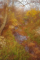
Below was my entry for the recent Free Study Challenge. I'd really like some feedback on this. I had no dilusions of ribboning, but, honestly, I thought it would do better than 4.8. I really liked the way it came out, but just didn't seem to connect with the voters.
So, what do you feel really held me back, and if you have any suggestions on improving this shot, I'd be glad to listen.
Thanks much!!
|
|
|
|
12/13/2005 10:21:13 PM · #2 |
| The scene is pretty, but I think if there were more contrast (the darks could be darker), it could give more depth to the image. |
|
|
|
12/13/2005 10:25:22 PM · #3 |
| Commented on the photo page, I think it's a really lovely shot myself. Bummer on the score, I agree it deserved better. :( |
|
|
|
12/14/2005 10:00:32 AM · #4 |
|
|
|
12/14/2005 10:39:30 AM · #5 |
|
|
|
12/14/2005 10:48:30 AM · #6 |
| Left you a comment... :-) |
|
|
|
12/14/2005 11:58:18 AM · #7 |
Thanks everyone! Laurie, that was an amazing critique, I really appreciate the time and though you put into that!
So, more contrast, less foreground, and the sky are the main issues that could be addressed in this particular shot.
Actually, a lot of the lack of contrast is from the processing in trying to give it a dreamy/mystical feel. I agree with everything you all said (focal point, perspective, sky etc..).
Thanks again to all of you! |
|
|
|
12/14/2005 01:36:59 PM · #8 |
Originally posted by tsheets:
...So, what do you feel really held me back, and if you have any suggestions on improving this shot, I'd be glad to listen.
|
A combination of factors kept this image from scoring higher:
1-Image is to "busy".
2-Image lacks a central focal point.
3-Colors are "weak", image lacks contrast and the sky is washed out.
4-Perspective is unimaginative.
I like nature and landscape photography. Outside our color differences your entry shares a lot in common with a recent one of mine that did not do as well as I'd hoped:
The "busy" nature of your image is its most glaring defect just like it is in mine. A "busy" image is one with a lot of fine detail that lacks a specific eye-catching component. The amount of detail is confusing to the human eye. There is simply to much fine detail and it is not sharp enough. I'm certain this scene was a lot more stunning in person than was captured in the photograph.
Here is a killer in landscape photographs... it is very hard to get the sharpness on "busy" images (lots of branches, leaves and things) correct in such a way as to allow the viewer the same experience you had when you were there. Almost always they are either overshapened that gives them a "digital" look or too soft focused for the amount of fine detail present.
A good photograph needs a strong central focal point. Tranquility, which is what you may have been trying to capture, is very hard to convey. The image still needs a dominate object to hold the viewer's attention and interest.
Perspective is the single most powerful tool the photographer has to emphasize a theme or idea in a photograph. An everyday view of a scene like in your (an my) image has considerably less impact than one taken from an extraordinary perspective.
Suggestions for improvement:
1-Lessen the scope of the image to reduce the amount of tiny detail that makes your image look "busy".
2-Look for and find a particular object, like a fern, within the scene that conveys the feeling you are trying to capture and make it a dominant object in the scene and provide a central focal point for the viewer.
3-Work more on the contrast and color of the image to give it more depth and richness.
4-Since the sky is washed out don't include any of it in the frame or, conversely, add more of it but only do that if the interplay with the branches adds value to the image. Overcast skies are great for bringing out good tones but you don't often want them included in the image.
5-Walk around and look at the scene from many different angles from the ground up and you will likely be able to find a more interesting perspective from which to capture this tranquil scene.
Message edited by author 2005-12-14 13:44:31.
|
|
|
|
12/14/2005 02:20:07 PM · #9 |
Just for the heck of it, I decided to see what I could "do" with this image. Obviously, working from tsheet's already-fogged, 640-pixel image is not the "right" way to go at this, but I did it anyway. This clearly bears no resemblance to what tsheets was trying for, and it equally clearly isn't a very GOOD end result, but... it DOES show that there's more compositional strength in the image than has been brought out in the as-entered version:

Robt. |
|
|
|
12/14/2005 02:50:26 PM · #10 |
Originally posted by bear_music:
Just for the heck of it, I decided to see what I could "do" with this image.
|
Nice job for what you had to work with!
Agreed that you emphasized the as-is compositional strength of the image in a very creative way. It does cross the border into digital fine art which is definitely NOT a bad thing. Looks like a Monet painting. (Is that the guy who painted landscapes like this?) I got a ton of fine art roll paper I don't like for standard photographs that this would look pretty darned good on. :)
Your technique transforms the image into something new that works.
My sense, however, is that a photograph needs to stand on its own merits first. Then applying your technique would make this an even greater image than what you've accomplished with your changes.
Message edited by author 2005-12-14 14:50:59.
|
|
|
|
12/14/2005 02:55:57 PM · #11 |
Originally posted by stdavidson:
Originally posted by bear_music:
Just for the heck of it, I decided to see what I could "do" with this image.
|
Nice job for what you had to work with!
Agreed that you emphasized the as-is compositional strength of the image in a very creative way. It does cross the border into digital fine art which is definitely NOT a bad thing. Looks like a Monet painting. (Is that the guy who painted landscapes like this?) I got a ton of fine art roll paper I don't like for standard photographs that this would look pretty darned good on. :)
Your technique transforms the image into something new that works.
My sense, however, is that a photograph needs to stand on its own merits first. Then applying your technique would make this an even greater image than what you've accomplished with your changes. |
And I suspect that if we looked at the original we could more-easily discern the compositional merits of this image; I believe his "fog" post-processing obscured, rather than emphasized, the strengths in this actually-interesting composition, basically.
That's why I did what I did. I couldn't find any way to make my compositional point in this case except by exaggeration, because I didn't have the source image minus the fog. For example, the replacement of yellow with green is arbitrary and not my first choice, but the processing had made this so monochromatic I couldn't effect separation except by exaggeration.
There's no localized burn and dodge in this btw. Except for the gradient at the top all adjustments were applied globally.
R.
Message edited by author 2005-12-14 14:57:35. |
|
|
|
12/14/2005 03:22:02 PM · #12 |
Originally posted by bear_music:
|
Regardless what you had to do to get the result... it looks good! And that, after all, is all that matters! :)
|
|
|
|
12/14/2005 07:14:42 PM · #13 |
Thanks again for the advise, good stuff!!
Interesting effect, bear. That really hilights the compositional elements as you said.
Just for fun, I tried incorporating some of the comments into the shot (didn't re-work from scratch, and tried not to abandon my initial intention of mystical/dreamy). Also, just for reference, and if anyone wants to play further, I included a straight from the camera version (only adjustments after RAW conversion, which had some adjustments, were resize and USM).
If anyone wants, I can send a full-sized file.
------Rework--------------SOTC------
  |
|
Home -
Challenges -
Community -
League -
Photos -
Cameras -
Lenses -
Learn -
Help -
Terms of Use -
Privacy -
Top ^
DPChallenge, and website content and design, Copyright © 2001-2026 Challenging Technologies, LLC.
All digital photo copyrights belong to the photographers and may not be used without permission.
Current Server Time: 05/01/2026 05:27:47 PM EDT.


