| Author | Thread |
|
|
06/20/2003 02:52:45 AM · #26 |
OK I'm not a member and I haven't even looked at the Black on Black photos yet, but I have noticed the gray scale bar under the Voting images, and have been curious about it.
Am I suppose to be able to see every level of gray there? I can only see the first 24 shades, starting from white. The last few are look solid black.
|
|
|
|
06/20/2003 02:54:18 AM · #27 |
Originally posted by Fiver:
The last few are look solid black. |
This means your monitor is too dark
|
|
|
|
06/20/2003 04:18:19 AM · #28 |
yeah. my monitor is 100% a ok. I'm guessing, but surprised, that other people's are not. How do you not have your monitor calibrated? Wierd. Anyway. I didn't find many pictures that were too dark. Maybe only 5 or so.
Message edited by author 2003-06-20 18:56:51. |
|
|
|
06/20/2003 06:24:16 AM · #29 |
With few exceptions, I personally find most of the entries to be leaning a bit to much toward the dark side. In this example, you will not see such a literal interpretation of black on black or low key (like many of the entries are in this challenge).
|
|
|
|
06/20/2003 07:43:39 AM · #30 |
Yeah, I'm in the 4's with a shot that looks as I expected on three different monitors and fulfilled the various definitions proposed and is very good technically. :(
Dennis
|
|
|
|
06/20/2003 09:04:39 AM · #31 |
Originally posted by Sonifo:
Most of them look really good. I was surprised. I think that some photos are to dark. I can barely make them out..but it is not my monitor. I fixed mine months ago.
|
You know you're supposed to recalibrate a monitor every couple of weeks or so - the settings shift with time and temperature. I just reused my spyder last night after about a month and the brightness settings had moved a noticeable amount.
and as a general aside, it isn't so much brightness that people probably need to adjust, but contrast. Just had a look and my monitor is currently set at only 52% brightness, but the contrast is right up about 95%
Message edited by author 2003-06-20 09:16:42. |
|
|
|
06/20/2003 10:44:38 AM · #32 |
Taken from the thread Photoshop/NeatImage tutorials initiated by bod, there's a great section on how to adjust monitor calibration...
monitor calibration how to
|
|
|
|
06/20/2003 11:55:31 AM · #33 |
Originally posted by kavamama:
Taken from the thread Photoshop/NeatImage tutorials initiated by bod, there's a great section on how to adjust monitor calibration...
monitor calibration how to |
Well I did these two links, and everything looked fine. I didn't have to adjust anything. But I still can't make out the last 4 squares on the gray scale bar on DPC.
|
|
|
|
06/20/2003 12:10:50 PM · #34 |
I like this idea a lot. Why don't you do this for us with instructions?
Personally I use the bar at the bottom of the vote screen but some obviously don't know how. It might give those folks another shot at getting it right.
Originally posted by DrJOnes:
... this topic makes me think of a suggestion to DPC:
What about creating 1 (or a few more) image(s) in a specific section called MONITOR CALIBRATION.
For instance, there could be multiple versions of the same image, in darker tones and lighter tones. But one version would be called "reference picture" and the others "2 stops darker, 1 stop darker, 1 stop lighter, 2 stops lighter". At a glance, you can then easylly calibrate your monitor for the best view on the reference picture, while seeing the calibration's effect on the brighter and darker versions.
This way, when we prepare our image for DPC, we'd be calibrated the same.
Just a thought. |
|
|
|
|
06/20/2003 12:15:37 PM · #35 |
Mine, too. I guess I need a "Monitor Calibration for dumber dummies" how to link. 8-(
edit..
Actually, I've got it so I can see all but the definition between the two darkest patches. I'm a little "vision challenged" so maybe that last part is something I can't discern.
Message edited by author 2003-06-20 12:20:12.
|
|
|
|
06/20/2003 12:37:46 PM · #36 |
To all,
I wouldn't worry about the last two boxes on the gray scale on the DPC pages. The RGB values of the blackest fours quares are, from the right (blackest):
0,0,0
9,9,9
18,18,18
27,27,27
From the above listed monitor calibration tutorial, BTW one of the better basic overviews I have seen, they recommend that you be able to see the difference between the "0" and "10" squares in this image:
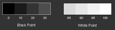
The rgb values of these two squares are:
0,0,0
26,26,26
So as you can see the second square in the above image corresponds to the fourth square in the DPC calibration bar:

I went through the tutorial and verified my black & white points and also my gamma (which is set to 2.2). I can relatively easily make out the difference between 0,0,0 (0%) and (26,26,26 (10%), however the lst three boxes on the DPC scale are nearly indiscernable to me. It does help if I view the DPC scale against a black background, but only slightly.
I would highly recommend NOT adjusting to be able to see the last two to three shades on the black end of the DPC scale. Set your monitor using calibration software, and repeat the process regularly.
|
|
|
|
06/20/2003 12:43:03 PM · #37 |
Originally posted by dacrazyrn:
Originally posted by Sonifo:
Originally posted by dacrazyrn:
Holy crap!! Is this a low key challenge, or are the voters thinking it is a black and WHITE!!! I have to be getting ones and twos, cuz I just hit a freakin 3.26 with 19 votes and no comments!! ARRRGGGGGHHHHH! How DPhrustrating!!!!!!! Welcome to my lowest score EVER! I can feel it!! |
I would like to know what you think is a low-key photo and the difference between a b/w photo. I think that most everyone did an excellent job on there pictures. The others forgot to look up what low-key is. |
I am meaning that many look like they are in black and white, and any that have color in them are being voted down because of it. There are a ton of great shots in there and I think I handed out mainly 5-7's
Low key to me is low illumination (ie more of a dull lighting situation), which can have long shadows and total areas of blackness that obscure parts of the intended subject. Early, early morning and late evening light are kind of the idea I get for the "brightness" of the light, etc.. example |
And you are quite right in your definition.
Low-Key doesn't mean absence of color either. I had this discussion with a friend of mine (another DPC photographer) and we both came to the conclusion (prior to the start of the voting procedures) that it would be safer to send a B&W photo for this challenge simply because of the nature of the voters on DPC. And you know what I mean by that! Keep it simple. Keep it conservative. That is, if you want to win...
They see "Black on Black" and think "black and white". Simple, simple, simple... minded.
Mind you, the active photographers of this site usually rate a lot higher and with a more educated photographic mind than voters with no camera, or voters with cameras who rarelly participate to DPC. Doesn't mean you'll get a higher score though...
Predictable I tell you...
You chose to go color. Way to go! I encourage you!
DrJOnes666
|
|
|
|
06/20/2003 12:48:20 PM · #38 |
I don't know if the bar under the pictures helps much, I have always been able to see every bar as a different shade, in fact even when I switch my settings around a lot I still see everything. I just think we all have a varying monitor capabilities that we will all have to take into account. Even though my shot is black to most, I am very pleased personally with it and that is all that counts.
Message edited by author 2003-06-20 12:48:39.
|
|
|
|
06/20/2003 01:35:59 PM · #39 |
Originally posted by Gordon:
Originally posted by Sonifo:
Most of them look really good. I was surprised. I think that some photos are to dark. I can barely make them out..but it is not my monitor. I fixed mine months ago.
|
You know you're supposed to recalibrate a monitor every couple of weeks or so - the settings shift with time and temperature. I just reused my spyder last night after about a month and the brightness settings had moved a noticeable amount.
and as a general aside, it isn't so much brightness that people probably need to adjust, but contrast. Just had a look and my monitor is currently set at only 52% brightness, but the contrast is right up about 95% |
I don't know what kind of monitor you have but I check mine often
and it hasn't changed. I can see all the black squares on the and all the white squares on kirbics examples. What else is there to do? Am I missing something here?
|
|
|
|
06/20/2003 01:53:22 PM · #40 |
Originally posted by David Ey:
I like this idea a lot. Why don't you do this for us with instructions?
Personally I use the bar at the bottom of the vote screen but some obviously don't know how. It might give those folks another shot at getting it right. |
Nothing I can do to my monitor will make the last few on the left be anything but flat white or the last few on the right be anything but flat black.
However, in this challenge, there was only one shot which gave me a completely all-the-same-black square. All the rest I could see fairly well.
|
|
|
|
06/20/2003 01:54:21 PM · #41 |
Originally posted by kirbic:
From the above listed monitor calibration tutorial, BTW one of the better basic overviews I have seen, they recommend that you be able to see the difference between the "0" and "10" squares in this image:
|
Aha. I can distinguish those two, but not so much the white-bar ones, and not at all the right few on the DPC bar.
|
|
|
|
06/20/2003 01:58:51 PM · #42 |
Originally posted by eloise:
However, in this challenge, there was only one shot which gave me a completely all-the-same-black square. All the rest I could see fairly well. |
If I know which one you're talking about, there's actually something there. :)
|
|
|
|
06/20/2003 02:04:50 PM · #43 |
Originally posted by kirbic:
I would highly recommend NOT adjusting to be able to see the last two to three shades on the black end of the DPC scale. Set your monitor using calibration software, and repeat the process regularly. |
I would like to hear from somebody with a properly (ie. with a Spyder) configured monitor on this.
My belief is that the 15000+ tones represented by the last few boxes DO matter ... and if you're ever going to print the image then they matter even more.
I thank the people who pointed out the flaws in my early entries which led me to realise that my monitor was not properly calibrated.
|
|
|
|
06/20/2003 02:05:04 PM · #44 |
Originally posted by Sonifo:
I don't know what kind of monitor you have but I check mine often
and it hasn't changed. I can see all the black squares on the and all the white squares on kirbics examples. What else is there to do? Am I missing something here? |
Well, when I calibrate, I'm changing the contrast, the brightness and then each of the red, blue and green colour channels individually. It doesn't change a huge amount, but there is certainly drift over time as things age and heat up/ cool down, as with any analogue device. |
|
|
|
06/20/2003 02:08:33 PM · #45 |
Originally posted by mavrik:
Originally posted by eloise:
However, in this challenge, there was only one shot which gave me a completely all-the-same-black square. All the rest I could see fairly well. |
If I know which one you're talking about, there's actually something there. :) |
Yes, but if with my monitor pumped as high as it will go on both contrast and brightness it's still a completely featureless black image, and I have no problem with *any* other shot in the competition with those settings, I feel justified in giving it a 'Sorry, all black is not black-on-black' comment and a low score.
If I couldn't see five, or ten, or more, then I'd agree it was completely all my fault. :-> However, in future, we might not want to go for challenge topics where monitor calibration is so very intensely key to the nature of the challenge, given the givens?
|
|
|
|
06/20/2003 02:14:37 PM · #46 |
Originally posted by eloise:
However, in future, we might not want to go for challenge topics where monitor calibration is so very intensely key to the nature of the challenge, given the givens? |
For those of us who like dark images it's always a problem :-/
This challenge is just showing everyone else what we have to go through!
As for the image you refer to, I could barely see anything at work, but now I'm on a good monitor I can make out a *lot* more. Like I said, there's 15000 or so tones down at that bottom end that can hold a fair bit of detail.
Unfortunately some monitors will never show all the detail, they are just so poor. My work monitor isn't that old, yet it's still very bad with brightness & contrast maxed out (and I can't run Linux so have no access to the xgamma command).
|
|
|
|
06/20/2003 02:24:02 PM · #47 |
Sonja,
I very much recommend the above posted link...
monitor calibration how to
Specifically, I recommend that anyone who has doubts about how their monitor is set up, go to the above, and work through all of the pages linked in the frame at the left. Once you are done, you have done a good, basic calibration.
To get more sophisticated than this you will need hardware-based calibration, e.g. spyder or similar. A hardware-based system like the Spyder can calibrate the R, G and B channels separately, and also account for nonlinear behavior of the monitor hardware. It's a superior way to calibrate, but at a price!
Again, not to worry if you can't differentiate the blackest squares on the DPC scale. Part of this is determined by room lighting and screen intensity in nearby areas.
Try this: after calibrating, mouse over the DPC test bar, right click & copy, paste into a new file in your graphics editor with a pure black background. Zoom in until the last four or five squares on the black end take up a good portion of the screen. Dim your room as much as possible. You should be able to easily differentiate the last two squares. repeat with a white background... you will not be able to differentiate them, most likely!
|
|
|
|
06/20/2003 02:37:56 PM · #48 |
Originally posted by bod:
Originally posted by eloise:
However, in future, we might not want to go for challenge topics where monitor calibration is so very intensely key to the nature of the challenge, given the givens? |
For those of us who like dark images it's always a problem :-/
This challenge is just showing everyone else what we have to go through!
As for the image you refer to, I could barely see anything at work, but now I'm on a good monitor I can make out a *lot* more. Like I said, there's 15000 or so tones down at that bottom end that can hold a fair bit of detail.
Unfortunately some monitors will never show all the detail, they are just so poor. My work monitor isn't that old, yet it's still very bad with brightness & contrast maxed out (and I can't run Linux so have no access to the xgamma command). |
Hence my thought that for something as key as 'does this fit the challenge?', relying on as ephemeral and unhelpable a quality as monitor calibration is dangerous.
Honestly, I agree that fine, sure, if you want to make a photograph that uses only the tones in the three leftmost squares, that's all well and good IF YOU CAN CONTROL THE VIEWER'S METHOD OF VIEWING. For a medium like photos-on-a-webpage, though, there is no such ability to control, because some monitors, even if calibrated 'right,' simply cannot resolve those tones, as you yourself just said. Post your uberdark shots on chemicals-and-paper in a gallery, but don't offer them in such a variable medium and then bitch when not everyone has the Newest Bestest Coolest Monitor calibrated exactly like yours. :->
It's like putting up a website where all your content is embedded in full-screen flash animations behind javascript popups that refuse to let anyone in who isn't using Internet Explorer 4.92, and then complaining that your friends on dialup using Mozilla can't see it.
|
|
|
|
06/20/2003 02:46:00 PM · #49 |
Originally posted by eloise:
Post your uberdark shots on chemicals-and-paper in a gallery, but don't offer them in such a variable medium and then bitch when not everyone has the Newest Bestest Coolest Monitor calibrated exactly like yours. :-> |
LOL! Point taken : )
I do try my best not to complain though - I've been here long enough now to know what to expect and accept it.
|
|
|
|
06/20/2003 05:50:31 PM · #50 |
|
Am I wrong or is there one (and only one) entry in the B/B contest which is completely black and without any features at all? |
|


