| Author | Thread |
|
|
11/09/2021 03:15:02 PM · #76 |
Originally posted by grahamgator:
The challenge description is: Challenge Details: This is DPC's first "mentored" challenge. See the accompanying thread in the forum to learn more. You need not be a part of the mentoring process to enter, but all are welcome to be involved at that level.
The last part of that is what is confusing to me. In Wendy’s original suggestion, I believe that is what she said. Maybe I am the only one seeing that, lol. |
Forget what I said, IAM REALLY OUT OF IT THESE DAYS! It clearly says you need NOT be a part of the mentoring process to enter - DUH. |
|
|
|
11/09/2021 03:16:45 PM · #77 |
|
Wendy, a small jpeg will work. The best way would be to email it to me: maryannandrews@windstream.net |
|
|
|
11/09/2021 04:00:26 PM · #78 |
So the idea is to present the mentor with a challenge, right? ;-)
I don't think I'll have time to shoot anything else for this challenge, so wale (wail?) away ...
Unadjusted original: 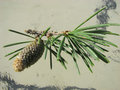
Basic adjustments: 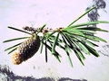
plus Crop/Rotate: 
Message edited by author 2021-11-09 16:02:13. |
|
|
|
11/09/2021 04:13:55 PM · #79 |
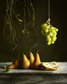
Wendy asked for one of my originals and editing steps so I will give it a shot. I had an image in mind and then had to search and search to find it and wasn't very successful. Then going through the Photoshop layers and trying to give an explanation for everything was not easy. However, here it is, hope it helps.
I know I used the raw file and did minor adjustments before going to Photoshop and for validation of the image, however, I can’t seem to locate jpeg or raw file. I changed over from Windows to Mac about a year ago and it probably got lost in the shuffle or is on one of many external hard drives. I am including another shot from this sequence that is very close to the original image (I can tell I did an angle adjustment and slight movement of the vine on the pear left side and I was farther away). However, this will show the original lighting and set-up.
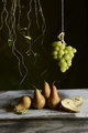 
Set-up – old wooden box for platform, dark abstract backdrop in the background. I hung the vines and grapes from the rod of the luggage rack I have. I was about three feet from a window with diffuser.
Nikon D600 – 24-70mm lens, focal length 42.0 m, 1/10 sec, f 6.3 ISO 400
Rotate, crop
Curves adjustment to adjust highlights and shadows
Levels adjustment using the bottom sliders – 8/228
Brightness/contrast adjustment on upper left corner – Brightness -24, Contrast +5
Brightness/contrast on upper right into the middle - +27 +4
CEP4 – Dark Sunlight – 40% opacity
CEP4 – Darken/Lighten Center
Green Texture added – 60% opacity soft light blend
Spot heal the small twig in middle of pears
Curves adjustment – very slight on shadow, fruit and right side
Define - noise reduction on background and grapes
Selective color – Whites +22 on black, +4 Blacks on black, Neutrals +4 on black
Hue/Saturation to top of cut pears – Yellows -46 saturation +15 lightness
High pass sharpen – Grapes pears and wood bottom half of image – 2.8 soft light blend
Slight curves adjustment
Slight levels adjustment
Resize
Save for web
|
|
|
|
11/09/2021 04:14:14 PM · #80 |
|
|
|
11/09/2021 07:11:10 PM · #81 |
Originally posted by grahamgator:
Wendy, a small jpeg will work. The best way would be to email it to me: maryannandrews@windstream.net |
Thanks! Will do. My son is working on book cover for tonight, so he’s on my computer. I’ll send it when he’s off. |
|
|
|
11/09/2021 07:13:50 PM · #82 |
I think this might have gotten lost in the thread, so I’m going to repost:
Which brings me to a question (I hope I can ask a question about someone else's photo). I absolutely adore Marion's cats, but it seems like the vase doesn't really fit in with it? Which leads me to ask: Mary Ann -- how do you select your items? You mentioned the varying height. What do you look for in width, color, tones, etc?
I have my pomegranates -- I like the idea of the color, and I think I can play with that well, but I have no idea what to put with it. What should I be considering? My simply looking around the house to see what I have isn't working very well. It seems like I should be having some type in mind before looking through my house.
Message edited by author 2021-11-09 19:14:42. |
|
|
|
11/09/2021 07:37:45 PM · #83 |
Originally posted by vawendy:
I think this might have gotten lost in the thread, so I’m going to repost:
I have my pomegranates -- I like the idea of the color, and I think I can play with that well, but I have no idea what to put with it.[/i] |
For what I think is my "best" still life I used in-season fruits of similar colors in a simple basket. In your case, maybe nest the pomegranate with a couple of varieties of red apples and a red pear, and maybe a beet if your want to get radical (pun intended); perhaps on a decorative plate or a cake-stand if you have one. |
|
|
|
11/09/2021 07:39:49 PM · #84 |
Originally posted by grahamgator:
I will give it a whirl. |
You don't need to edit -- comments or suggestions are fine ... |
|
|
|
11/09/2021 09:33:49 PM · #85 |
Originally posted by vawendy:
I think this might have gotten lost in the thread, so I’m going to repost:
Which brings me to a question (I hope I can ask a question about someone else's photo). I absolutely adore Marion's cats, but it seems like the vase doesn't really fit in with it? Which leads me to ask: Mary Ann -- how do you select your items? You mentioned the varying height. What do you look for in width, color, tones, etc?
I have my pomegranates -- I like the idea of the color, and I think I can play with that well, but I have no idea what to put with it. What should I be considering? My simply looking around the house to see what I have isn't working very well. It seems like I should be having some type in mind before looking through my house. |
Wendy, I mentioned earlier that I think the pomegranate should be the star of the i age, so I would be minimalistic in my approach. Blue goes well with the blue/red skin of the pomegranate so a tablecloth in muted blues would work as a foundation. If you have an elegant cake stand or something to elevate to hold an open one and have another whole on the table with a few seeds falling out.. Going that route, I would keep the tones darker. This is just off the top of my head, so hopefully that helps.
I tend to choose natural muted colors and earthy items for still life, I.e., flowers, weeds, wild foliage, fruits, baskets, wood, I find glass to daunting to work with and is a little to modern for me. I do like simple scenes. I collect old objects, vases, bowls, books, etc. in various sizes and heights. The height thing can be subtle, I just think various degrees in height, even if it is three things, gives movement to the image. My earlier work, imo, had too many elements, and my taste has changed over time.
I really have a difficult time explaining myself, so I hope this makes sense and answers some your questions.
Mary Ann |
|
|
|
11/09/2021 09:41:46 PM · #86 |
So I spent some time on this today. My final is not great but I like it and do think it's much improved over what I started with. Thanks to Mary Ann, of course, but also the Margaret and Wendy for their thoughts.
Here are four unedited versions - kind of an evolution sequence - followed by an edit of the fourth one. I included a very brief explanation in the description of the unedited versions.
   

Message edited by author 2021-11-09 21:42:39. |
|
|
|
11/09/2021 10:02:45 PM · #87 |
Very nicely done Nikki. Your process sounds like mine, you keep moving, shifting and replacing until it looks right.
If you still have time to do it, I think the texture is a little too heavy and looks to gritty, IMO. Maybe lower the opacity a little. Just a suggestion and not crucial. |
|
|
|
11/09/2021 10:16:32 PM · #88 |
Originally posted by grahamgator:
Originally posted by vawendy:
I think this might have gotten lost in the thread, so I’m going to repost:
Which brings me to a question (I hope I can ask a question about someone else's photo). I absolutely adore Marion's cats, but it seems like the vase doesn't really fit in with it? Which leads me to ask: Mary Ann -- how do you select your items? You mentioned the varying height. What do you look for in width, color, tones, etc?
I have my pomegranates -- I like the idea of the color, and I think I can play with that well, but I have no idea what to put with it. What should I be considering? My simply looking around the house to see what I have isn't working very well. It seems like I should be having some type in mind before looking through my house. |
Wendy, I mentioned earlier that I think the pomegranate should be the star of the i age, so I would be minimalistic in my approach. Blue goes well with the blue/red skin of the pomegranate so a tablecloth in muted blues would work as a foundation. If you have an elegant cake stand or something to elevate to hold an open one and have another whole on the table with a few seeds falling out.. Going that route, I would keep the tones darker. This is just off the top of my head, so hopefully that helps.
I tend to choose natural muted colors and earthy items for still life, I.e., flowers, weeds, wild foliage, fruits, baskets, wood, I find glass to daunting to work with and is a little to modern for me. I do like simple scenes. I collect old objects, vases, bowls, books, etc. in various sizes and heights. The height thing can be subtle, I just think various degrees in height, even if it is three things, gives movement to the image. My earlier work, imo, had too many elements, and my taste has changed over time.
I really have a difficult time explaining myself, so I hope this makes sense and answers some your questions.
Mary Ann |
I think you’ve done an excellent job of explaining! I greatly appreciate the time you’ve spent with us! It’s helping me be a little more patient with my still lifes :) |
|
|
|
11/09/2021 10:25:41 PM · #89 |
Originally posted by grahamgator:
. . .
If you still have time to do it, I think the texture is a little too heavy and looks to gritty, IMO. Maybe lower the opacity a little. Just a suggestion and not crucial. |
I didn't save in layers but can certainly try again. Not married to the texture and actually thought others might find it too light LOL |
|
|
|
11/09/2021 11:39:02 PM · #90 |
Originally posted by MargaretNet:
Homework from Lesson 1:

Thanks for your feedback, Mary Ann. Not sure how much better this is. I changed the lighting, positions of some pumpkins (I realized that your composition had a nice diagonal line for green pumpkins so I tried to do something similar), desaturated colors, added a butterfly for fun and to complete the rule of three highlights (not thirds :)
What do you think? |
I'm just peeking in here for the first time, and wanted to say this is very nice, a definitely "Margaret" sense to the lighting, excellent composition, good colors. A distinct improvement over v1, especially with lowering the light and moving the baby punkin up close to the mother. |
|
|
|
11/09/2021 11:41:16 PM · #91 |
Originally posted by grahamgator:
Very nicely done Nikki. Your process sounds like mine, you keep moving, shifting and replacing until it looks right.
If you still have time to do it, I think the texture is a little too heavy and looks to gritty, IMO. Maybe lower the opacity a little. Just a suggestion and not crucial. |
I agree with Mary Ann here, but would add that for me the POV seems a little high. I'm looking "down onto" more than "straight at", and for me most successful still lives are from a slightly lower camera angle.
Message edited by author 2021-11-09 23:44:43. |
|
|
|
11/10/2021 06:52:51 AM · #92 |
|
Thanks for the step by step post Nam, the little changes each made a difference along the way and like the final look |
|
|
|
11/10/2021 09:23:44 AM · #93 |
Originally posted by grahamgator:
I will give it a whirl. |
General, this one is a challenge. First, it doesn’t say “still life” to me. Second, the focus is off at the tip of the cone which is distracting. You might salvage it by making it a grungy black and white. |
|
|
|
11/10/2021 03:43:06 PM · #94 |
Originally posted by grahamgator:
[quote=jomari] 
Marion, you have a good grouping and I like the cats a lot. I agree, it needs to be less centered. Here are some suggestions: Move the vase and three cats to the right and the small one move more to the left, turn the tall stem on right around facing left. Maybe put one of the leaves on the tabletop at the foot of vase on the left and see how that looks. To my eyes, the image looks a bit oof. Also, there is some texture on the bottom left of the vase that looks like it shouldn't be there. Try adding a soft light gold blend gradient from the left and see if that brightens it up some. A vignette may add something too.
Hope this helps a little.
Mary Ann |
Thank you, Mary Ann. I missed doing anything yesterday for all sorts of reasons, but I'll try your suggestions.
|
|
|
|
11/10/2021 09:04:48 PM · #95 |
Originally posted by vawendy:
....
Which brings me to a question (I hope I can ask a question about someone else's photo). I absolutely adore Marion's cats, but it seems like the vase doesn't really fit in with it?
Mary Ann -- how do you select your items? You mentioned the varying height. What do you look for in width, color, tones, etc? ... |
Thanks for your input, Wendy. And the question is one I need to understand too.
If I do away with the vase, I have no idea what to put with my cats. I sort of thought that all the elements were a bit art nouveau and therefore created a bit of a theme. I might have to start from scratch and keep the ctas for another day. |
|
|
|
11/10/2021 11:03:52 PM · #96 |
Lighter hand on texture. Added steam. I'm done with this one and I do like it just fine. I'll start with a completely different something for my entry . . . but the thoughts and process have been very helpful and I'll continue to follow this thread until it's closed.

I saw your comment about angle, Robert, but really can't start over on this one. Ordinarily I would agree with you, but my reason for starting with a slightly high pov was to show the coffee. That may not be as good for a still life, but I'm thinking for a "food" image it works okay.
Message edited by author 2021-11-10 23:05:29. |
|
|
|
11/10/2021 11:18:28 PM · #97 |
|
I really like what you have ended up with, Nikki. I think that the higher pov shows the nice ellipses of the crockery. You lose that when you get level with the tops of things. |
|
|
|
11/10/2021 11:21:38 PM · #98 |
|
Just a heads-up that this thread will be locked to further commenting/posting at midnight tonight (Thursday), a week after it was opened. The thread will remain visible for another week, and will be hidden while voting is happeing. |
|
|
|
11/11/2021 02:01:07 AM · #99 |
Just wanted to say thank you to  grahamgator for taking time to do this and sharing her processing tips and to everyone who submitted so we could learn from all the comments. I'm currently away from home so haven't been able to submit anything for practice (only have my phone) but have been following thread. It's been so informative and I'm looking forward to getting home and trying to get an entry together for the challenge. grahamgator for taking time to do this and sharing her processing tips and to everyone who submitted so we could learn from all the comments. I'm currently away from home so haven't been able to submit anything for practice (only have my phone) but have been following thread. It's been so informative and I'm looking forward to getting home and trying to get an entry together for the challenge. |
|
|
|
11/11/2021 10:17:41 AM · #100 |
|
Though I'm not a participant, I've found this thread to be fascinating and illuminating, especially as pertains to attention to detail and subtle intuition. Thank you Mary Ann and all the other people who've participated. Much appreciated. |
|


