| Author | Thread |
|
|
11/05/2021 07:48:27 PM · #26 |
Originally posted by grahamgator:
Hi Wendy. Placement of objects is one of the hardest to get right. You need something at eye level and then something a little higher and then again higher, t least that is how I approach it, making a triangle so to speak, working with rule of thirds as much as possible and using odd number of objects (a stack of books can be one object). I attempt to sketch the idea before doing it. Overlapping some of the items helps make it cohesive. I think the most important thing before starting is to have a picture in your mind of what you want to doDo some research on still life photography and painting. Pick out what you like and then come up with a plan.
I really like the old masters work, however they can be a bit too much, but they offer a vision and how to place objects. Their work had meaning associated with each element and told a story, although I have trouble figuring it out, lol. There is almost always a piece of cloth in all the old images that was significant. I arrange and rearrange many times before I am satisfied. It usually takes about three or four days before I get something I like. Take shots and then view them to check how it looks on screen. After selecting the image I want to use, I process it and wait until the next day to look at it again. I usually find things I don�t like and then redo it. |
Thanks, I knew the odd numbers, but I like you thing, higher and higher yet idea.
The other thing I struggle with is point of view. For wildlife, I like to be exactly on level, if possible. But it seems like still lifes like to be up a bit higher and shooting down a bit so that you see part of the table top? |
|
|
|
11/05/2021 07:58:54 PM · #27 |
Originally posted by vawendy:
The other problem I have is arranging things. I absolutely suck at arranging more than one thing. ... |
Well that explains this then. :-D
 |
|
|
|
11/05/2021 08:29:40 PM · #28 |
| Great information so far! Thank you, Mary Ann. |
|
|
|
11/05/2021 08:32:33 PM · #29 |
Originally posted by vawendy:
Originally posted by grahamgator:
Hi Wendy. Placement of objects is one of the hardest to get right. You need something at eye level and then something a little higher and then again higher, t least that is how I approach it, making a triangle so to speak, working with rule of thirds as much as possible and using odd number of objects (a stack of books can be one object). I attempt to sketch the idea before doing it. Overlapping some of the items helps make it cohesive. I think the most important thing before starting is to have a picture in your mind of what you want to doDo some research on still life photography and painting. Pick out what you like and then come up with a plan.
I really like the old masters work, however they can be a bit too much, but they offer a vision and how to place objects. Their work had meaning associated with each element and told a story, although I have trouble figuring it out, lol. There is almost always a piece of cloth in all the old images that was significant. I arrange and rearrange many times before I am satisfied. It usually takes about three or four days before I get something I like. Take shots and then view them to check how it looks on screen. After selecting the image I want to use, I process it and wait until the next day to look at it again. I usually find things I don�t like and then redo it. |
Thanks, I knew the odd numbers, but I like you thing, higher and higher yet idea.
The other thing I struggle with is point of view. For wildlife, I like to be exactly on level, if possible. But it seems like still lifes like to be up a bit higher and shooting down a bit so that you see part of the table top? |
Yes, I struggle with that too. The placement of the items determines the angle to shot. I like to shot level and that is where the object placement becomes important. Objects can get lost at eye level so the tendency is to go higher and shot down. To me, that is not as attractive although I am guilty of doing it. Look through the viewfinder make sure you can see everything that is important .
I am really not an expert on still life photography. I fly by the seat of my pants most of the time and just know what I like whenI see it. So, please don�t take everything I say as gospel for photographing a still life. Play around with an idea and rearrange until it looks good to you, and do research and see what others are shooting and appeals to you. I like mixed media a lot but it is hard to do with just photography but I try to find ways to mimic mixed media in still life photography. The rules for DPC limit that somewhat but is easier with extended editing. |
|
|
|
11/05/2021 08:35:55 PM · #30 |
Originally posted by glad2badad:
Originally posted by vawendy:
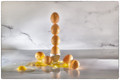
The other problem I have is arranging things. I absolutely suck at arranging more than one thing. ... |
Well that explains this then. :-D
|
That one was easy. I just dropped a lot of eggs from stack height. :)
But I really dislike my �table� and background. Too busy and I have problems with that back seam where the horizontal meets the vertical. I really really didn�t like the way that looked. I think I need to move my bakgrou9nd significantly farther away from my composition. |
|
|
|
11/06/2021 01:45:40 AM · #31 |
This is such a great thread. I have watched Mary Ann develop over the years and I am blown away by what she has accomplished
especially over the last three or four years. Even if she is not shooting a still life her style is recognizable by the way she controls
light. That is such an art and she has really nailed it. If you put her name in "search" at 1x.com the collection is really impressive.
Fine Art Andrews !!! |
|
|
|
11/06/2021 04:51:28 AM · #32 |
Originally posted by grahamgator:
I attempt to sketch the idea before doing it. Overlapping some of the items helps make it cohesive. I think the most important thing before starting is to have a picture in your mind of what you want to do........
I really like the old masters work ....... they offer a vision and how to place objects. Their work had meaning associated with each element and told a story .... There is almost always a piece of cloth in all the old images that was significant. I arrange and rearrange many times before I am satisfied. It usually takes about three or four days before I get something I like. Take shots and then view them to check how it looks on screen. After selecting the image I want to use, I process it and wait until the next day to look at it again. I usually find things I don�t like and then redo it. |
Masses of useful advice here. I really hadn't appreciated the amount of preparation that goes into successful images. Thank you so much for your generosity in sharing how you work - I am certainly feeling inspired to try harder! |
|
|
|
11/06/2021 04:20:40 PM · #33 |
Lesson nr 1 - recreate Mary Ann's still life of choice. I chose this one:

I found it very difficult:

It seems to look similar but it is almost entirely different. Is the light? The colors? The props? The composition is rather close. |
|
|
|
11/06/2021 04:49:24 PM · #34 |
| Hi Margaret. You did a great job on this. It looks like the lighting is from above rather from the side which is different, and the angle is higher than mine, which is ok. I think I would crop some from the left to take out the negative space there. Also, move the small pumpkin on the right close to the larger pumpkin to fill in the space between them and add a bit more space to the right. Try desaturating orange pumpkins a bit and see how that looks, I think they will blend with the scene better. I really like your flower and vine choices as well as the table top. Lovely job Margaret. |
|
|
|
11/06/2021 06:43:31 PM · #35 |
Originally posted by MargaretNet:
Lesson nr 1 - recreate Mary Ann's still life of choice. I chose this one:
I found it very difficult:
It seems to look similar but it is almost entirely different. Is the light? The colors? The props? The composition is rather close. |
Yes, they are totally different in my opinion which is positive sign (unless you wanted to do a perfect copy like students do in art school).
Two different sensibilities.
I almost liked for all of us to use the same elements in the similar arrangement and come up with our photo interpretation. Only that I , for instance will not go to same length to get all the props. |
|
|
|
11/07/2021 10:30:16 AM · #36 |
I realized that I don't do still lifes well because I don't look at many still lifes.
I always just grab a couple of things and try to make them work. But now I've bothered looking through still lifes, I'm beginning to understand why I go gaga over some still lifes while the vast majority rather bore me. It's the tones, colors and movement of a piece that's calling to me. I turns out that the subject probably doesn't really matter to me if the tones, colors and shadows work well with each other.
That's why I loved your recent extended editing still life. It is so incredibly beautiful -- it just glows! Did you do the toning in photoshop? If so, I would really really really love to know how to do that.
(off to find things for my still life!)
Message edited by author 2021-11-07 10:57:08. |
|
|
|
11/07/2021 11:19:53 AM · #37 |
Wendy, on most of may still life images I use the same textures and toning a lot. I usually lean toward the warm side of things. I like Color Efex Dark Sunlight at low opacity. Some of the toning is done in Photoshop and some with Analog Efex Vintage Camera preset #8 where I tweak the settings to my liking. I also almost always use a custom tinted black and white filter using Photoshop - tint ffedcb, reds-77, yellow-75, greens-40, cyan-60, blue-20, magenta-80. I have this set as an action. It varies on my images by using different opacities depending on what it looks like. I tend to use textures on my images at low opacity, which gives a muted tone. Here are the two I used on the EFS. I use the green one on a lot of my images. The levels menu sliders can give the faded look as well. With EFS images, I tend to composite the image and then do all the toning, etc.
Hope this helps
 |
|
|
|
11/07/2021 11:38:36 AM · #38 |
Homework from Lesson 1:

Thanks for your feedback, Mary Ann. Not sure how much better this is. I changed the lighting, positions of some pumpkins (I realized that your composition had a nice diagonal line for green pumpkins so I tried to do something similar), desaturated colors, added a butterfly for fun and to complete the rule of three highlights (not thirds :)
What do you think? |
|
|
|
11/07/2021 11:46:45 AM · #39 |
| Margaret, I love it! I really like the shadows on the pumpkins in the box. Moving the small pumpkin next to the large one made a big difference, imo. I would probably pull the highlights down just a bit and add just a little shadow/highlight to the butterfly to correspond to the lighting. I like that you made it your own and hopefully you learned something from it. Great job! |
|
|
|
11/07/2021 11:57:55 AM · #40 |
Originally posted by grahamgator:
Margaret, I love it! I really like the shadows on the pumpkins in the box. Moving the small pumpkin next to the large one made a big difference, imo. I would probably pull the highlights down just a bit and add just a little shadow/highlight to the butterfly to correspond to the lighting. I like that you made it your own and hopefully you learned something from it. Great job! |
Thanks, Mary Ann, your comments made me think so you did help a lot :) It is still not perfect but I have to leave it for now as I am going away next week only with Iphone. |
|
|
|
11/07/2021 02:17:01 PM · #41 |
Originally posted by grahamgator:
Wendy, on most of may still life images I use the same textures and toning a lot. I usually lean toward the warm side of things. I like Color Efex Dark Sunlight at low opacity. Some of the toning is done in Photoshop and some with Analog Efex Vintage Camera preset #8 where I tweak the settings to my liking. I also almost always use a custom tinted black and white filter using Photoshop - tint ffedcb, reds-77, yellow-75, greens-40, cyan-60, blue-20, magenta-80. I have this set as an action. It varies on my images by using different opacities depending on what it looks like. I tend to use textures on my images at low opacity, which gives a muted tone. Here are the two I used on the EFS. I use the green one on a lot of my images. The levels menu sliders can give the faded look as well. With EFS images, I tend to composite the image and then do all the toning, etc.
Hope this helps
|
What blending do you use with your textures? Overlay?
I don�t think I understand what you mean about white and black filters? |
|
|
|
11/07/2021 02:44:33 PM · #42 |
Wendy, I use soft blend most of time, sometime overlay and some normal but lower opacity, depending on the look I am after.
Photoshop black and white adjustment layer is what I am referring to.
Message edited by author 2021-11-07 15:11:19. |
|
|
|
11/07/2021 03:42:23 PM · #43 |
Mary Ann, probably a dumb question but are you taking about NIK Filters: Color Efex and Analog Efex ?
This is so interesting. I had no idea what was involved..as I've said so many times, you have really mastered this art form.
It is so nice of you to share it. |
|
|
|
11/07/2021 03:48:41 PM · #44 |
| Jane, yes NIK filters. Thanks for the support :) |
|
|
|
11/07/2021 04:11:14 PM · #45 |
Ok -- now I'm really excited to do this. :)
I just did a simple quick set up.
And I immediately hated it. I don't know how to drape fabric. It looked stupid. It looked like it was just thrown there. Took a couple of different angles, and moved it around a small amount to see what happened with the light.
Then I did a small amount of editing and got excited. The folds aren't really placed well, but I'm starting to like them! The richness that I wanted in the colors was starting to come out. Now I'm pumped, but the sun is going down!!!
Well -- there's always tomorrow!
Cropped but not edited

Couple different small edits
  
They've got a long way to go, but I'm still excited. :)
|
|
|
|
11/07/2021 04:30:38 PM · #46 |
| Wendy, those look good! I like the angle of the middle edited image best. You could try pleating the background to give more texture and movement, highlights and shadows. Just a suggestion. Very nice. |
|
|
|
11/07/2021 05:26:40 PM · #47 |
Originally posted by grahamgator:
Wendy, those look good! I like the angle of the middle edited image best. You could try pleating the background to give more texture and movement, highlights and shadows. Just a suggestion. Very nice. |
I'm curious if you'd be willing to take the unprocessed one and pretend it was yours and process it. I'm very curious as to your techniques. I tried playing with the black and white adjustment layer and I see that it's doing something interesting, but completely lost as to what it's doing.
And you just become my favorite person in the world. Because I love the sunlight filter in color effects but it doesn't do what I want it to do and it doesn't let me adjust the way I want it to adjust. I had never done dark sunlight, and I absolutely adore it!
I'm going to have difficulties with tables. I love the old rustic tables in free studies, but I don't have that. I bought pomegranates tonight, and I'm going to use them and what hopefully will be my real free study. So I think I'm going with gray fabric, if I have any, for my table top and backdrop. I would normally think black with very concentrated lighting to make the seeds light up. But I want to play with the less contrast, softer still life idea. Instead of my tendency for high contrast. |
|
|
|
11/07/2021 08:27:28 PM · #48 |
| Wendy, I can play around with your image nd see what I come up with. |
|
|
|
11/08/2021 12:43:23 PM · #49 |
| Is it just me and Wendy? Common! Do some work and get great advice :) |
|
|
|
11/08/2021 01:28:35 PM · #50 |
Originally posted by MargaretNet:
Is it just me and Wendy? Common! Do some work and get great advice :) |
I'm watching this thread closely but haven't had a chance to try shooting a still life of any nature. South Africa is going through a difficult time with power shortages and frequent "loadshedding" (scheduled power cuts) in addition to unscheduled power failures.
|
|
Home -
Challenges -
Community -
League -
Photos -
Cameras -
Lenses -
Learn -
Prints! -
Help -
Terms of Use -
Privacy -
Top ^
DPChallenge, and website content and design, Copyright © 2001-2024 Challenging Technologies, LLC.
All digital photo copyrights belong to the photographers and may not be used without permission.
Current Server Time: 04/25/2024 03:50:25 AM EDT.


