| Author | Thread |
|
|
01/25/2025 02:46:10 PM · #126 |
I prefer it in black and white... so I'd get that right and then I'd look at the composition to see if skew and or crop were necessary.
No need to blur the crowd.
I enjoy that you and the young man had a good time with this:)
|
|
|
|
01/25/2025 02:56:10 PM · #127 |
Originally posted by posthumous:
I respectfully disagree with all the rotaters and skewers and croppers. You are straightening to what purpose? To make me bored?
The shot has a natural candid energy to it. All you need to do is play with the black and white conversion until you like it. Does not need artificial blur. |
I’m overall with Don on this. I love the b&w. I do actually like the blur if it had a less abrupt transition |
|
|
|
01/25/2025 09:42:38 PM · #128 |
Originally posted by posthumous:
I respectfully disagree with all the rotaters and skewers and croppers. You are straightening to what purpose? To make me bored?
The shot has a natural candid energy to it. All you need to do is play with the black and white conversion until you like it. Does not need artificial blur. |
I don't disagree with you. It's just that folks were discussing HOW to "fix" the perspective, including the photographer having mentioned she had trouble with that, so I went ahead and had a crack at it. After all, it's in my genes as an architectural photographer to square stuff up. That said, I was surprised at how sterile "my" version looked next to the unaltered original... |
|
|
|
01/26/2025 04:46:22 AM · #129 |
Thanks Bear for givin it a go and showing the result of a proper perspective fix.
I am especially grateful that so many people are taking part in the discussion. You get to know the different points of view and can then decide for yourself what to implement next time
|
|
|
|
01/26/2025 05:46:09 AM · #130 |
Original
Entry

It was the low evenining sun that created the mood, but, like the comment received stated, I might have overdone it on the processing making the leaves to dominant. |
|
|
|
01/26/2025 08:09:32 AM · #131 |
|
See my comment in the entry. |
|
|
|
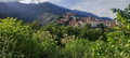
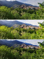
01/26/2025 10:51:05 AM · #132 |
Thanks, with help of your comments I have now created a more balanced version that retains the details in the mountains and sky and creates a bit more fresh look in the village and sky, while keeping the foliage almost as-is. I have used graduated masks to achieve this. Above you see the original, mid the entry, below the new look. Probably the more distance foliage beneath the village could be a bit brighter still. Working with a jpg from a relatively cheap phone has its limitations.
Message edited by author 2025-01-26 10:57:26. |
|
|
|
01/26/2025 06:23:05 PM · #133 |
Originally posted by willem:
Thanks, with help of your comments I have now created a more balanced version that retains the details in the mountains and sky and creates a bit more fresh look in the village and sky, while keeping the foliage almost as-is. I have used graduated masks to achieve this. Above you see the original, mid the entry, below the new look. Probably the more distance foliage beneath the village could be a bit brighter still. Working with a jpg from a relatively cheap phone has its limitations.
|
Curiously, in one way the original seems best to me: the SKY is better rendered and more detailed. |
|
|
|
01/26/2025 07:27:47 PM · #134 |
Originally posted by willem:
Thanks, with help of your comments I have now created a more balanced version that retains the details in the mountains and sky and creates a bit more fresh look in the village and sky, while keeping the foliage almost as-is. I have used graduated masks to achieve this. Above you see the original, mid the entry, below the new look. Probably the more distance foliage beneath the village could be a bit brighter still. Working with a jpg from a relatively cheap phone has its limitations.
|
Willem, I really like your new edit. It retains the detail in the sky without foreground looking overdone. It has atmosphere. I would have given this quite a high vote. |
|
|
|
01/26/2025 07:28:29 PM · #135 |
Originally posted by Bear_Music:
Originally posted by willem:
Thanks, with help of your comments I have now created a more balanced version that retains the details in the mountains and sky and creates a bit more fresh look in the village and sky, while keeping the foliage almost as-is. I have used graduated masks to achieve this. Above you see the original, mid the entry, below the new look. Probably the more distance foliage beneath the village could be a bit brighter still. Working with a jpg from a relatively cheap phone has its limitations.
|
Curiously, in one way the original seems best to me: the SKY is better rendered and more detailed. |
100% Robert ..
i love your original Willem .. its a stunning image ..
i might have done a bit of brightness and contrast on the buildings to bring them out more .. and darkened the sky just a tad ..
but that's just me .. :) |
|
|
|
01/27/2025 02:00:47 PM · #136 |
Originally posted by willem:
Thanks, with help of your comments I have now created a more balanced version that retains the details in the mountains and sky and creates a bit more fresh look in the village and sky, while keeping the foliage almost as-is. I have used graduated masks to achieve this. Above you see the original, mid the entry, below the new look. Probably the more distance foliage beneath the village could be a bit brighter still. Working with a jpg from a relatively cheap phone has its limitations.
|
I think your new edit is better, though I think the busy foreground would benefit from being a little desaturated. as it is, I'm not sure if i like the new edit or the original better. |
|
|
|
01/27/2025 02:36:29 PM · #137 |
|
I prefer the more balanced layers of the original. If anything, I would have tried to tone down the foreground and bring out the village to make it pop a bit more. |
|
|
|
01/27/2025 02:45:21 PM · #138 |
Originally posted by PennyStreet:
I prefer the more balanced layers of the original. If anything, I would have tried to tone down the foreground and bring out the village to make it pop a bit more. |
I think I'd have darkened the mountain and sky for the same reason -- with the contrasting foreground foliage it would better "frame" the village |
|
|
|
01/28/2025 05:23:40 AM · #139 |
|
Thank you all for your feedback. I am learning for the future. I also had the additional challenge that I did put this picture in the printed holiday album and there is the additional challenge to estimate how it would look when printed (outside processor, not own printer). Often the printed versions are much more toned down than the on-screen images so the on-screen version need to have some extra punch to come out normal when printed. Thanks again. |
|
|
|
01/28/2025 09:41:07 PM · #140 |
From the Extended FS:
Entry:  Resized original: Resized original:  |
|
|
|
01/29/2025 02:10:38 AM · #141 |
Originally posted by GeneralE:
From the Extended FS:
Entry: Resized original: |
Now that is creative. I admire your idea. It indeed gives the impression that it is the stern of an old ship (although of course on closer look you see it is not) |
|
|
|
01/29/2025 02:16:16 AM · #142 |
Taken with my 22 year old Sony F707 camera that is capable of infrared. Normally it is used by night with the IR LEDs of the camera (nightshot mode), but it can be used during daytime. For this the IR LEDs are covered with tape and a ND8 and IR filter are placed on the lens to block the visible light and lower the amount of IR light, since the nightshot mode only allows for a 1/30 s shutter speed or longer.
Entry

Original color image
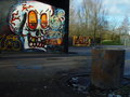
Original infrared image, after removal of the green tint that Sony adds to infrared images.
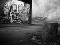
Infrared layered on top of color image, luminosity blend mode. This means that the IR image lightens/darken the colors of the normal image, creating a surreal look. It has a large effect on area's with lots of IR light such as sky and foliage and in this case also affected the colors or the graffiti.
It came out with a good grunge look, after some further desaturation.
Full processing (all on the total image, no local adjustments, except clone stamp of step 6):
1) auto levels on IR image (to remove green color cast) and lighten midtones with curves
2) layer IR on top of normal image, luminosity blend mode
3) scale IR image to match the normal image and then crop (as result of wavelenght IR results in different focus and therefore smaller image angle when compared to visible light)
4) desaturate -33%
5) curve
6) remove light post and part of fence (replace with background tree and grass)
7) add 3% noise
8) resize for dpc and unsharp mask
It was checked with SC beforehand whether step 2 was legal in standard editing and it was concluded that it is covered by the muti-image rule (in line with for example HDR images)
If anyone wants to try Infrared and buy a cheap Sony F707 (or successor) on Ebay, you will need:
1) a working camera
2) memory stick (or converter with sd card). 128 MB stick will fit approx. 50 images
3) battery charger
4) battery (can still be bought new, not original sony)
5) IR filter (I use RG 780) It does not filter IR, it filters out visible light.
6) ND8 filter
Images are 5 megapixels.
You will see youtube video's with a hack using small neodymium magnets to switch the camera to infrared and use IR combined with daylight. The problem is that you will NOT get any sharp images since the camera then does not correct for IR wavelengths. It will only provide sharp IR images in nightshot mode.
Message edited by author 2025-01-29 08:32:47. |
|
|
|
01/30/2025 03:19:24 AM · #143 |
Two images with the same blending technique. A lot more effect because a lot more foliage and also a less then perfect fit of IR on color due to moving clouds and foliage.


Message edited by author 2025-01-30 03:19:47. |
|
|
|
02/10/2025 03:01:36 AM · #144 |
Original

Entry

It is the staircase of museum villa "Huis Sonneveld" in Rotterdam. A villa that was designed in 1930 and is now fully restored including original interior and is now open to the public. |
|
|
|
03/14/2025 05:17:11 AM · #145 |
Original empty landscape image used
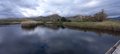
After adding all the elements (taken from other images of 2024) and adjusting brightness
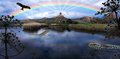
The final image after applying a LUT color transformation.
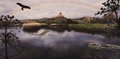
This was also to practice with the new software of ON1 Photo RAW, although I also ended up using Photoshop for this composition.
I think it is a pity that wide (or panorama) images get so small because of the 1200px size limitation. Looks much better when shown big on the screen. |
|
Home -
Challenges -
Community -
League -
Photos -
Cameras -
Lenses -
Learn -
Help -
Terms of Use -
Privacy -
Top ^
DPChallenge, and website content and design, Copyright © 2001-2026 Challenging Technologies, LLC.
All digital photo copyrights belong to the photographers and may not be used without permission.
Current Server Time: 06/20/2026 05:19:16 PM EDT.


