| Author | Thread |
|
|
12/09/2013 12:05:50 PM · #1 |
This link I think provides a better understanding of the golden ratio than the one in the description. Check out the photo adjuster link in the first paragraph and play with the different layouts.
Any other helpful information is more than welcomed.. |
|
|
|
12/09/2013 12:15:52 PM · #2 |
|
Pretty much negative space on the edges of short sides! |
|
|
|
12/09/2013 12:36:48 PM · #3 |
|
|
|
12/09/2013 12:40:47 PM · #4 |
|
|
|
12/09/2013 12:52:48 PM · #5 |
the golden ratio is a classic proof that:
1. Math is Real (since it occurs in nature)
2. Reality (nature) is beautiful and makes sense (because there's math in it)
people who see the world as chaotic consider the golden ratio to be a pathetic attempt by humans to see a pattern where there is none.
You can have the same argument about photography by replacing "nature" with "composition." Can we force a composition to be beautiful by imposing the golden ratio on it?
look at this photo, even the thumbnail is obviously well composed:
 it's eerie how perfect the composition is. Does it employ the golden ratio? If we look hard enough, can we find it? The frightening answer for me is that I don't know why the photo is so perfect. It's purely felt by me, not known by me. it's eerie how perfect the composition is. Does it employ the golden ratio? If we look hard enough, can we find it? The frightening answer for me is that I don't know why the photo is so perfect. It's purely felt by me, not known by me.
Message edited by author 2013-12-09 12:53:19. |
|
|
|
12/09/2013 01:07:27 PM · #6 |
Originally posted by posthumous:
the golden ratio is a classic proof that:
1. Math is Real (since it occurs in nature)
2. Reality (nature) is beautiful and makes sense (because there's math in it)
people who see the world as chaotic consider the golden ratio to be a pathetic attempt by humans to see a pattern where there is none.
You can have the same argument about photography by replacing "nature" with "composition." Can we force a composition to be beautiful by imposing the golden ratio on it?
look at this photo, even the thumbnail is obviously well composed:
it's eerie how perfect the composition is. Does it employ the golden ratio? If we look hard enough, can we find it? The frightening answer for me is that I don't know why the photo is so perfect. It's purely felt by me, not known by me. |
The composition is good, but the carelessness of the alignment of that bottom line ruins the effect for me - how can you so blindly look past the glaring flaw and call this perfect?
Honestly, if the bottom wasn't skewed off like that, would you even still like it?
Message edited by author 2013-12-09 13:09:44. |
|
|
|
12/09/2013 01:16:27 PM · #7 |

Message edited by author 2013-12-09 13:16:37. |
|
|
|
12/09/2013 01:21:10 PM · #8 |
Originally posted by posthumous:
It's eerie how perfect the composition is. Does it employ the golden ratio? If we look hard enough, can we find it? The frightening answer for me is that I don't know why the photo is so perfect. It's purely felt by me, not known by me. |
Actually, it's close to a perfect Fibonacci Spiral, the same way you see the golden ratio used so much in plants in the natural world:
You can view that full size if the lines don't show well. But the eye just spirals out of the red cushion, uses the gravity of the umbrella to turn, and exits through the steps, aided by the subtle "misalignment" Cory mentions, which, in trying to "stop" the inevitable, actually emphasizes the forcefulness of slingshotting into "out there" :-)
Message edited by author 2013-12-09 13:22:38. |
|
|
|
12/09/2013 01:23:30 PM · #9 |
It's in CS6 as well, and so is the Fibonacci Spiral... |
|
|
|
12/09/2013 01:33:10 PM · #10 |
Originally posted by Bear_Music:
Originally posted by posthumous:
It's eerie how perfect the composition is. Does it employ the golden ratio? If we look hard enough, can we find it? The frightening answer for me is that I don't know why the photo is so perfect. It's purely felt by me, not known by me. |
Actually, it's close to a perfect Fibonacci Spiral, the same way you see the golden ratio used so much in plants in the natural world:
You can view that full size if the lines don't show well. But the eye just spirals out of the red cushion, uses the gravity of the umbrella to turn, and exits through the steps, aided by the subtle "misalignment" Cory mentions, which, in trying to "stop" the inevitable, actually emphasizes the forcefulness of slingshotting into "out there" :-) |
Deepism.
I call BS. The spiral doesn't align any differently if the bottom is corrected.
For the record, I find the color palate here to be at least as powerful as the composition, red, black and white - probably the most powerful color combination known to man.
Message edited by author 2013-12-09 13:38:05. |
|
|
|
12/09/2013 01:37:04 PM · #11 |
Originally posted by Bear_Music:
But the eye just spirals out of the red cushion ... |
Isn't the bright spot of the chair back against the red (the only real "color") also right about at the upper-left "1/3 line" ...? |
|
|
|
12/09/2013 01:40:54 PM · #12 |
|
Well, Cory, I just mean there's a *tension* there of flow & counterpoint that works well for me. Has nothing to do with the spiral, agreed. |
|
|
|
12/09/2013 01:42:27 PM · #13 |
Originally posted by GeneralE:
Originally posted by Bear_Music:
But the eye just spirals out of the red cushion ... |
Isn't the bright spot of the chair back against the red (the only real "color") also right about at the upper-left "1/3 line" ...? |
Sure! The "rule of thirds" is an easy-to-visualize approximation of the golden ratio, and anything that uses the golden spiral reasonably precisely will also approximate a rule of thirds image at least in the placement of the beginning of the spiral.
Message edited by author 2013-12-09 14:26:47. |
|
|
|
12/09/2013 02:02:22 PM · #14 |
Golden Ratio I
finally a good discussion!! |
|
|
|
12/09/2013 02:23:06 PM · #15 |
Originally posted by Bear_Music:
Originally posted by GeneralE:
Originally posted by Bear_Music:
But the eye just spirals out of the red cushion ... |
Isn't the bright spot of the chair back against the red (the only real "color") also right about at the upper-left "1/3 line" ...? |
Sure! The "role of thirds" is an easy-to-visualize approximation of the golden ratio, and anything that uses the golden spiral reasonably precisely will also approximate a rule of thirds image at least in the placement of the beginning of the spiral. |
Yes, I figured that out after looking at one of the earlier links here ...
I seem to remember from geometry class that the "Golden Ratio" was 1:Square-root of 2 -- start with a square, then lengthen the base to be equal to the diagonal, but that would make it about 1:1.42 ... where does the 1:1.6x I've seen come from?
Message edited by author 2013-12-09 14:24:15. |
|
|
|
12/09/2013 02:59:01 PM · #16 |
Tears sniff sniff. I failed. Math
|
|
|
|
12/09/2013 03:19:07 PM · #17 |
|
Katie, I always had perfect scores in math, so just ask your fellow sheep if you need to :) |
|
|
|
12/09/2013 04:21:01 PM · #18 |
Originally posted by GeneralE:
I seem to remember from geometry class that the "Golden Ratio" was 1:Square-root of 2 -- start with a square, then lengthen the base to be equal to the diagonal, but that would make it about 1:1.42 ... where does the 1:1.6x I've seen come from? |
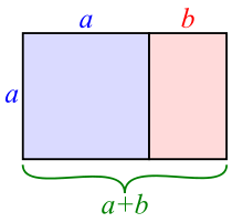
That first is not the golden ratio. Simply, the golden ratio is when a line is divided into two parts, such that the ratio of the larger to the smaller is the same as the ratio of the sum to the larger:

Here's the golden rectangle:
 |
|
|
|
12/09/2013 05:01:10 PM · #19 |
Originally posted by Cory:
The composition is good, but the carelessness of the alignment of that bottom line ruins the effect for me - how can you so blindly look past the glaring flaw and call this perfect?
Honestly, if the bottom wasn't skewed off like that, would you even still like it? |
I still don't see the glaring flaw you're talking about. Nor do I see a "bottom line". Then again, I've never been that interested in the bottom line except when I'm working.
Seriously, if you want me to discuss this "glaring flaw" you'll have to circle it or something. |
|
|
|
12/09/2013 05:13:33 PM · #20 |
Originally posted by posthumous:
Originally posted by Cory:
The composition is good, but the carelessness of the alignment of that bottom line ruins the effect for me - how can you so blindly look past the glaring flaw and call this perfect?
Honestly, if the bottom wasn't skewed off like that, would you even still like it? |
I still don't see the glaring flaw you're talking about. Nor do I see a "bottom line". Then again, I've never been that interested in the bottom line except when I'm working.
Seriously, if you want me to discuss this "glaring flaw" you'll have to circle it or something. |
You disturb me... (and I love it!)
Just a moment, I'll do it.
ETA: Ok - so, first, let me just say that I mean this image no ill - obviously it's loved by you guys, so there's something here - and I do think the image is good, I just can't see how you'd call it perfect.
No disrespect at all meant to daisydavid..
 - that is what I'm talking about, compare this to the original. - that is what I'm talking about, compare this to the original.
Message edited by author 2013-12-09 17:37:56. |
|
|
|
12/09/2013 05:54:14 PM · #21 |
+1 for the original.
It's a healthy discussion so I'll let you guys carry on. |
|
|
|
12/09/2013 06:57:28 PM · #22 |
The original is much stronger, Cory: all the oblique diagonals in the brickwork and the steps are in integral part of the visual balance of the composition and your skewing has obliterated that.
Message edited by author 2013-12-09 20:09:57. |
|
|
|
12/09/2013 07:24:59 PM · #23 |
|
<--- Too much of an engineer I guess... |
|
|
|
12/09/2013 08:21:23 PM · #24 |
|
or not enough of one? Corey you are always so almost there, valiant within the borders... |
|
|
|
12/10/2013 12:50:18 AM · #25 |
Originally posted by Cory:
- that is what I'm talking about, compare this to the original. |
just that slight change ruins it. I don't understand why any better than you do and I find it just as threatening as you do, but I won't deny what I see. |
|
Home -
Challenges -
Community -
League -
Photos -
Cameras -
Lenses -
Learn -
Help -
Terms of Use -
Privacy -
Top ^
DPChallenge, and website content and design, Copyright © 2001-2026 Challenging Technologies, LLC.
All digital photo copyrights belong to the photographers and may not be used without permission.
Current Server Time: 06/22/2026 09:10:16 PM EDT.