| Author | Thread |
|
|
03/26/2013 11:32:09 AM · #26 |
Originally posted by Ja-9:
Originally posted by glad2badad:
Originally posted by mefnj:
So, a B&W Free Study?.. ;-) |
I intentionally the first three that were linked in the first quote ... in using the last Duotones challenge it seems that only two of the Top 10 were Black & White, and even then not hardcore (possible hint of sepia in the 2nd place one and slight blue tone in the 10th place one). |
This indeed was the discussion that I really liked in the last Challenge. In order to be a true "Duotone" you had to take your photo to Monotone (B&W) then add in 2 tones in whatever combination thus making it "Duotone". But you had to be sure to add two tones. It was a pretty interesting discussion to say the least...
Wikipedia What is...Duotone
but it is my understanding that true B&W is NOT Duotone... |
From your link: "A duotone is created by overlaying a color (such as blue or red) on a grayscale image." So, for example, overlaying a specific hue (selenium or sepia or etc.) makes the image a duotone. "
I don't think one needs to add in more than one tone to the b&w to make it a duotone. But, maybe I misunderstand your interpretation.
The problem for me is that to make an optimal duotone, I use a subtle overlay of a hue. For the DPC crowd, it will take a blatant overlay for the "light switch to go on".
Actually, I've decided to forego the reach for a score and will go with a subtle duotone. It's a matter of principle.
Message edited by author 2013-03-26 11:32:46. |
|
|
|
03/26/2013 11:58:33 AM · #27 |
I disagree with the idea that the toning has to be in-your-face in order to avoid the DNMC crowd. I think that toning similar to that applied in this image:
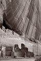
would do well. In fact, that image garnered some positive comments on the toning. Not that the challenge had anything to do with toned images. I don't regard this toning as being over-emphasized at all.
|
|
|
|
03/26/2013 12:25:38 PM · #28 |
Originally posted by hahn23:
... The problem for me is that to make an optimal duotone, I use a subtle overlay of a hue. For the DPC crowd, it will take a blatant overlay for the "light switch to go on". ... |
Yes, I also find it tedious, being so awesome compared to the average people of DPC.
It's just a cross we geniuses have to bear.
Message edited by author 2013-03-26 12:29:57.
|
|
|
|
03/26/2013 12:38:25 PM · #29 |
Originally posted by Strikeslip:
Originally posted by hahn23:
... The problem for me is that to make an optimal duotone, I use a subtle overlay of a hue. For the DPC crowd, it will take a blatant overlay for the "light switch to go on". ... |
Yes, I also find it tedious, being so awesome compared to the average people of DPC.
It's just a cross we geniuses have to bear. |
Neither "awesome", nor "genius", am I. I was simply offering my opinion on approach to image preparation for this challenge. I apologize if my comments seemed condescending. |
|
|
|
03/26/2013 12:45:47 PM · #30 |
Originally posted by kirbic:
I disagree with the idea that the toning has to be in-your-face in order to avoid the DNMC crowd. I think that toning similar to that applied in this image:
would do well. In fact, that image garnered some positive comments on the toning. Not that the challenge had anything to do with toned images. I don't regard this toning as being over-emphasized at all. |
But that IS "in your face" - at least for me :) |
|
|
|
03/26/2013 05:59:46 PM · #31 |
Originally posted by salmiakki:
Probably worthwhile taking a look at an old tutorial about how to create duotones. It's good to refresh the memory on these things |
thanks Sarah, I was just about to go looking for this, saved me some time |
|
|
|
03/28/2013 04:04:06 PM · #32 |
Just read this thread and now I am seriously confused :-(.
Several comments said it was 2 tones that are used. I use Gimp and found a tutorial using 2 tones (say red and blue, green and yellow, whatever) //www.youtube.com/watch?v=U4Ok-YmnmBA. The basic image has to fisrt be converted to greyscale, but then 2 tones are added.
When I read this thread and looked at your examples you have posted, it looks to me that only 1 color was used.
So what is it: 2 (as in DUO) or 1 colour as in ... Mono?
|
|
|
|
03/28/2013 04:13:06 PM · #33 |
After converting your image to b&w, tone with a hue. I don't think it's more complicated than that. Some programs, like SEP2 give you the option of toning separately for silver and paper, if it improves the image.
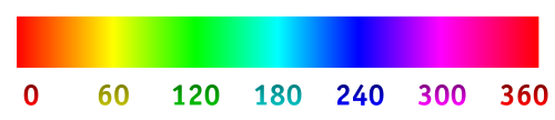
Example for medium sepia: (not what I used)
Silver Hue: 30º
Silver Toning: 45%
Paper Hue: 50º
Paper Toning: 16%
Message edited by author 2013-03-28 16:17:56. |
|
|
|
03/28/2013 04:30:45 PM · #34 |
Originally posted by hahn23:
After converting your image to b&w, tone with a hue.
Silver Hue: 30º
Silver Toning: 45%
Paper Hue: 50º
Paper Toning: 16% |
Ok, that is what I understood everyone was after here. But as I said, "duo" is actually "2", and the tutorial I looked at will tone the highlights in one tone and the dark tones another and obviously the greys come up a mix of the 2 tones. It's not complicated once you have learned the process, but it certainly is a totally different "thing" to just toning a B&W image in a colour.
|
|
|
|
03/28/2013 05:34:32 PM · #35 |
Originally posted by kasaba:
Just read this thread and now I am seriously confused :-(.
Several comments said it was 2 tones that are used. I use Gimp and found a tutorial using 2 tones (say red and blue, green and yellow, whatever) //www.youtube.com/watch?v=U4Ok-YmnmBA. The basic image has to fisrt be converted to greyscale, but then 2 tones are added.
When I read this thread and looked at your examples you have posted, it looks to me that only 1 color was used.
So what is it: 2 (as in DUO) or 1 colour as in ... Mono? |
I'm with you on the confusion. I believe the tutorial you've linked to is miss-named and is describing how to do what is normally referred to as split-toning. In the Meet The GIMP episode on split-toning, Rolf explains that a duo-tone is a combination of monochrome and a single colour.
|
|
|
|
03/28/2013 05:48:11 PM · #36 |
Originally posted by paynekj:
I'm with you on the confusion. I believe the tutorial you've linked to is miss-named and is describing how to do what is normally referred to as split-toning. In the Meet The GIMP episode on split-toning, Rolf explains that a duo-tone is a combination of monochrome and a single colour. |
Correct. If you think about it, "Mono"chrome = B/W, NOT Red/White or Blue/White, whatever. So "duo"tone would be monochrome plus a color.
Technically, duotoning isn't a photographic process at all, it's a mechanical printing process. And, technically, it doesn't require the use of a second color, it involves running the printed image through the printing press a second time with a different plate. The ink for the second run can be, and very often is, the same color as the first run. But the second plate is only for the shadows, the dark areas, of the image. This process is a much more expensive way to print, but it gives a much greater depth and luster to the printed images in, say, a photographic-art book. The best books on Ansel's work were printed this way.
Strictly speaking, "sepia" isn't a duotone. Technically, the sepia process is a form of "toning", one of many, and it's applied during the printing process to the photographic print, in the darkroom. Wiki: "In photography, toning is a method of changing the color of black-and-white photographs. In analog photography, toning is a chemical process carried out on silver-based photographic prints. This darkroom process can not be done with a color photograph and although the black-and-white photograph is now toned, it is still considered a black and white photograph as it is monochromatic. The effects of these processes can be emulated with software in digital photography."
Selenium and Sepia are the two most common types of print toning from the classic days.
So, really, calling this challenge "Duotone" is a very confusing misnomer, but the confusion will never go away, it's here to stay in the digital age. Make of it what you will :-)
ETA: and yes, using (say) red and blue to create the image would be "split toning" in digital parlance.
Message edited by author 2013-03-28 17:49:17. |
|
|
|
03/28/2013 06:05:23 PM · #37 |
|
The way I always understood it is duotone is a printing choice. White is not counted as part of the duotone because it's the paper showing through, it's not an ink. Black is always the first tone (ink), it's printed first. Whatever you pick is the second tone (ink), printed second. If you try to translate that into digital PP, it gets all confusing. |
|
|
|
03/28/2013 07:31:36 PM · #38 |
As Bear (and I) have said, duotones are really a mechanical printing process originally designed to emulate the look of a toned B&W photo. However, once you are running the sheet past two printing plates, the two inks can be any two colors, one does not necessarily have to be black.
If you look in Photoshop's duotone pre-sets, you'll find plenty which use two non-black inks. It is also possible (in printing) to use 3 or 4 inks to create images which are nevertheless not simulating "true" color (for this you need to use the CMYK ink set) -- when Adams' pictures are printed (for cards, calendars, etc.) they use a special combination of four different gray inks.
For photographic purposes (like this here contest) I think most people will be looking for a B&W photo with simulated toning; I don't think people will be so enthusiastic about pictures made up of two other colors ...
 |
|
|
|
03/29/2013 02:05:01 AM · #39 |
Originally posted by GeneralE:
I don't think people will be so enthusiastic about pictures made up of two other colors ...
|
Looking at your score on this image people weren't very enthusiastic with or without duotones ;-). |
|
|
|
03/29/2013 02:13:39 AM · #40 |
Originally posted by Bear_Music:
Originally posted by paynekj:
I'm with you on the confusion. I believe the tutorial you've linked to is miss-named and is describing how to do what is normally referred to as split-toning. In the Meet The GIMP episode on split-toning, Rolf explains that a duo-tone is a combination of monochrome and a single colour. |
Correct. If you think about it, "Mono"chrome = B/W, NOT Red/White or Blue/White, whatever. So "duo"tone would be monochrome plus a color.
Selenium and Sepia are the two most common types of print toning from the classic days.
So, really, calling this challenge "Duotone" is a very confusing misnomer, but the confusion will never go away, it's here to stay in the digital age. :-)
ETA: and yes, using (say) red and blue to create the image would be "split toning" in digital parlance. |
Thank you as always for taking the time to explain so carefully.
As far as this challenge goes, I'll just stick a colour onto a B&W :-).
However, further in my defense for being confused and not merely ignorant (which I admit I also am, but in this case its a matter of "a little knowledge", which, as we all know, is even worse ;-)).
If you enter Salons (which I have started doing), there usually is a section on "Monochrome" and they allow, what you guys here call "duotone" in "Monochrome", i.e one colour "tint" over the whole image.
Very confusing.
BTW, I started to like the "split colour" effect. If you take time and play with the colours you can get some nice stuff. To me it seems to be more "luminous" than the duotone. Howver, I am sure it depends of course which colours you use.
|
|
|
|
03/29/2013 02:20:54 AM · #41 |
Originally posted by GeneralE:
As Bear (and I) have said, duotones are really a mechanical printing process originally designed to emulate the look of a toned B&W photo.
If you look in Photoshop's duotone pre-sets,
For photographic purposes (like this here contest) I think most people will be looking for a B&W photo with simulated toning; I don't think people will be so enthusiastic about pictures made up of two other colors ...
|
Thank you as well for always answering all my questions so patiently.
I do feel that people who have been in photography for a long time and/or have actually studies it, are at an advantage. You know where all this stuff comes from in terms of the "original" (i.e non-digital) photography. There are lots of examples, this is just one of them.
OK, presets in photoshop ... haven't got photoshop :-). No worries, will "make a plan" with what I have, now that I know what I need :-)
As I said in my other post, I will "colour" (tint, whatever the right terminology is) a B&W for this challenge, but I did like playing with 2 colours. It is interesting to see what you "think" works and what "actually" looks good (well, it was interesting to me anyway :-)).
|
|
|
|
03/29/2013 11:25:48 AM · #42 |
Originally posted by gcoulson:
This one just rocked!
 |
ha - I came here to refresh my memory on how to create a duotone. Thanks! |
|
|
|
03/29/2013 05:47:34 PM · #43 |
|
I guess dual tone is very old fashioned (old memories are coming back). A lot of versions later and Lightroom still can't do anything with Photoshop's dual-tone images :( |
|
|
|
03/29/2013 06:11:44 PM · #44 |
Originally posted by hajeka:
I guess dual tone is very old fashioned (old memories are coming back). A lot of versions later and Lightroom still can't do anything with Photoshop's dual-tone images :( |
Files in Photoshop's Duotone formats can only be saved in .PSD or .EPS format -- again, they are intended to produce separate printing masters from which to make plates. You should be able to open them with any version of Photoshop, and an EPS can be opened by quite a few programs and exported to an RGB file compatible with the JPEG format. |
|
|
|
03/29/2013 06:39:57 PM · #45 |
|
Here's a helpful tip from a seven year old thread ... :-) |
|
|
|
03/29/2013 06:47:57 PM · #46 |
|
No problem to convert it back to jpg or whatever. I was just wondering why two programs of the same company can't understand each other. Looks like a brother/sister relation :) |
|
|
|
03/29/2013 06:56:10 PM · #47 |
|
I've never used Lightroom (or Aperture), so I don't really know what they can/can't do or why. I'm not even all that familiar with newer (CS) versions of Photoshop, but very familiar with the basic funtions and tools ... |
|
|
|
03/30/2013 12:12:13 AM · #48 |
 Picasa duotone Picasa duotone
Would this count?
|
|
|
|
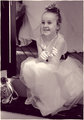
03/30/2013 12:14:58 AM · #49 |
Originally posted by jomari:
Picasa duotone
Would this count? |
I've just gone through several tutorials and been playing around myself, and it looks like what I'm coming up with - except for the subject, of course. Quite lovely, I think, and a very nice color for a little girl. One of the tutorials I watched turned a portrait green and that bothered me the entire time LOL |
|
|
|
03/30/2013 10:49:37 AM · #50 |
|
OMG I almost hate duotone. So flat. So boring. So much work for so little reward. No wonder I only do this if challenged by DPC. Waugh! |
|
Home -
Challenges -
Community -
League -
Photos -
Cameras -
Lenses -
Learn -
Help -
Terms of Use -
Privacy -
Top ^
DPChallenge, and website content and design, Copyright © 2001-2026 Challenging Technologies, LLC.
All digital photo copyrights belong to the photographers and may not be used without permission.
Current Server Time: 06/20/2026 08:40:18 AM EDT.


