| Author | Thread |
|
|
03/06/2013 01:16:02 PM · #1 |
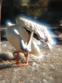
//500px.com/photo/24828665
I realise that this lady is a great artist and you have to have the "vision" to create these pictures in the first place.
What I would like to know is how they are technically achieved. Most of her portfolio has pictures of this "type". I was curious if anybody knows how you go about doing it. I love the strong colours juxtaposed by the blurry/soft feel.
Thank you
|
|
|
|
03/06/2013 01:19:13 PM · #2 |
I'm guessing that it's two layers -- one in focus, and one with a Gaussian blur, say around 20, then reduce the opacity on that layer? (saturate, of course)
Message edited by author 2013-03-06 13:19:34. |
|
|
|
03/06/2013 01:21:23 PM · #3 |
If I may guess, "Glow". In my opinion, overused at this time.
There are various commercial filters to ad "glow" to a picture. Or, you can create two copy layers and blur them with gaussian blur set to about 40%. Set one of the copy layers to soft light, the other to screen (or multiply in some cases). Play around with opacity, usually somewhere between 30-40% opacity gives enough glow to be noticed but not so much to make the picture glow too much. Use same or different opacities for both copy layers. Use only one copy layer (soft light) and not the other one. Play with it. It does work as a way to bring out colour, but it also often obscures detail. In my opinion, just my opinion, when the glow is the first thing you notice about an image, then it has been done too strongly. Like any other processing, it should support and reinforce the idea of the image, not become a stand-alone feature. |
|
|
|
03/06/2013 01:23:15 PM · #4 |
|
seems pretty simple, take a macro shot and pull the clarity all the way down, apply split toning and color filters. |
|
|
|
03/06/2013 01:26:06 PM · #5 |
Originally posted by ursula:
If I may guess, "Glow". In my opinion, overused at this time.
There are various commercial filters to ad "glow" to a picture. Or, you can create two copy layers and blur them with gaussian blur set to about 40%. Set one of the copy layers to soft light, the other to screen (or multiply in some cases). Play around with opacity, usually somewhere between 30-40% opacity gives enough glow to be noticed but not so much to make the picture glow too much. Use same or different opacities for both copy layers. Use only one copy layer (soft light) and not the other one. Play with it. It does work as a way to bring out colour, but it also often obscures detail. In my opinion, just my opinion, when the glow is the first thing you notice about an image, then it has been done too strongly. Like any other processing, it should support and reinforce the idea of the image, not become a stand-alone feature. |
whoa...
I had said normal, because when I tried soft light or overlay it made my squirrel really dark (that's what I had up at the time the question came through.) I never tried two copy layers. One on screen and one on soft light looks like it could be pretty cool!! |
|
|
|
03/06/2013 01:26:29 PM · #6 |
The blur is possibly contributed-to by the ultra-macro nature of the shot; tou will usually have a very shallow DOF under those conditions.
I tweak colors using Curves Adjustment Layers; remember you can adjust each color channel separately.
You can often make the colors "pop" more by using High-Radius Unsharp Mask: for a DPC-sized image (800px) try applying the Unsharp Mask filter using (Photoshop numbers):
Amount: 15%
Radius: 50 pixels
Threshold: 0
Play around with the numbers, keeping the "Amount" low and the "Radius" high (compared to normal sharpening settings), and the threshold always at zero. It can make a big difference, especially for flat-looking landscapes. This process increases contrast without creating edge halos. Be careful though, as it can also blow out fine highlight detail or block up shadows if over-applied. You may still need to apply your "regular" sharpening after doing this. |
|
|
|
03/06/2013 01:29:34 PM · #7 |
Originally posted by ursula:
If I may guess, "Glow". In my opinion, overused at this time. |
Or you can get an ultra-cheap lens with enough chromatic abberation that you don't need any post-processing at all ... ;-)
 |
|
|
|
03/06/2013 02:16:30 PM · #8 |
Originally posted by vawendy:
Originally posted by ursula:
If I may guess, "Glow". In my opinion, overused at this time.
There are various commercial filters to ad "glow" to a picture. Or, you can create two copy layers and blur them with gaussian blur set to about 40%. Set one of the copy layers to soft light, the other to screen (or multiply in some cases). Play around with opacity, usually somewhere between 30-40% opacity gives enough glow to be noticed but not so much to make the picture glow too much. Use same or different opacities for both copy layers. Use only one copy layer (soft light) and not the other one. Play with it. It does work as a way to bring out colour, but it also often obscures detail. In my opinion, just my opinion, when the glow is the first thing you notice about an image, then it has been done too strongly. Like any other processing, it should support and reinforce the idea of the image, not become a stand-alone feature. |
whoa...
I had said normal, because when I tried soft light or overlay it made my squirrel really dark (that's what I had up at the time the question came through.) I never tried two copy layers. One on screen and one on soft light looks like it could be pretty cool!! |
Not my idea, I got it from a Workshop. The second blur layer set to screen makes it lighter. That's why, sometimes, for very light pictures, having the second layer set to multiply works. But only sometimes. I make a lot of light pictures, so it sometimes works for me. But, for the most part, I don't like "glow" all that much; it tends to make images look fakey IMO. |
|
|
|
03/06/2013 03:06:27 PM · #9 |
Gosh, you guys are so fast :-) ... THANK YOU.
Will work on Ursula's description and see what happens.
Thank you GeneralE for the explanation regarding threshold and radius and amount. I usually just adjust the amount, because honestly I simply don't know what the others do :-(.
Mike, a lot of her pictures are like that, not only the macro shots. She has people pictures (whole body), forests, animals, all sorts. I simply picked this one because here the colours were especially bright.
I think Ursula and Wendy have the right idea. Maybe this artist even uses more than "just" 2 layers.
I need to find a scene or perhaps a shot that I have already taken and try this out. Sounds like a good learning project.
Thank you again, you are all wonderful. I am learning so much here. |
|
|
|
03/06/2013 03:46:22 PM · #10 |
This one of hers is just magnificent.
Image
Reminds me of  salmiakki a bit. salmiakki a bit.
|
|
|
|
03/06/2013 03:50:29 PM · #11 |
Originally posted by kasaba:
Thank you GeneralE for the explanation regarding threshold and radius and amount. I usually just adjust the amount, because honestly I simply don't know what the others do :-(. |
In brief:
Amount: "intensity" with which the effect is applied
Radius: how far to either side of the tonal junction to apply the effect
Threshold: how "different" the tonal values between pixels have to be before the effect is applied.
Unsharp Mask (USM) looks for areas of contrasting colors, and makes the pixels on the lighter side just a little lighter, and those on the darker side a little darker, to emphasize the contrast between the two and make the edge more clearly defined.
Increase the amount to accentuate the effect. Set the radius larger to make the effect bolder/more obvious. Lower the threshold to apply the effect everywhere, raise it where you don't want so much effect (smooth gradients). I very often apply "lighter" settings twice, rather than "bolder" settings once. To see the effect of over-doing it, get DPC-sized images of something with a lot of detail (e.g. leaves) and a nice portrait with smooth skin tones, and apply USM with the following settings:
AMT: 200%
RAD: 3.3px
TH: 0
FWIW my most common settings for DPC entries:
AMT: 66-88%
RAD: 0.6-1.3px
TH: 5
Examples at pBase
Basic Image Sharpening(DPC Tutorial)
Sharpening Halos and How To Hide Them (DPC Tutorial) |
|
|
|
03/06/2013 04:13:26 PM · #12 |
Google "Orton effect" and you might get something close to this.
|
|
|
|
03/06/2013 04:37:15 PM · #13 |
I've used this technique to good effect for portraits where it is desirable to tone down the severity of lines/wrinkles without actually eliminating them. It takes a little experimenting to optimize the radius & opacity, and occasionally two layers with different radii are beneficial. When done well, the technique can be really effective in this use. It is pretty much always necessary to mask the effect, eliminating or reducing it for eyes, hair, and lips.
ETA: For portraits, as Ursula says, it is important that the effect not become the first thing you notice. It should get out of the way and the image should speak for itself.
In other cases, I think it's fine if the effect becomes an important part of the image, if that's what you are after. The example posted by  gcoulson is a good example of this, IMO. gcoulson is a good example of this, IMO.
Message edited by author 2013-03-06 16:40:03. |
|
|
|
03/06/2013 10:17:09 PM · #14 |
This was done pretty much as Ursula describes. |
|
|
|
03/07/2013 07:35:46 AM · #15 |
|
I guess the hard part is to keep just enough detail so that it does not look like a general out of focus image |
|
|
|
03/07/2013 07:45:32 AM · #16 |
Originally posted by gcoulson:
This one of hers is just magnificent.
Image
Reminds me of salmiakki a bit. |
Her fine art portraits are quite good as well. Worth a look through her port. |
|
|
|
03/07/2013 08:09:07 AM · #17 |
|
Doesn't look all that hard, obviously some tonal adjustments, then looks like maybe another slightly transparent layer on top that may have been masked in areas, with "difference clouds" applied in photoshop (Filter -> Render -> Difference Clouds). Just my quick guess. |
|
|
|
03/07/2013 09:49:20 AM · #18 |
Originally posted by gcoulson:
I guess the hard part is to keep just enough detail so that it does not look like a general out of focus image |
To me seeing detail in the shadows looks nice with a bit of "glow" in the highlights. I guess you could make a blur layer (or group of layers) and use a luminosity mask to mask out the shadows so that the "glow" is only applied to the highlights.
For my landscape shots I generally add a layer of difuse glow with a luminosity mask but I will try out the method mentioned below and see how I like it and add it to my actions if it passes ;-)
Thanks all for the knowledgable help and tips. This place is great! |
|
|
|
03/07/2013 09:54:13 AM · #19 |
Originally posted by gcoulson:
I guess the hard part is to keep just enough detail so that it does not look like a general out of focus image |
I agree. I think that is what makes this woman's images so beautiful. They are clearly NOT an OOF "mess" :-). I think on the macro shot that I originally posted this was particularly obvious. |
|
|
|
03/07/2013 09:59:27 AM · #20 |
Originally posted by ShutterRev:
Doesn't look all that hard, |
... well I guess if you know "how" most things are not "that hard" :-) |
|
|
|
03/07/2013 10:18:36 AM · #21 |
|
I find that the easiest and most effective way of masking is to create a layer mask on the blur layer(s) and paint in black to the mask where I don't want the effect applied. I used a very large, feathered brush with the opacity set to 25% or so. For smaller, more well-defined areas, I decrease the brush size and/or feathering amount. |
|
|
|
03/07/2013 12:08:04 PM · #22 |
Originally posted by GeneralE:
In brief:
Amount: "intensity" with which the effect is applied
Radius: how far to either side of the tonal junction to apply the effect
Threshold: how "different" the tonal values between pixels have to be before the effect is applied.
Unsharp Mask (USM) looks for areas of contrasting colors, and makes the pixels on the lighter side just a little lighter, and those on the darker side a little darker, to emphasize the contrast between the two and make the edge more clearly defined.
Increase the amount to accentuate the effect. Set the radius larger to make the effect bolder/more obvious. Lower the threshold to apply the effect everywhere, raise it where you don't want so much effect (smooth gradients). I very often apply "lighter" settings twice, rather than "bolder" settings once. To see the effect of over-doing it, get DPC-sized images of something with a lot of detail (e.g. leaves) and a nice portrait with smooth skin tones, and apply USM with the following settings:
AMT: 200%
RAD: 3.3px
TH: 0
FWIW my most common settings for DPC entries:
AMT: 66-88%
RAD: 0.6-1.3px
TH: 5
Examples at pBase
Basic Image Sharpening(DPC Tutorial)
Sharpening Halos and How To Hide Them (DPC Tutorial) |
This was soooo helpful. THANK YOU for taking the time to explain this and for giving your "secret setting" away.
I will have to try and "translate" it to Gimp. I am sure there is a straight forward "conversion" ... may even be somewhere on an official tutorial ... definitely have to read up on that.
So in essence, amount and radius look at the "result", whereas threshold looks at a parameter to "apply" the effect?
FWIW, I mostly use several small "amounts" rather than one big in "unsharp mask". I just never really knew "why" I liked the image better that way ... :-).
In the meantime concentrating on the portrait :-). Once I have the shot I can use my new found knowledge to get a nice image I hope :-). Thanks again.
|
|
|
|
03/07/2013 12:10:18 PM · #23 |
Originally posted by Bear_Music:
This was done pretty much as Ursula describes. |
That is beautiful. |
|
|
|
03/07/2013 01:27:36 PM · #24 |
I think I get my best results when I just take pictures on a foggy day ...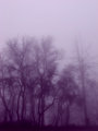   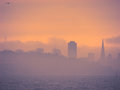 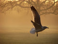 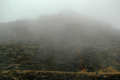
|
|
|
|
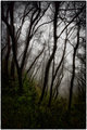
03/07/2013 03:25:25 PM · #25 |
I tried the technique that Ursula mentioned quickly as an experiment.
First, the photo looks a lot better large. I honestly haven't noticed it to this degree before. I've got a full-scale version that looks fine to me, but shrunk down to 800 pixels wide it looks over-sharpened and overly contrasty, or something.
Anyway... the point was to find out what this effect would have on this image, and it certainly makes a big difference. As kirbic suggested, I painted the trunks back in (rather sloppily). One thing I'd probably do if I were to give it more time is paint in a bit more detail in the leaves closest to the lens. Not fully so they regain that over-sharpened look, but enough to create some more depth.
I wouldn't imagine this is the best way to edit this photo, and the fact remains it's a simple shot of some trees, but I think it has a bit more emotion or allure after the edit. Of course I'd love any suggestions.
So, before:
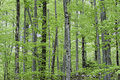
And after:
 |
|
Home -
Challenges -
Community -
League -
Photos -
Cameras -
Lenses -
Learn -
Help -
Terms of Use -
Privacy -
Top ^
DPChallenge, and website content and design, Copyright © 2001-2026 Challenging Technologies, LLC.
All digital photo copyrights belong to the photographers and may not be used without permission.
Current Server Time: 06/26/2026 11:08:25 AM EDT.


