| Author | Thread |
|
|
10/05/2022 01:22:12 PM · #76 |
Original: 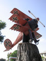
Entry: 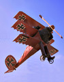
"Someone" (probably not the city) seems to have attached this sculpture atop a tree stump on a relatively busy street corner ... :-)
Message edited by author 2022-10-05 13:34:06. |
|
|
|
10/05/2022 01:26:43 PM · #77 |
Originally posted by GeneralE:
Original:
Entry: |
Very clever! |
|
|
|
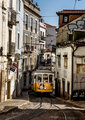
10/05/2022 02:31:27 PM · #78 |
Entry:
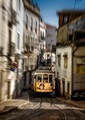
Original
After some contemplation, I decided to add this radial blur in Photoshop, mostly for the tram to stand out more against a very busy background. But I'm still not sure if it was worth it, I'm generally not a big fan of such post-factum modifications... |
|
|
|
10/05/2022 02:59:19 PM · #79 |
Originally posted by LevT:
After some contemplation, I decided to add this radial blur in Photoshop, mostly for the tram to stand out more against a very busy background. But I'm still not sure if it was worth it, I'm generally not a big fan of such post-factum modifications... |
i think it was a good decision because the tram gets lost otherwise, but you overdid it. also, you made that wonderful driver less prominent when you should have made him more prominent. but don't listen to me. I don't get those ribbons. |
|
|
|
10/05/2022 03:48:03 PM · #80 |
Originally posted by LevT:
After some contemplation, I decided to add this radial blur in Photoshop, mostly for the tram to stand out more against a very busy background. But I'm still not sure if it was worth it, I'm generally not a big fan of such post-factum modifications... |
The fact that the tram operates amongst the busyness is, in my opinion, part of the charm. Therefore I much prefer the original.
I also realize that my take on this is probably not shared by most DPCers so congrats on the ribbon! FYI, I did not vote in the challenge. |
|
|
|
10/05/2022 05:05:01 PM · #81 |
Entry:
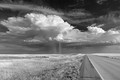
Original:
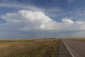
Alternate Entry:
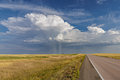
I first entered the color version, then pulled it and replaced with the B/W version which I thought was more dynamic. Interested in opinions on whether I made the right decision... |
|
|
|
10/05/2022 05:15:53 PM · #82 |
| Interesting how much more traction this thread gets versus the outtake one. |
|
|
|
10/05/2022 05:58:00 PM · #83 |
Originally posted by LevT:
Entry:
Original
After some contemplation, I decided to add this radial blur in Photoshop, mostly for the tram to stand out more against a very busy background. But I'm still not sure if it was worth it, I'm generally not a big fan of such post-factum modifications... |
I didn't care for it I thought it was rather gimmicky and part of the charm is how cramped it is |
|
|
|
10/05/2022 07:14:29 PM · #84 |
Originally posted by glad2badad:
Interesting how much more traction this thread gets versus the outtake one. |
The original purpose of this site was to learn how to make "better" photographs, so it seems logical people would be interested in having a discussion about that process, and not just about which photo might have scored higher ...
Maybe in the standard outtakes thread people can also post the "Minimal editing" version (i.e. "original") of the entry to show how they took advantage of the editing rules ... |
|
|
|
10/05/2022 07:23:24 PM · #85 |
Originally posted by GeneralE:
Originally posted by glad2badad:
Interesting how much more traction this thread gets versus the outtake one. |
The original purpose of this site was to learn how to make "better" photographs, so it seems logical people would be interested in having a discussion about that process, and not just about which photo might have scored higher ...
Maybe in the standard outtakes thread people can also post the "Minimal editing" version (i.e. "original") of the entry to show how they took advantage of the editing rules ... |
I don't have a problem with this thread, per se ... I've actually contributed to it myself. I just noticed recently how the outtake threads weren't getting much attention recently and that this one is having healthy conversations.
As for "The original purpose of this site" - kind of preaching to the choir on that one. I get it 100%. Would love to see more conversations about photos, the capture and processing thereof. Hardly any "regular" photos shared around here anymore (keeping them for archival choices I guess - LOL). |
|
|
|
10/05/2022 07:47:42 PM · #86 |
Your original is a great photo! The color version takes it up a notch but your b/w processing really pops, yes more dynamic, slightly more balanced and definitely better emphasizes the leading lines. I think darkening the sky at the top added to that process. I do enjoy the color as well, so maybe with some different processing you could have made that more dynamic as well, but I really like what you entered. It�s always a hard choice when the color is good to decide to go mono. |
|
|
|
10/06/2022 05:51:25 AM · #87 |
I prefer the color version as the color helps as a visual guide for following the intended line. |
|
|
|
10/06/2022 01:52:38 PM · #88 |
| I also favor the color version here... maybe because it reminds me the Ukrainian flag :) |
|
|
|
10/06/2022 04:12:55 PM · #89 |
Originally posted by LevT:
I also favor the color version here... maybe because it reminds me the Ukrainian flag :) |
I guess I missed an opportunity, could have entered the color version, titled it "Solidarity With Ukraine." |
|
|
|
10/06/2022 04:57:30 PM · #90 |
Originally posted by kirbic:
I first entered the color version, then pulled it and replaced with the B/W version which I thought was more dynamic. Interested in opinions on whether I made the right decision... |
Totally. It's a masterful, sweeping, Anselish B/W landscape processed to perfection. The color version lack impact for me. |
|
|
|
10/06/2022 07:35:00 PM · #91 |
Originally posted by Bear_Music:
Originally posted by kirbic:
I first entered the color version, then pulled it and replaced with the B/W version which I thought was more dynamic. Interested in opinions on whether I made the right decision... |
Totally. It's a masterful, sweeping, Anselish B/W landscape processed to perfection. The color version lack impact for me. |
I agree.
|
|
|
|
10/06/2022 08:21:30 PM · #92 |
| To me the B&W is far beyond a landscape and has an entire story while the alternate with its enhanced colors is a just a nice picture |
|
|
|
10/07/2022 11:13:31 AM · #93 |
No news here - you folk are incredible!
How do you decide what direction to take the picture? Not sure I even understand what goal(s) you should aim for in pp.
Thank you all very much for sharing on this thread! It has been mind opening. |
|
|
|
10/07/2022 11:52:40 AM · #94 |
Originally posted by dtremain:
No news here - you folk are incredible!
How do you decide what direction to take the picture? Not sure I even understand what goal(s) you should aim for in pp.
Thank you all very much for sharing on this thread! It has been mind opening. |
As far as the goals in PP, surely it depends on the photog's vision for the image. Using my image discussed here as an example, I wanted to increase the dynamism of the cloud formation and enhance the detail in the clouds and rain. I found that the B/W treatment did this to my satisfaction more than any changes made to the color version. A big part of that was using the red channel preferentially, which naturally resulted in a very dark sky, making the clouds really pop. I wanted to capture the feeling that I had looking at the scene and keep it relatively natural, but not a completely faithful reproduction. I think Robert said it best, the final image is kind-of Ansel-ish, and that look is definitely what I was after.
For other images a more heavy-handed approach might be called for, for instance if a very painterly effect were desired in the final image. I rarely apply very heavy processing, and that is purely my preference. Now that I think about it, the last time I even entered a grayscale image was 2009 (!) |
|
|
|
10/07/2022 01:01:54 PM · #95 |
| when I decide to process a photo, I almost always convert it to BW on a separate layer (usually with Silver Efex). Then I compare the BW version with color one (which I can see by toggling the BW layer to the luminosity mode) and decide which one works better for me. Often I know from the outset which one it's likely going to be, but in most cases I like to compare anyway. If I choose the color version, I typically tone down the BW luminosity layer as color photos don't need as much tonal contrast as BW. |
|
|
|
10/07/2022 01:11:19 PM · #96 |
Originally posted by kirbic:
... the last time I even entered a grayscale image was 2009 (!) |
Based on the result, I think you need to do it more often.
|
|
|
|
10/07/2022 01:12:26 PM · #97 |
Originally posted by GinaRothfels:
Originally posted by kirbic:
... the last time I even entered a grayscale image was 2009 (!) |
Based on the result, I think you need to do it more often. |
You have an excellent point :-) |
|
|
|
10/13/2022 01:10:31 PM · #98 |
LevT asked where my shadow was in the bike photo - I was able to crop out most of it and had to clone a small amount
Here's the entry:
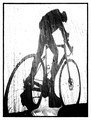
Here's the original:
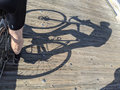
Message edited by author 2022-10-13 13:11:01. |
|
|
|
10/13/2022 01:21:49 PM · #99 |
| Thank you Wendy! Interesting effect, after 90 degree rotation and cropping it looked like you were standing right next to the biker to his right (that's why I was wondering about your shadow), while in reality you were pretty far behind him. |
|
|
|
10/13/2022 01:35:21 PM · #100 |
Originally posted by LevT:
Thank you Wendy! Interesting effect, after 90 degree rotation and cropping it looked like you were standing right next to the biker to his right (that's why I was wondering about your shadow), while in reality you were pretty far behind him. |
Yeah- I was surprised at how it turned out. It was one of the few that I could find (I didn't have time to shoot a new one). So I was trying to polish what I thought was a meh photo. But I really was excited at how it turned out. I like it quite a bit! Thanks for the comment! |
|
Home -
Challenges -
Community -
League -
Photos -
Cameras -
Lenses -
Learn -
Help -
Terms of Use -
Privacy -
Top ^
DPChallenge, and website content and design, Copyright © 2001-2025 Challenging Technologies, LLC.
All digital photo copyrights belong to the photographers and may not be used without permission.
Current Server Time: 12/19/2025 02:13:47 AM EST.


