| Author | Thread |
|
|
07/08/2009 06:33:54 PM · #1 |
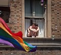
Could you please explain to me why I received a 5.1 on this image? It was liked by most of my commenters, so I'm somewhat at a loss. Is it the subject matter, is it the processing, is it the colors? One commenter thought that the bubbles in the foreground were solar flares. Could this have been the reason?
Also, if no one picked up from the title or the flag, this was at the gay pride parade in San Francisco, and the girls are a lesbian couple perched in a hotel window. I don't really think it needs that much of an explanation, but maybe I was wrong. |
|
|
|
07/08/2009 06:42:47 PM · #2 |
Historically, it's been my experience that people are more likely to comment when they like your photo versus when they think it could be better. Many voters, even many who take the voting part seriously, just simply don't care to leave a comment explaining why they gave you a 5.
Having said that, I think it's great compositionally, but I think many people might see the main subject as being out of focus. I think the flag is in focus unless my contacts are in backwards. :)
Other than that, I think that perhaps the light is a little tragic on the girl on the left (the viewer's left) and isn't incredibly flattering.
But yeah, I do like the crop and comp. |
|
|
|
07/08/2009 06:50:26 PM · #3 |
The picture has some strong elements, but also some weaknesses.
I like the play of subjects between the flag and the couple. They compliment each other well and the flag almost provides leading lines to the couple. The bubbles also are a whimsical addition to the picture.
I don't like the square crop. Square crops generally need a reason for their squareness. It's also unclear exactly where the camera decided to focus and if you didn't have spot focus on it probably tried to compromise between the two. The couple is not quite in focus and that bothers me as they are one of, if not the, main subject.
Pics like this probably also benefit from some burning on the edges to help hone in the focus. But that's a taste thing.
It doesn't look like the subject matter got you because you only got 3 1-votes which isn't that many and seems in line with the general voting curve.
Message edited by author 2009-07-08 18:50:44. |
|
|
|
07/08/2009 06:52:52 PM · #4 |
| really? yeah someone said the focus seemed to be more on the flag, which I can kinda sorta see, but when I zoom in in Lightroom 1:1, I swear that they are just as much in focus. Hmmm, maybe I need MY contacts checked. |
|
|
|
07/08/2009 06:56:44 PM · #5 |
Originally posted by DrAchoo:
The picture has some strong elements, but also some weaknesses.
I don't like the square crop. Square crops generally need a reason for their squareness.
Pics like this probably also benefit from some burning on the edges to help hone in the focus. But that's a taste thing.
|
I dislike square crops too most of the time because it feels too compressed, so I can understand that. As for the burning...I vignetted, I vignetted a crap-load, almost to a "spotlight point" on the couple, but maybe it isn't apparent. |
|
|
|
07/08/2009 06:58:32 PM · #6 |
Originally posted by Blue Moon:
Could you please explain to me why I received a 5.1 on this image? It was liked by most of my commenters, so I'm somewhat at a loss. Is it the subject matter, is it the processing, is it the colors? One commenter thought that the bubbles in the foreground were solar flares. Could this have been the reason?
Also, if no one picked up from the title or the flag, this was at the gay pride parade in San Francisco, and the girls are a lesbian couple perched in a hotel window. I don't really think it needs that much of an explanation, but maybe I was wrong. |
Because this is how patient they are when they vote:
Originally posted by xxxxxx:
There is lens flare everywhere... And that banner is just distracting! |
|
|
|
|
07/08/2009 07:01:34 PM · #7 |
Originally posted by Zigomar:
Originally posted by Blue Moon:
Could you please explain to me why I received a 5.1 on this image? It was liked by most of my commenters, so I'm somewhat at a loss. Is it the subject matter, is it the processing, is it the colors? One commenter thought that the bubbles in the foreground were solar flares. Could this have been the reason?
Also, if no one picked up from the title or the flag, this was at the gay pride parade in San Francisco, and the girls are a lesbian couple perched in a hotel window. I don't really think it needs that much of an explanation, but maybe I was wrong. |
Because this is how patient they are when they vote:
Originally posted by xxxxxx:
There is lens flare everywhere... And that banner is just distracting! |
|
Wait, someone really commented that way? Moronic.
For the record, I have had plenty of shots that I loved score low, and then some ones I didn't think would do well that did better than I had expected. 5.1 isn't that bad on this site, all things considered. But I guess I'm more saying that I know how you feel. :) |
|
|
|
07/08/2009 07:01:53 PM · #8 |
Originally posted by Blue Moon:
Originally posted by DrAchoo:
The picture has some strong elements, but also some weaknesses.
I don't like the square crop. Square crops generally need a reason for their squareness.
Pics like this probably also benefit from some burning on the edges to help hone in the focus. But that's a taste thing.
|
I dislike square crops too most of the time because it feels too compressed, so I can understand that. As for the burning...I vignetted, I vignetted a crap-load, almost to a "spotlight point" on the couple, but maybe it isn't apparent. |
THIS is a "crapload" of burning... ;)
I'm not saying your shot needs that, but we need to readjust the "crapload" meter... :P
Message edited by author 2009-07-08 19:03:54. |
|
|
|
07/08/2009 07:05:28 PM · #9 |
| I think the strong points are the couple and the flag. But the image has a lot of brick wall and the glass part of the window which IMO detracts. Perhaps a severe crop in which you remove a decent amount from the right, left and top, and leave just the couple, the window sill, just the open part of the window (plus surrounding frame) and maybe half of the flag, would emphasize the couple better and increase the colorfulness of the image. |
|
|
|
07/08/2009 07:07:50 PM · #10 |
I didn't vote in the challenge, but I would have given it a 5.
The couple is out of focus as shown on my monitor and the large dark area upper left could be cropped out (still leaving the important "homosexual flag" in the shot).
Also, if it had been shot straight on (no sexual orientation pun intended *grin*), the image would not seem so ... ummm... skewed. The window they're sitting in would have been more of a 'natural frame' and highlighted them even more. As it is, there are three main features in the image when I see it. The girls, the flag, and the dark area. Cropping more would have brought all of the focus on the girls in the window.
I know... shooting a parade, things happen fairly quickly, but still, we're asked to judge the image since you entered it in a photography contest. |
|
|
|
07/08/2009 07:07:52 PM · #11 |
Originally posted by ErikV:
I think the strong points are the couple and the flag. But the image has a lot of brick wall and the glass part of the window which IMO detracts. Perhaps a severe crop in which you remove a decent amount from the right, left and top, and leave just the couple, the window sill, just the open part of the window (plus surrounding frame) and maybe half of the flag, would emphasize the couple better and increase the colorfulness of the image. |
I was just going to say something similar -- all that wall didn't add that much, the interest was in the couple and the flag  might be stronger? plus, the oof bubbles didn't add much. might be stronger? plus, the oof bubbles didn't add much.
I think mostly, people will vote you down if it's not tack, tack sharp. And the people are a little soft. |
|
|
|
07/08/2009 07:08:41 PM · #12 |
Yes, what Erik said. :) I was posting when he was. :)
|
|
|
|
07/08/2009 07:09:41 PM · #13 |
| Plus their knees are blown out. Blown out knees are and automatic 3 from me... |
|
|
|
07/08/2009 07:10:13 PM · #14 |
Originally posted by LydiaToo:
Also, if it had been shot straight on...the image would not seem so ... ummm... skewed. |
Yeah, Blue. You should get the new Canon Jetpack so you could float up and get that angle. ;) |
|
|
|
07/08/2009 07:22:48 PM · #15 |
Originally posted by sprite777:
Originally posted by LydiaToo:
Also, if it had been shot straight on...the image would not seem so ... ummm... skewed. |
Yeah, Blue. You should get the new Canon Jetpack so you could float up and get that angle. ;) |
I was giving an honest critique as requested. The same 'elevation', but from right in front would have scored more highly from me. If that weren't possible, perhaps a different subject from the same event would have scored more highly. I don't know. I'm just saying what I think would have helped the image.
This is more of what I mean:
Original: My Edit: 
Please know that my edit would not be legal in anything other than Expert Editing. It's for reference of what I was talking about only.
|
|
|
|
07/08/2009 07:26:23 PM · #16 |
Originally posted by LydiaToo:
Originally posted by sprite777:
Originally posted by LydiaToo:
Also, if it had been shot straight on...the image would not seem so ... ummm... skewed. |
Yeah, Blue. You should get the new Canon Jetpack so you could float up and get that angle. ;) |
I was giving an honest critique as requested. The same 'elevation', but from right in front would have scored more highly from me. If that weren't possible, perhaps a different subject from the same event would have scored more highly. I don't know. I'm just saying what I think would have helped the image.
This is more of what I mean:
Original: My Edit:
Please know that my edit would not be legal in anything other than Expert Editing. It's for reference of what I was talking about only. |
Just messin!
And actually, yeah, I think that when I left that last comment, I didn't realize how the elevation was pretty even-planed like you said. I was assuming it was from the street.
:) |
|
|
|
07/08/2009 07:37:09 PM · #17 |
Originally posted by sprite777:
Just messin!
|
:) |
|
|
|
07/08/2009 08:22:05 PM · #18 |
Originally posted by sprite777:
Originally posted by LydiaToo:
Also, if it had been shot straight on...the image would not seem so ... ummm... skewed. |
Yeah, Blue. You should get the new Canon Jetpack so you could float up and get that angle. ;) |
heehee, I really need one of those ;)
and yeah, it is a little skewed, I guess I kinda ignored that because I was more focused on the elements of the picture. I'm staring to see now that the image has a lot of little issues which you are all explaining that make me understand my score a little more. Thanks. |
|
|
|
07/08/2009 08:26:27 PM · #19 |
Originally posted by sprite777:
Originally posted by Zigomar:
Because this is how patient they are when they vote:
Originally posted by xxxxxx:
There is lens flare everywhere... And that banner is just distracting! |
|
Wait, someone really commented that way? Moronic.
For the record, I have had plenty of shots that I loved score low, and then some ones I didn't think would do well that did better than I had expected. 5.1 isn't that bad on this site, all things considered. But I guess I'm more saying that I know how you feel. :) |
ok, I'm glad to hear that there no one else thought they looked like lens flare. I don't mean to attack anybody, but when PMed them to tell them that they were in fact bubbles, they replied with:
"Don't get me wrong, I've taken a ton of shots a lot worse than this in my time, but I personally would've done this differently. Go to my profile if you'd like and look back at the first ten-twenty shots I look!..."
Needless to say, I told them off, in the most polite way as humanly possibly :) |
|
|
|
07/08/2009 08:39:38 PM · #20 |
Originally posted by Blue Moon:
Originally posted by sprite777:
Originally posted by Zigomar:
Because this is how patient they are when they vote:
Originally posted by xxxxxx:
There is lens flare everywhere... And that banner is just distracting! |
|
Wait, someone really commented that way? Moronic.
For the record, I have had plenty of shots that I loved score low, and then some ones I didn't think would do well that did better than I had expected. 5.1 isn't that bad on this site, all things considered. But I guess I'm more saying that I know how you feel. :) |
ok, I'm glad to hear that there no one else thought they looked like lens flare. I don't mean to attack anybody, but when PMed them to tell them that they were in fact bubbles, they replied with:
"Don't get me wrong, I've taken a ton of shots a lot worse than this in my time, but I personally would've done this differently. Go to my profile if you'd like and look back at the first ten-twenty shots I look!..."
Needless to say, I told them off, in the most polite way as humanly possibly :) |
Some people are just too full of themselves. |
|
|
|
07/08/2009 08:40:47 PM · #21 |
Originally posted by Blue Moon:
PMed them to tell them that they were in fact bubbles |
I don't really understand why you PMd them during the voting period, nor why you are posting a private message publicly.
Don't get me wrong, I don't want to sound harsh, just don't see a real necessity for explaining your work to the viewers. You don't stand beside your photo in a gallery and provide details. Some people get the shot - some don't, some take care and respect your photo and the time it took you to make it - some just take an evanescent glance and walk away. |
|
|
|
07/08/2009 08:42:34 PM · #22 |
Originally posted by Zigomar:
Originally posted by Blue Moon:
PMed them to tell them that they were in fact bubbles |
I don't really understand why you PMd them during the voting period, nor why you are posting a private message publicly.
Don't get me wrong, I don't want to sound harsh, just don't see a real necessity for explaining your work to the viewers. You don't stand beside your photo in a gallery and provide details. Some people get the shot - some don't, some take care and respect your photo and the time it took you to make it - some just take an evanescent glance and walk away. |
you are right, it is not something I've ever done before, and I apologize. |
|
|
|
07/09/2009 12:37:50 AM · #23 |
harsh sunlight.
centered subject.
these are not dpc values.
|
|
|
|
07/09/2009 01:02:33 AM · #24 |
I will be perfectly honest with you on this one. And please do not take offense with what I say, it is just another different view on your shot.
To me, it is boring as all. There seems to be no emotion in it at all, more along the lines of a snapshot.
It would have been better with a crop, very harsh sunlight and barely any contrast to it, it is a great subject and from looking through your portfolio , I feel you could have done a lot better with it. Your port has some fantastic shots in it.
Also the "I told them off" is a bit naughty. They are just giving you their opinions on your shot and that is why you entered it in the first place , isn't it? |
|
|
|
07/09/2009 01:12:25 AM · #25 |
| Okay, figure I'll give ya my two cents. The lense flare and banner are really distracting...LMAO... Just kidding, but in all seriousness, my issue with the photo was that the flag is sharp, but the girls are not. Well, that and the lighting was harsh. I gave it a 5, simply because I saw it as a nice candid, but nothing particularly catchy about it. I liked the composition, but I really felt that the harsh light, and the focus on the flag, rather than the couple, is what detracted from the image. Just my two cents, mileage may vary :) |
|


