| Author | Thread |
|
|
04/22/2009 02:32:08 PM · #1 |
Hi
I'm quite fond of monochrome images but mine suck. They tend to look too harsh; does anybody have any tips? I've tried conversions in Aperture, PS4 (and a little in camera raw), tried software filters, curves and levels
manipulation - but I can't pull it off. My images never look like there is enough bit depth / shades of grey.
Can anybody help point me in the right direction?
Many thanks
Paul |
|
|
|
04/22/2009 02:53:13 PM · #2 |
| Have you tried playing in the channel mixer in PS? |
|
|
|
04/22/2009 02:53:36 PM · #3 |
Color provides visual contrast far in excess of the middle gray tones it usually converts to. So, in a nutshell, your solution to better B/W tonalities is to increase mid-range contrast. With CS3's B/W adjustment layer you can get a kick start by testing the effects of the various filters. A red filter will brighten red/yellow and darken blue/green, for example.
You can often significantly pump up the mid-tone contrast by the simple expedient of duping the image to a new layer then setting that layer to soft light mode, and fading it to suit.
R. |
|
|
|
04/22/2009 03:01:54 PM · #4 |
Both good pieces of advice. I personally use the Channel Mixer to do an initial conversion. I often use curves to increase mid-tone contrast, and sometimes use a local contrast enhancement technique (large-radius USM) as well. This last technique needs to be applied sparingly!
Prior to invoking Channel Mixer, I always look at the individual channels to see what might be good starting points. I also work in 16-bit mode during the conversion to monochrome, and afterward during contrast adjustment (and toning, which I always do to my monochrome images). |
|
|
|
04/22/2009 03:02:13 PM · #5 |
I am away from my mac just now, so I can't open aperture and spell out the exact wording of the selections, so you may have to do a little interpretation :-)
I've done it two ways in Aperture:
The monochrome conversion selection will give you a control panel on the left that lets you select various filters (red, orange, etc.) and you can adjust the strength of the filters directly.
I find that I use the highlight/shadow controls on most images: If you slide the highlight and shadow sliders slightly to the right, you now get the option to use the high, mid, and low range contrast sliders immediately below. These are also helpful in color images, and in both types can be easily overdone.
I don't think I have ever done a b/w without doing the Edit With Dodge & Burn: this comes from my wet-darkroom days. There is always some local thing to be done, and this tool lets you go in and lighten eyes, etc. (also local sharpening, local contrast).
I recently got the Nik Software suite for Aperture, and I love it! Silver Efex is a great tool.
I always, before I do the conversion to b/w, work on the color image first: noise reduction, general exposure level, definition slider, and such. That way, I have done the "common work" on the color image and don't have to repeat it on the conversion.
All this being said, I am still a newbie at this digital stuff, and getting digital b/w to have the silver gelatin print feel is still out of my grasp. On a display, it is easy to get a very luminous image, it seems, but the depth and subtlety of a silver gelatin print still elude me.
I have some in my porfolio here, and this is a recent one that is not yet in my dpc portfolio.
So you can see that I still have a way to go. And you can see if those are anything like what you are looking to do--lots of styles to choose from :-)
Cheers
|
|
|
|
04/22/2009 03:04:10 PM · #6 |
Perhaps not the cheapest option, but I personally find the Nik Silver Efex filters for Photoshop/Aperture to be possibly the best for B&W conversions. I seldom use anything else these days (at least for advanced editing or personal images). Not for basic challenges.
Nik Silver Efex
ETA. Chromeydome beat me to it! Chromeydome beat me to it!
Message edited by author 2009-04-22 15:04:59. |
|
|
|
04/22/2009 03:06:38 PM · #7 |
And  salmiakkiknows whereof she speaks! Look at her portfolio--those images Sing!! salmiakkiknows whereof she speaks! Look at her portfolio--those images Sing!! |
|
|
|
04/22/2009 03:06:49 PM · #8 |
Oops wierd double post.
Thanks Chromeydome!
Message edited by author 2009-04-22 15:07:58. |
|
|
|
04/22/2009 03:09:35 PM · #9 |
Thanks - yes, I have tried the monochrome mixed, both via the sliders, filters and in the image with the new click and drag tool in CS4. The mid tone thing is very interesting and makes sense in terms of how the maths must work - I presume that without any filters or sliders it just converts the luminosity value to a grey scale value?
If I understand this right, might it be effective to manipulate the luminosity of the color channels in Aperture and then convert to grey scale in PS4; would this introduce some artifical contrast between colors which would translate into some additional tonality; though I will try the layers approach too. Just thinking aloud really.
Thanks again
Paul
Thanks to all posters - others had offered more advice while I composed the above on my iPhone; going to read and try everything now.
Cheers
Paul
Message edited by author 2009-04-22 15:12:53. |
|
|
|
04/22/2009 03:31:40 PM · #10 |
Originally posted by paulbtlw:
I presume that without any filters or sliders it just converts the luminosity value to a grey scale value? |
That's essentially correct, yes, though it may be that the algorithms are constructed to favor certain color tones over others (built-in filter, in other words) to make the resultant untweaked grayscale image look more natural than what you'd get if you just "converted to grayscale" or desaturated in hue/saturation.
Here's an interesting experiment for you btw:
1. Open color image
2. Make a new adjustment layer for hue/sat but alter nothing now
3. Make a new B/W adjustment layer and leave that at default for now as well.
4. Now go back to the hue/sat layer and tweak the individual channels to their limits and watch what happens to the grayscale image on your screen.
R. |
|
|
|
04/22/2009 03:43:23 PM · #11 |
Ah - I presume it does this via something like a lookup table?
Just tried the experiment - I like the way you can slide and eyeball this in a seamless way; I also note how the changes are more pronounced once a filter is applied - which of course make sense.
Going to try the soft light layer approach now. (and I'll probably try the Silver Efex demo too)
Thanks again
Paul |
|
|
|
04/22/2009 03:59:49 PM · #12 |
Ok
Just reporting back; duplicating the image as a soft light adjustment layer at 80%, then applying a curves layer, then applying the black white layer, then adjusting the curves at this layer in the stack seems to be giving me much greater tonal range - am I imagining it, or does this make some sort of sense?
Thanks
Paul |
|
|
|
04/22/2009 04:02:01 PM · #13 |
Originally posted by paulbtlw:
Ok
Just reporting back; duplicating the image as a soft light adjustment layer at 80%, then applying a curves layer, then applying the black white layer, then adjusting the curves at this layer in the stack seems to be giving me much greater tonal range - am I imagining it, or does this make some sort of sense?
Thanks
Paul |
Makes lots of sense. Keep experimenting and find something that works for you.
R. |
|
|
|
04/22/2009 04:04:12 PM · #14 |
I try to shoot for B&W before I ever even think of getting to post-processing. I'm to the point now where I kind of just know if a shot is going to be right for B&W before I even take it, but I'm not really sure how to translate it into words.
Kind of a second sense, and one that doesn't always work.
I just wanted to mention that because so far all you've gotten are suggestions for post-processing, but finding the right lighting and situations BEFORE you take the shot is far more instrumental, IMO. |
|
|
|
04/22/2009 04:40:40 PM · #15 |
Originally posted by K10DGuy:
I try to shoot for B&W before I ever even think of getting to post-processing. I'm to the point now where I kind of just know if a shot is going to be right for B&W before I even take it, but I'm not really sure how to translate it into words.
Kind of a second sense, and one that doesn't always work.
I just wanted to mention that because so far all you've gotten are suggestions for post-processing, but finding the right lighting and situations BEFORE you take the shot is far more instrumental, IMO. |
AMEN!
I tend to see almost all of my shots as b/w, since for 20+ years that is about all I did. I think that is why my attempts at color work generally fail--I am imagining the b/w image when I shoot.
With digital, at least some options remain. I sure hated loading my OM2 with either color or b/w film, because as soon as I did, I would see great opportunities for shots with the opposite film choice. I nearly bought a second camera so I could have one of each ready at all times. |
|
|
|
04/22/2009 04:50:13 PM · #16 |
I haven't read the whole thread, but I've been trying several different things.
I have gotten to a point as well where I can know if it will work for B/W or not, but you have to get a feel for it.
The first thing I do is shoot in RAW and make sure the contrast is toned down slightly (blacks @ 0 in ACR). I usually apply the BW filter in CS4 and play with the different color filters to get the tonal range I want. I then will do unsharp mask with a large radius to get more defined tones. Then I'll sharpen with a small radius and adjust curves accordingly. I've noticed that I end up making the contrast using this process before I even hit the contrast option and find that there's usually not as much need for it.
Hope that helps a little bit, I suck at explaining things sometimes.
|
|
|
|
04/22/2009 04:58:36 PM · #17 |
Originally posted by chromeydome:
I sure hated loading my OM2 with either color or b/w film, because as soon as I did, I would see great opportunities for shots with the opposite film choice. I nearly bought a second camera so I could have one of each ready at all times. |
Heck, I used to carry FOUR bodies (along with the large format camera and its various film holders) because I needed to have access, on the same shoot, to 35mm transparency in both tungsten and daylight flavors, plus 35mm b/w AND color negative film. The color neg film was tungsten balanced, and we'd use a filter on the lens to compensate when shooting in daylight, so as to avoid a FIFTH body. It was a pain in the keister. Medium-format was easier (different backs for different films) but the clients wanted 35mm slides ready to go out of the box, and the negative films were for environmental shots we didn't shoot at all in large format, mostly with people in them. The medium format was good for those, of course, but sometimes we just didn't want to be bothered with THREE different formats on a single shoot, depending on how many assistants were in tow that particular day.
R. |
|
|
|
04/22/2009 04:58:45 PM · #18 |
| I'll provide a counterpoint to the "shoot for B&W" approach. Whether my final, processed image will be B&W or color, my goal is to capture all the data that I can capture. As such, I ascribe to the expose (to the) right philosophy. I *always* shoot RAW and have my in-camera histogram display individual color channels, so I can maximize exposure without clipping a channel. While this does not always give me something close to a final image out of the camera, it gives me as much data to work with as possible. Whether I'm targeting B&W or color makes no difference in the "data acquisition" phase. |
|
|
|
04/22/2009 05:00:53 PM · #19 |
Originally posted by kirbic:
I'll provide a counterpoint to the "shoot for B&W" approach. Whether my final, processed image will be B&W or color, my goal is to capture all the data that I can capture. As such, I ascribe to the expose (to the) right philosophy. I *always* shoot RAW and have my in-camera histogram display individual color channels, so I can maximize exposure without clipping a channel. While this does not always give me something close to a final image out of the camera, it gives me as much data to work with as possible. Whether I'm targeting B&W or color makes no difference in the "data acquisition" phase. |
No, but when you're shooting *for* B/W, you tend to put on a mental filter that excludes certain shots simply because they won't work as well in monochrome as they will in color. When you've shot that way all your life, it's sometimes hard to see the *best* color-shot possibilities even when they're staring you in the face.
R. |
|
|
|
04/22/2009 05:03:26 PM · #20 |
|
|
|
04/22/2009 06:03:30 PM · #21 |
Originally posted by Bear_Music:
Originally posted by kirbic:
I'll provide a counterpoint to the "shoot for B&W" approach. Whether my final, processed image will be B&W or color, my goal is to capture all the data that I can capture. As such, I ascribe to the expose (to the) right philosophy. I *always* shoot RAW and have my in-camera histogram display individual color channels, so I can maximize exposure without clipping a channel. While this does not always give me something close to a final image out of the camera, it gives me as much data to work with as possible. Whether I'm targeting B&W or color makes no difference in the "data acquisition" phase. |
No, but when you're shooting *for* B/W, you tend to put on a mental filter that excludes certain shots simply because they won't work as well in monochrome as they will in color. When you've shot that way all your life, it's sometimes hard to see the *best* color-shot possibilities even when they're staring you in the face.
R. |
YES! Bear is right on the money, as always.
I am usually looking for a b/w shot, even if I end up staying with color later on for other reasons. I agree with getting all the data needed when shooting (that is the way I approached b/w with film--careful metering and exposure, consciously pre-planning an N, N+1 or N-1 process, etc.
I guess I need to change my pair-a-diggum (paradigm) to be more open to color--though with digital I already have done more color work than ever before.
Message edited by author 2009-04-22 18:04:09. |
|
|
|
04/22/2009 06:47:23 PM · #22 |
| I find Exposure does the most beautiful conversions i have ever imagined. |
|
|
|
04/22/2009 08:01:12 PM · #23 |
Originally posted by Bear_Music:
No, but when you're shooting *for* B/W, you tend to put on a mental filter that excludes certain shots simply because they won't work as well in monochrome as they will in color. When you've shot that way all your life, it's sometimes hard to see the *best* color-shot possibilities even when they're staring you in the face.
R. |
I totally understand this, even though it doesn't affect me (I've nearly always shot color). Occasionally I do see a shot that just screams monochrome. My recent (tepidly-received) entry in Hidden Gem:
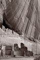
is an example. I also shot quite a bit of landscape stuff around Sedona one morning a few years ago with Steve Davidson, and we talked about how the light was not doing us favors for color work, but that things would pop once converted to monochrome. And they did. |
|
|
|
04/22/2009 08:03:54 PM · #24 |
Originally posted by kirbic:
I also shot quite a bit of landscape stuff around Sedona one morning a few years ago with Steve Davidson, and we talked about how the light was not doing us favors for color work, but that things would pop once converted to monochrome. And they did. |
And there you have it: a lot of the time, "harsh" light is death on color but it sings in monochrome...
R.
Message edited by author 2009-04-22 20:17:56. |
|
|
|
04/22/2009 08:15:50 PM · #25 |
I often do BW conversions by copying three channels (R,G,B) into three different layers and then mixing and matching them in different blending modes and with different masks and opacities. I also often duplicate these layers and add them to the mix them with different blending modes and masks as well. This way gives me ultimate control over the result and virtually unlimited possibilities. Of course in most cases this procedure is illegal in basic challenges.
|
|


