| Author | Thread |
|
|
04/16/2009 08:15:57 AM · #1 |
Hi everyone.
I did a wedding on the 4th, and I have finally had time to edit some of them, mainly just cropping....would you mind taking a look at the link in my portfolio, and telling me what you think? If they are worth giving to the bride. She had another photographer as well, from what I heard, the photos did not turn out good, so I want to share these with her. Im just not sure if they are good enough. I would love some advice on editing I could do to make them better.
Thanks,
Jamie
Krissys Wedding |
|
|
|
04/16/2009 08:20:13 AM · #2 |
Hi Jamie,
Will she be getting these printed? - If so, you might want to check some of these strange crop ratios you have, expecially the very narrow ones and the square ones.
ETA:
- Some need to be straigtened (check the brick patterns on the wall, they're not straight)
- The poses and expressions are good
- The main issue is lighting. Go here: //strobist.blogspot.com/ - it will change your life... :)
Message edited by author 2009-04-16 08:23:28. |
|
|
|
04/16/2009 10:28:47 AM · #3 |
Except for the few obviously blurry ones I like them.
Next time remove the tripod out of your shots, though ;-) |
|
|
|
04/16/2009 11:17:19 AM · #4 |
I meant to say, the girl in the long white dress is cute.
Is she married? |
|
|
|
04/16/2009 12:42:38 PM · #5 |
| OK - do you want ego-stroking or some good honest criticism? |
|
|
|
04/16/2009 01:31:41 PM · #6 |
| Don't show or post the bad ones, like the group one with the girl sticking her tongue out, or blurry ones. You client shouldn't see those. I'm sure you have enough good ones to satisfy the couple. |
|
|
|
04/16/2009 04:29:27 PM · #7 |
I'm with JH
do you know if she is single at all? she is very cute....
So my honest 'Critique on a wedding' is that she made a mistake and should not have gotten married!
Regarding the photos. Some a great, some could be so much better if a few things were changed. For example 206 ( //www.dpchallenge.com/image.php?IMAGE_ID=782827 . In this photo she looks fantastic. I would have taken this photo in a different location with better lighting or used your 50mm with a low f stop. I don't like the shadow from the flash in the background and i'm not a fan of the background because i find all the different lines from the brickwall etc distracting. With a f1.8 it should brokeh (i think thats the technical word i am looking for) all that away.
But i'm no wedding photographer so I am a long way from an expert.
What i would suggest you do. Take your photos, maybe play with them a little more and get as much feedback as you can from dpchallenge and them give them to the bride. She is never going to not like them or not appreciate them. She is going to get everyone sending her their point and shoot photos anyway. Then, if you go over their house sometime, or she sends out a bulk email to everyone with photos from her wedding and you see one of YOUR photos in there, that is the best feedback you can get.
I went to a wedding a few weeks ago and did the same thing (although i ended up taking a bunch of baby photos with the 2 couples i went with) and the best feedback i got was from one of the mothers of the baby asked me for a copy of all my photos so she can print them. (see my photos from that wedding //www.flickr.com/photos/36937362@N06/)
|
|
|
|
04/16/2009 07:15:16 PM · #8 |
overall not bad.
as others have stated a few are blurry -camera shake I assume.
Some would be much better with shallower DOF.
|
|
|
|
04/16/2009 07:29:52 PM · #9 |
Thanks everyone for the critique. I totally agree with all of you. I wanted to do some more artistic photos, but because of the bride (being so tired), I didn't have time to keep switching lenses, plus everyone was not cooperating. Weddings are very hard I realized. It was great experience though.
Thanks so much again! |
|
|
|
04/16/2009 07:30:41 PM · #10 |
Lots of easy to correct errors in there - a lot of the shots, especially the posed ones, almost get all of her dress in, but then you seem to literally end up chopping off a few inches. For example, 567bnw.jpg is typical of this error, all you needed to do is move a bit more to your left, we, the viewer, did not need to see out of the window, having a shallower angle would of bought her dress into shot better, and we wouldn't see what`s outside the window, which looks like another part of the building - very dull. Maybe coming in closer for that portrait with your 50mm and gone for a upper body shot would of been preferable? You had nice light streaming in there, would of been great if you could of used it better.
Also, as mentioned earlier, remove the blurry ones, some are just out of focus as well, a good (or poor) example of this is 524.jpg where the focus looks sharper on the metalwork behind instead of on the bride. Same seems apparent on 471.jpg as well - seems the focus was off.
However, I know how hard it is to shoot those first few weddings - keep at it, and don't be afraid to ask questions.
Mark
PS - shot 471.jpg - anyone help me out with that one. |
|
|
|
04/16/2009 08:46:41 PM · #11 |
I think she'd be more than happy to get them. You could also do some extreme editing on a few for a different flavor, (more mint chocolate chip than vanilla, LOL). I played with one of them to see what I could get. I'd be happy to send it to you (or post it) if you'd like just for an idea.
Message edited by author 2009-04-16 21:35:40. |
|
|
|
04/17/2009 07:43:03 AM · #12 |
OK, thanks! LOL! I actually played with 2 so here they are...
  |
|
|
|
04/17/2009 11:24:04 AM · #13 |
Originally posted by Kelli:
OK, thanks! LOL! I actually played with 2 so here they are... |
Before: 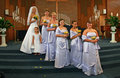 After: After:
Kelli, I think this one was better before. Better too soft than oversharpened/overprocessed. Now it just looks like a mess.
Message edited by author 2009-04-17 11:25:32. |
|
|
|
04/17/2009 11:54:43 AM · #14 |
| i am sorry the before is better. it is too sharp all i can see are the bricks. |
|
|
|
04/17/2009 02:55:14 PM · #15 |
Originally posted by Kelli:
OK, thanks! LOL! I actually played with 2 so here they are...
|
Sorry Kelli, but these actually make the images look worse IMHO.. |
|
|
|
04/17/2009 03:37:38 PM · #16 |
Originally posted by caba:
Don't show or post the bad ones, like the group one with the girl sticking her tongue out, or blurry ones. You client shouldn't see those. I'm sure you have enough good ones to satisfy the couple. |
I saw a photo where it was two women sticking their tongues out. If it were me I'd probably ask the bride indirectly how close of a relationship she has with them before tossing the photo. Maybe that's just their thing like to do. You never know what quirky image the client will like. However I do get why the photographer might want to trash it but seeing how she is just getting started with weddings if it were me I wouldn't mind. Ultimately I want a satisfied customer and if that does it so be it.
That said, if I had a stronger collection of photos that had personality I would probably toss the tongue hangers. Technicals can be overlooked or improved upon but you can't fix a lack of life, personality and that is what I notice the most in many of the images. I would have loved to see a good belly laugh or tears or something. They are not bad overall, it just lacks that one or two great moments that captivates you.
Disclaimer: Not a wedding photographer so take it for what it's worth. :)
Message edited by author 2009-04-17 15:44:15.
|
|
|
|
04/17/2009 06:16:37 PM · #17 |
Originally posted by Simms:
Originally posted by Kelli:
OK, thanks! LOL! I actually played with 2 so here they are...
|
Sorry Kelli, but these actually make the images look worse IMHO.. |
To each their own, LOL! I only spent a few minutes on a small image to give her an idea of processing out of the box. You might not like it, but the bride just might love it. I wasn't going for perfection, just a general idea.
eta: She did ask for editing advice, I don't see anyone else posting what she could do with any of the images.
Message edited by author 2009-04-17 18:17:43. |
|
|
|
04/17/2009 09:30:43 PM · #18 |
 
I made a quick edit of an image chosen at random, I made a new layer, added blur. darkened the image, then masked the Bride and Groom out of the new layer so they are back to the original shot. With all the clutter in the background it can help to minimize the background and bring them to the focal point.
Message edited by author 2009-04-17 22:22:09. |
|
|
|
04/18/2009 07:46:45 AM · #19 |
I think this is a great idea, that I think I will go back and use for most of the shots. Thanks so much! : )
Originally posted by PapaBob:
I made a quick edit of an image chosen at random, I made a new layer, added blur. darkened the image, then masked the Bride and Groom out of the new layer so they are back to the original shot. With all the clutter in the background it can help to minimize the background and bring them to the focal point. |
|
|
|
|
04/18/2009 07:47:42 AM · #20 |
Kelli,
I appreciate your advice, I thought it was good, and I am using it some. Thanks so much.
Originally posted by Kelli:
Originally posted by Simms:
Originally posted by Kelli:
OK, thanks! LOL! I actually played with 2 so here they are...
|
Sorry Kelli, but these actually make the images look worse IMHO.. |
To each their own, LOL! I only spent a few minutes on a small image to give her an idea of processing out of the box. You might not like it, but the bride just might love it. I wasn't going for perfection, just a general idea.
eta: She did ask for editing advice, I don't see anyone else posting what she could do with any of the images. |
|
|
|
|
04/18/2009 08:43:48 AM · #21 |
The one on the right (with the brides maids)
The first thing my eye goes to is the girl in front. It would be better I think if the bride were in front, she is the most important person and she should be leading the rest.I know in the actual wedding the others do come before her but that is to present her as the most important. Hope that makes some sense. That is just my opinion! |
|
|
|
04/18/2009 09:13:49 AM · #22 |
I agree with your suggestion totally. We had them post differently. My thought on this posing was to have her at the top of the stairs, but I see now, that she doesn't pop as much as the girl in the front.
Originally posted by meow:
The one on the right (with the brides maids)
The first thing my eye goes to is the girl in front. It would be better I think if the bride were in front, she is the most important person and she should be leading the rest.I know in the actual wedding the others do come before her but that is to present her as the most important. Hope that makes some sense. That is just my opinion! |
|
|
|
|
04/18/2009 09:14:22 AM · #23 |
I would 'dress up' a couple shots with the same steps that  PapaBob suggested. I like to take a portrait and make 3 layers....Turn 2 layers B&W. on one layer make it blurred, then use Layer Mask to bring the bride/groom (on the other B&W layer) back into it. Then use a layer mask and bring hints of color back in...i.e. just the flowers, or the rings, or the veil....or?? PapaBob suggested. I like to take a portrait and make 3 layers....Turn 2 layers B&W. on one layer make it blurred, then use Layer Mask to bring the bride/groom (on the other B&W layer) back into it. Then use a layer mask and bring hints of color back in...i.e. just the flowers, or the rings, or the veil....or??
|
|
|
|
04/18/2009 11:27:17 AM · #24 |
Did a little of what has been mentioned above regarding blurring the background but not quite as aggressively plus once I masked the blurred area I slightly desaturated it and darkened it to pull the people out of the image a little, it's only a pretty quick edit so not perfect by any means (tripod should be cloned out for a start) but hopefully it will give you a few more ideas.
EDIT:

ORIGINAL:
 |
|
|
|
04/18/2009 12:06:54 PM · #25 |
I went here, and it tells me what kind of equipment I need, and this is where I get confused. I feel like just giving up, because I don't understand the different things I need, how to set it up, etc. I would like to have an off camera flash (Im assuming I need a strobe light) correct? I will also need a synch adapter?
Is there anything else I need?
Originally posted by JH:
Hi Jamie,
Will she be getting these printed? - If so, you might want to check some of these strange crop ratios you have, expecially the very narrow ones and the square ones.
ETA:
- Some need to be straigtened (check the brick patterns on the wall, they're not straight)
- The poses and expressions are good
- The main issue is lighting. Go here: //strobist.blogspot.com/ - it will change your life... :) |
|
|
Home -
Challenges -
Community -
League -
Photos -
Cameras -
Lenses -
Learn -
Help -
Terms of Use -
Privacy -
Top ^
DPChallenge, and website content and design, Copyright © 2001-2025 Challenging Technologies, LLC.
All digital photo copyrights belong to the photographers and may not be used without permission.
Current Server Time: 12/03/2025 10:31:29 PM EST.


