| Author | Thread |
|
|
07/02/2008 09:27:02 AM · #1 |
| I know trends come and go but I am noticing lately that so many entries are very over saturated. Sometimes it works, but to me, they look fake most of the time. Possibly the calibration of the monitor. Just an observation. |
|
|
|
07/02/2008 09:49:32 AM · #2 |
|
|
|
07/02/2008 09:52:21 AM · #3 |
|
|
|
07/02/2008 10:01:42 AM · #4 |
I think that Photomatix could be a culprit. I find that default settings cause combined images to be extremely oversaturated. I'll often take the resulting image into Photoshop and desat the living hell out of it.
I've got an entry currently in voting that has multiple comments on it saying that it looks 'fake' and 'oversaturated'. The truth of the matter is that the end product looked very similar to what came out of the camera.. The colours were extremely vibrant, and looked 'fake' even when looking at it. So ironically I would have probably scored higher if I desaturated the colour that actually existed. |
|
|
|
07/02/2008 10:23:40 AM · #5 |
| Yea I noticed that as well, along with some were seriously lacking in contrast as well... |
|
|
|
07/02/2008 10:33:32 AM · #6 |
Originally posted by scalvert:
Hue really think so? |
LOL!
I have noticed that too. I usually don't care for it - but sometimes it works very well (IMHO).
|
|
|
|
07/02/2008 10:47:06 AM · #7 |
| If HDR is used and it has that 3-D effect, then I rather like it, but so many almost look plastic. I think the main culprit is the sky and grass. I've never seen a sky like that. Maybe that's cause I live in Texas. ROFL |
|
|
|
07/02/2008 10:56:58 AM · #8 |
Originally posted by Jutilda:
I know trends come and go but I am noticing lately that so many entries are very over saturated. Sometimes it works, but to me, they look fake most of the time. Possibly the calibration of the monitor. Just an observation. |
you commented on mine being over saturated on an aspect of the photo and I was worried about that when it went in. but there ya go |
|
|
|
07/02/2008 11:00:46 AM · #9 |
I was only chuckling at it because somebody brings up oversaturation every year as a "trend".
2002
2003
2004
 ... ...
|
|
|
|
07/02/2008 11:04:03 AM · #10 |
| It's a LOOONNNGGG running trend. :-) |
|
|
|
07/02/2008 11:06:20 AM · #11 |
Originally posted by Jutilda:
...they look fake most of the time... |
Hm, I think that's not just the matter of over saturation. More likeley it's a combo of dodging+burning+higher contrast which all make some aspect of the photo look more extreme. Like the sky in the recent ribbon winner. The sky may look 'fake', but it's not completely artificial - everything was alredy there, it's just emphasized. I think people like that "bigger than life" effect... Sometimes it works, sometimes it doesn't...
|
|
|
|
07/02/2008 11:41:23 AM · #12 |
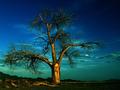
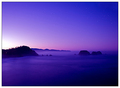
Well, if it is any consolation, THIS: 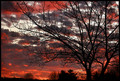 really was very blood red. I did a lot of dodging and burning but other than that, no increase in saturation because it did make it look a little stupid. LOL I only got the shot because my mom was SCREAMING at me, "GO GET YOUR CAMERA!!! RIIIIGHT NOOOOWWWWW!" hehe really was very blood red. I did a lot of dodging and burning but other than that, no increase in saturation because it did make it look a little stupid. LOL I only got the shot because my mom was SCREAMING at me, "GO GET YOUR CAMERA!!! RIIIIGHT NOOOOWWWWW!" hehe
However, the sky around here is weird. We often get weird looking skys... maybe you could come visit with me Judy :) That would be lovely and maybe my sky will put on a show for you while you are here :)
Then there was this the other night:  and my poor kids couldn't take their eyes off it (good thing there were no moving vehicles in the yard). and my poor kids couldn't take their eyes off it (good thing there were no moving vehicles in the yard). |
|
|
|
07/02/2008 11:45:57 AM · #13 |
Originally posted by scalvert:
Hue really think so? |
The topic is not black and white. There are many gray areas.
|
|
|
|
07/02/2008 11:49:40 AM · #14 |
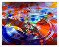
I wonder if it's a matter of preference sometimes. I find myself becoming too reliant on photoshop tools and other editing process. My goal as a newer member here is try and go back to 'basics'...and concentrate more just on taking a good picture. I like the pictures below...
My new mantra when editing..."take your hand off the mouse".... |
|
|
|
07/02/2008 11:58:25 AM · #15 |
| Maybe it's a trend, maybe it's a constant flux. I do find that I often start editing with shadow/highlight followed by a brightness/contrast adjustment layer. Those two things alone can raise the vivid/gaudy factor to a level of discomfort. Some desaturation seems to happen a lot. It's a matter of taste, for sure, and every picture has its own aesthetic, but starting this thread was a worthwhile heads up, IMO. Thanks. |
|
|
|
07/02/2008 12:38:23 PM · #16 |
| ARKK You guys want over saturation, then come to Tucson, the capital of oversaturated sunrises and sunsets |
|
|
|
07/02/2008 12:50:07 PM · #17 |
Since I love color so much I would only consider oversaturation to be the point where pixelation and posterization occurs in the colors. Learning where that line is takes practice and the closer you get to that line the more chance you run of looking bad on the outlier monitors. That's the risk we take for our art.
Viva la colour!
Message edited by author 2008-07-02 12:52:56.
|
|
|
|
07/02/2008 01:42:31 PM · #18 |
Originally posted by DrAchoo:
Viva la colour! |
That's quite a rainbow, Doc! Nice examples showing that color isn't the culprit.
|
|
|
|
07/02/2008 01:52:41 PM · #19 |
::gasp::
Who would even think of doing such a heinous thing?
::stares guiltily down at toes:: |
|
|
|
07/02/2008 02:05:33 PM · #20 |
i always try to keep my shots very natural looking
 |
|
|
|
07/02/2008 02:11:00 PM · #21 |
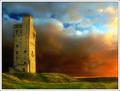
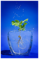
I like color but I know what you mean sometimes people over due it with hue/saturation. It's unfortunate however that people think you over did it when you really didn't saturate it in PP at all. This shot for instance has no editing except for resize and sharpen.
|
|
|
|
07/02/2008 02:15:16 PM · #22 |
Originally posted by JustinM:
I like color but I know what you mean sometimes people over due it with hue/saturation. It's unfortunate however that people think you over did it when you really didn't saturate it in PP at all. This shot for instance has no editing except for resize and sharpen.
|
If that was shot on JPG it does have editing, just in camera. You may have the saturation boosted there.
You may have also stumbled upon the fact that reds supersaturate on Canon sensors (and maybe Nikons too) very easily. Even though I love boosting saturation, I find myself on a fairly regular basis desaturating reds to give a little more detail...
|
|
|
|
07/02/2008 02:25:11 PM · #23 |
Originally posted by DrAchoo:
Originally posted by JustinM:
I like color but I know what you mean sometimes people over due it with hue/saturation. It's unfortunate however that people think you over did it when you really didn't saturate it in PP at all. This shot for instance has no editing except for resize and sharpen.
|
If that was shot on JPG it does have editing, just in camera. You may have the saturation boosted there.
You may have also stumbled upon the fact that reds supersaturate on Canon sensors (and maybe Nikons too) very easily. Even though I love boosting saturation, I find myself on a fairly regular basis desaturating reds to give a little more detail... |
Yeah I guess I failed to mention that. Yeah the saturatin was boosted in camera which I guess in all reality it's the same thing as oversaturation in PP. good point!
|
|
|
|
07/02/2008 02:59:49 PM · #24 |
| Of course it's time to saturate. Makes up for all those years of desaturated over sharpened grunge. |
|
|
|
07/02/2008 03:13:46 PM · #25 |
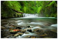
| I oversaturated my Green submission intentionally, trying to for a specific look, and almost every comment to this point refers to that saturation... unfortunately in a negative manner. |
|
Home -
Challenges -
Community -
League -
Photos -
Cameras -
Lenses -
Learn -
Help -
Terms of Use -
Privacy -
Top ^
DPChallenge, and website content and design, Copyright © 2001-2025 Challenging Technologies, LLC.
All digital photo copyrights belong to the photographers and may not be used without permission.
Current Server Time: 11/19/2025 10:06:34 PM EST.


