| Author | Thread |
|
|
04/28/2009 10:41:21 PM |
|
 Photographer found comment helpful. Photographer found comment helpful. |
|
|
10/31/2008 01:15:36 PM |
|
This is absolutely stunning! I was looking at your tutorial on how to photograph waterfalls, wish you'd posted more on the post processing, but only cause I'm a dummy at photoshop. |
|
| Photographer found comment helpful. |
|
|
10/15/2007 01:48:16 AM |
|
This one is a good shot, but apart from the border, i like the original way better than this. The understated looks of the original works for me. Compared to that one, this seems to be shouting out loudly! |
|
| Photographer found comment helpful. |
|
|
03/11/2007 10:26:08 PM |
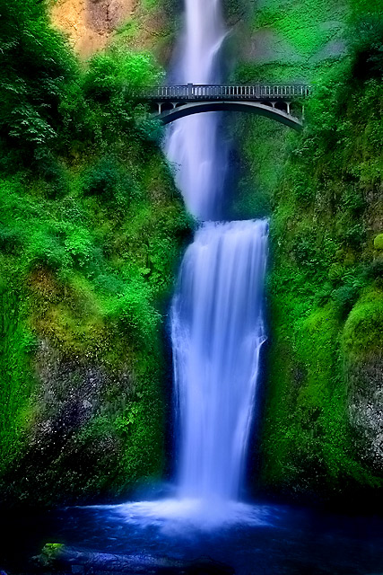
Wow! well done, I have to agree the border is distracting but the post processing really works. Looks like you did the orton effect. I have just recently learned how to do it and I think it will work great on my falls shots. I can't wait for spring.
Do you use any other filters other than nd filter? or do you do most in post processing.
Sam
The Waterfall Hunter |
|
| Photographer found comment helpful. |
|
|
12/05/2006 02:49:05 PM |
|
very beautiful! is it real? :) it looks so perfect! |
|
| Photographer found comment helpful. |
|
|
06/14/2006 02:37:24 PM |
|
Congratulations on your top 20 finish. Excellent shot! |
|
| Photographer found comment helpful. |
|
|
06/13/2006 10:01:43 PM |
|
Greater concentration on the main subject and what a spirited water flow! Congratulations on your top 20 finish. |
|
| Photographer found comment helpful. |
|
|
06/13/2006 01:23:25 PM |
Other than the border, the original photo was superb!!
The post processing in this is way too much, and I miss the log :-(
|
|
| Photographer found comment helpful. |
|
|
06/13/2006 03:13:57 AM |
|
Nice color for the most part, especially the greens, but I feel that the water is a bit TOO blue. Compositionally, however, this is superb. Compared to the original shot, I like this more isolated composition without the foreground log. |
|
| Photographer found comment helpful. |
|
|
06/13/2006 01:55:02 AM |
Needs a border. ;-P
Great job, Doc! |
|
| Photographer found comment helpful. |
|
|
06/13/2006 01:01:34 AM |
Great picture Doc! But I do like your first one better. They are both great pictures!
|
|
| Photographer found comment helpful. |
|
|
06/13/2006 12:14:14 AM |
|
Just shy of beating the score. But then again, that score was pretty high to begin with ;) Great shot and hyper-processing Doc ;P |
|
| Photographer found comment helpful. |
Comments Made During the Challenge  |
|
|
06/12/2006 11:22:46 PM |
|
DNMC :P This is waaay better with no fancyu schmancy border Achoo! I think you're trying to compete with me via the patented Hyper-Processing™ editing techniques eh? Sweet shot dude! |
|
| Photographer found comment helpful. |
|
|
06/12/2006 08:14:06 PM |
|
Too much saturation for my taste. You've created a great piece of surreal/fantasy art, but that green is just too much! :) |
|
| Photographer found comment helpful. |
|
|
06/12/2006 06:54:39 PM |
Holy saturation Batman.
Split the difference on the shutter speed and saturation boost between this and the last one, and I'll give you a 10.
As it is, 8 |
|
| Photographer found comment helpful. |
|
|
06/12/2006 05:03:56 PM |
|
Way too much saturation, but nice subject and composition. |
|
| Photographer found comment helpful. |
|
|
06/12/2006 10:26:43 AM |
|
| Photographer found comment helpful. |
|
|
06/11/2006 01:54:16 PM |
|
I'm going to assume this is Jason's. Improvements over the original - straightened the bridge, lost the border. :-) Do I like this one better? I'm not sure. The first one was processed well but I'm sure there was some room for improvement. This one seems a bit over the top to me, though. I've no doubt the foliage is a wonderful green this time of year there, but is it really that green, and the water that blue? It's still a damn fine shot, but in my completely unprofessional opinion, I think I'd like something between the two. |
|
| Photographer found comment helpful. |
|
|
06/10/2006 07:46:02 PM |
|
Oh now this is nice. I like the velvia feel to it. |
|
| Photographer found comment helpful. |
|
|
06/10/2006 04:11:41 PM |
|
| Photographer found comment helpful. |
|
|
06/09/2006 01:38:36 PM |
|
Over saturated for my taste. still looks nice. |
|
| Photographer found comment helpful. |
|
|
06/09/2006 07:07:47 AM |
|
I remember this image. It is definitely more saturated and the green is very velvety. The water seems less overexposed as well. Nice retake. |
|
| Photographer found comment helpful. |
|
|
06/09/2006 01:52:05 AM |
|
Very very nice! It is a place I will return to again and again. Wonderful color! |
|
| Photographer found comment helpful. |
|
|
06/08/2006 08:09:02 PM |
|
Gorgeous scene but the colours look too fake and oversaturated to me. |
|
| Photographer found comment helpful. |
|
|
06/08/2006 10:48:30 AM |
|
| Photographer found comment helpful. |
|
|
06/08/2006 03:32:00 AM |
|
Beautiful setting, but saturation makes it look fake, with the greens and the blues unnatural. Still a nice shot though. |
|
| Photographer found comment helpful. |
|
|
06/07/2006 02:57:40 PM |
|
surreal for sure. Great color contrast between the blues and greens. I would prefer the greens be somewhere between your original and the hyper-sat greens of this one. Like your tighter cropping choice and the lack of a border on this entry. |
|
| Photographer found comment helpful. |
|
|
06/07/2006 01:14:03 PM |
|
This looks like a lovely fantasy world, maybe something out of Lord of the Rings, or Narnia, or Perelandra. The detail of the hillside gives it a lovely texture. The placement of the bridge is other worldly. The soft flow of the water belies its power. In short a stunning photo which I like very much. That being said, the water is very blue and I can't help thinking I'd like it better if it weren't quite so blue. |
|
| Photographer found comment helpful. |
|
|
06/07/2006 01:55:49 AM |
|
A little to strong in saturation..... |
|
| Photographer found comment helpful. |
|
|
06/06/2006 02:42:03 PM |
|
Wow this is too cool, unreal, LOVE it.....10 |
|
| Photographer found comment helpful. |
|
|
06/06/2006 12:32:23 PM |
|
Let me keep it simple. 10 |
|
| Photographer found comment helpful. |
|
|
06/06/2006 10:45:40 AM |
|
Multnomah Falls is such a beautiful place to photograph. You did a great job of catching it's beauty. Did you read the legend of the Indian maiden while you were there? |
|
| Photographer found comment helpful. |
|
|
06/06/2006 09:28:18 AM |
|
Wow, if ever there was a challenge entry that just glowed this is it. The rich, vibrant greens and blues are simply incredible. Very nice! |
|
| Photographer found comment helpful. |
|
|
06/06/2006 09:26:08 AM |
don't recall the original, but this looks fantastic and I hope you do well with this
Perhaps a little over saturated, that would be my only negative |
|
| Photographer found comment helpful. |
|
|
06/06/2006 01:30:35 AM |
|
I'd gorgeous, just stunning! |
|
| Photographer found comment helpful. |
|
|
06/06/2006 12:59:13 AM |
|
Damn, you went for the full Rikki here didn't ya? If it were me I'd have toned down the warm rocks upper left, made 'em cooler; they really stand out among these surreal blues and greens, to no good advantage. |
|
| Photographer found comment helpful. |
Home -
Challenges -
Community -
League -
Photos -
Cameras -
Lenses -
Learn -
Help -
Terms of Use -
Privacy -
Top ^
DPChallenge, and website content and design, Copyright © 2001-2026 Challenging Technologies, LLC.
All digital photo copyrights belong to the photographers and may not be used without permission.
Current Server Time: 06/29/2026 05:59:28 PM EDT.