| Author | Thread |
|
|
03/10/2008 03:03:13 PM · #1 |
Seems a lot of folks don't get as many comments or reasons for low scores during a challenge. If you have a recent challenge entry that didn't do as well as you'd expected, and after having reviewed it following the close of the challenge still want more feedback, post it here. I'll try to do a few and hopefully others will help out as well. Please include any pertinent information you want considered in either the photographer's comments or with your post.
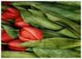
I'd like feedback on my two FS entries so far this year, if anyone is willing.
Edit to add:
Appreciate the comments on these and no more are necessary. The consensus seems to be "no wow factor" though I will admit I really did try for that on the tulips. It was a serious attempt to not only create a decent photograph, but one that might score well (ie 6) here. I did not succeed in that endeavor. I also accept that there really isn't anything I could do to either of these to make them score better. Very good feedback - thanks!
Thanks to all who are contributing to this thread!
Message edited by author 2008-03-11 02:26:32. |
|
|
|
03/10/2008 04:12:10 PM · #2 |
| Left a comment (of sorts). |
|
|
|
03/10/2008 04:18:33 PM · #3 |
Ahhh Deb, already commented on those. :) Guess I will have to go thru and find some more then to leave some comments on...
Here's mine. Just wondering why this color on color did not resonate so well with folks.

|
|
|
|
03/10/2008 04:25:32 PM · #4 |
Good, idea Deb. (I'll comment on yours a later on this evening, when I get some time to look at them more carefully). However, what I would like to know is exactly the opposite. My Led Zepplin entry was quickly done and uninspired. (Not bad enough to get the coveted brown ribbon, however) As you commented, it was a very literal interpretation of the song title. I don't disagree with the final score it got of 4.89. What I would like to know is what qualities it had that made a few people give it 7's 8's and a couple of 10's?

Message edited by author 2008-03-10 16:27:56. |
|
|
|
03/10/2008 04:41:05 PM · #5 |
Thanks, Louis.
Michelle, I've already commented on yours but I went back to try to figure if there was anything I would change. As I said, I love the greens - marvelous greens, actually. One commenter said the shot seemed unbalanced. So I played with a few different crops but couldn't come up with anything I liked better. Perhaps the trailing beads a bit more prominent as they move away from the apple, at least to start? Dunno. And I'm sure this isn't much help. :-) |
|
|
|
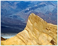
03/10/2008 04:53:24 PM · #6 |
This was my free study entry. The score did not surprise me, but the lack of comments did. My guess is it didn't have enough pop to gather interest, and with comments down generally it just ended up over there in the corner with all the rest. Still, I would be curious to hear your thoughts, good or bad, on the image and will return the favor both in this thread and to the commenters directly. I'm curious because this image didn't really grab me initially, but its kind of grown on me since as I think there is a lot to look at both in the foreground and back here (which, of course, is the kiss of death in a free study!).
 |
|
|
|
03/10/2008 05:03:42 PM · #7 |
Originally posted by colorcarnival:
Ahhh Deb, already commented on those. :) Guess I will have to go thru and find some more then to leave some comments on...
Here's mine. Just wondering why this color on color did not resonate so well with folks.
|
Did these come from Iceland? That may be the problem! *wink, grin* And, where's the nude or the "splash" from items being dropped into a liquid or some sort? (Again, *wink, grin* JUST JOKING AROUND before anyone's knickers get in a knot somewhere!!!!)
Actually, Mich, I thought this was very well done and should have scored higher than it did. As you know, I've commented on this shot and did NOT know it was yours, right? So, it was a truly HONEST comment! I didn't score this as I was also entered into this challenge, but I would have given it a much higher mark than it got.
About the only thing that I can think of, may be that perhaps if, the apple (peeps might not have lingered long enough to have recognized that item) had have been a bit more exposed (3/4's of it rather than half) and recognizable as an apple, it might have given it "more elements" so to speak, but even then.....I'm not sure that it would have made that much of a difference. It seems that it all boiled down to "personal taste" in this challenge rather than anything "wrong" with a shot.
Personally, I felt that this image that I put into the same challenge would have done better than it did. Had lots of wonderful comments, but the score simply did not reflect that in the end. When I look at the winning entries, I see that voters went more for the flowers and colors and liquid dropped items. Again, personal tastes. So, perhaps, it's not what you did "wrong" but, more just a "taste" for bugs and liquids! *grin*
Hey, I know....had you put the beads in a brandy snifter full of green liquid, same background, but created a splash....you likely would have ribboned on it! *grin*

Message edited by author 2008-03-10 17:19:48. |
|
|
|
03/10/2008 05:07:17 PM · #8 |
 From the Led Zeppelin Challenge: From the Led Zeppelin Challenge:
I was really disappointed with the scoring on this one. 5.78
I had very few comments on it as well and have no idea why. Did people just not "get" my sense of humour on this??? I knew it wouldn't ribbon, but I don't understand what was wrong with it. I also spent a lot of time, getting as good a setting as possible as well as talk my husband into being VERY BRAVE and freezing his hiney off to get it! *grin*
Message edited by author 2008-03-10 17:08:53. |
|
|
|
03/10/2008 05:17:46 PM · #9 |
Originally posted by Melethia:
Seems a lot of folks don't get as many comments or reasons for low scores during a challenge. If you have a recent challenge entry that didn't do as well as you'd expected, and after having reviewed it following the close of the challenge still want more feedback, post it here. I'll try to do a few and hopefully others will help out as well. Please include any pertinent information you want considered in either the photographer's comments or with your post.
I'd like feedback on my two FS entries so far this year, if anyone is willing.
|
Deb, this is a "flower shot" that I think is really UNIQUE! It's by far, a much more superb layout/composition than most other flower shots! It certainly has a LOT more interest than a lot of the ribboning flower shots and truly deserved a much higher score than it received. The burning that you did really gave it interest...not to mention clarity in the leaves, which gave the petals a much softer focus and really set a quite nice tone to the entire shot.
Again, as I said with Michelle's shot, I feel that it all came down to "personal tastes" and that the "traditional DPC look" was strayed from which obviously was a real "hit" with some members who truly WANT a change, but the "die hards" who are looking for that "DPC LOOK" just couldn't get past it.
Such a shame because they are missing out on some really terrific work!
"Whiskers" was a GENIUS shot! I love the quality to this one too! Unfortunately, again, it has a more "artsy" look to it and the voters go "traditional". Other than that, I feel that this is a gorgeous shot!!! The crop and contrasts are phenominal! It's just far too "artistic" for this site!
|
|
|
|
03/10/2008 05:31:58 PM · #10 |
Originally posted by yospiff:
Good, idea Deb. (I'll comment on yours a later on this evening, when I get some time to look at them more carefully). However, what I would like to know is exactly the opposite. My Led Zepplin entry was quickly done and uninspired. (Not bad enough to get the coveted brown ribbon, however) As you commented, it was a very literal interpretation of the song title. I don't disagree with the final score it got of 4.89. What I would like to know is what qualities it had that made a few people give it 7's 8's and a couple of 10's?
|
Steve, in looking at this photo again (I didn't score anyone in this challenge), I think that perhaps, it may have been that you had a very "literal" interpretation of the song title, which normally would have done very well....however, in this particular challenge, for some odd reason, they seemed to go with more or less "shoe horned" shots that were more to DPC voter's usual tastes. I think that thinking "outside the box" in this challenge was a "fine line" so to speak. If you thought too far inside the box or too far outside the box, it didn't do well.
Likely, had you perhaps, had a shot of a hand with the change as you've done, extending forward, with a DOF back to a person's pants, pockets hanging out, emptied sort of thing, it may have added an extra "element" which may have caught more attention. I think here that it was voter's wanting to see something "dramatic" in terms of a shot, rather than the person's interpretation of the song title as asked for. To me, the winning entries were really "shoehorned" to fit somewhat, although BRILLIANTLY DONE shots!!! (And, I think that I just answered my own questions about my own shot in LZ challenge! *sigh*)
Again, "artistic merit" doesn't do well in here....only technically brilliant shots. |
|
|
|
03/10/2008 06:30:47 PM · #11 |
| On the Led Zep challenge, I didn't vote in this challenge because I am in the wrong generation. But on reviewing the results, I was impressed by the outstanding quality of the entries. I think this challenge has some of the best photos over all that I've seen. |
|
|
|
03/10/2008 07:08:01 PM · #12 |
left some comments for Melethia and EstimatedEyes. I'll come back to some of the others in a bit.
|
|
Home -
Challenges -
Community -
League -
Photos -
Cameras -
Lenses -
Learn -
Help -
Terms of Use -
Privacy -
Top ^
DPChallenge, and website content and design, Copyright © 2001-2026 Challenging Technologies, LLC.
All digital photo copyrights belong to the photographers and may not be used without permission.
Current Server Time: 04/30/2026 05:19:27 AM EDT.


