| Author | Thread |
|
|
02/13/2008 03:28:48 PM · #1 |
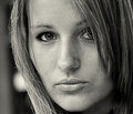
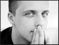
I have a tendency of entering the wrong image...at least in terms of scoring well. I have reasons for going with my heart but I'd figure I'd post a toss up, where I had some trouble choosing. For those who don't know, my model is Nina, a bartender from the restaurant downstairs. The owner was nice enough to let us run outside for two minutes during her shift (when it was slow) to get this shot. A short and sweet shoot....I'll take'em anyway I can get them.
I had this one in at first. Perhaps too heavy?
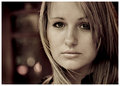
Then I switched to a softer version. Needed a little D&B to lighten the eyes a dash (illegal). I may have a lighter, more delicate version somewhere but I can't find it at the moment.
[thumb]641693[/thumb]
...and wound up with a lightly tinted (yellow) image where I thought people would have less issues in any direction. It looked best as a clean (Basic) edit. IMHO.

Final entry. The eye is pretty sharp but lost a little in the sizing down to 150k. If it weren't for basic I could have turned it into a masterpeice. I think Brad would have rocked the shizzle out of it (pp-wise) if he had the original. I was a little curious why it didn't score much better than it did. I noticed one commentor saying the negative space to the left, as being a distraction...which I think is riddiculous but ok.
I interpreted the Challenge as "the eyes having to show some soul"...something...anything. Not a "sharp eyeball, macro" thing. When I saw a lot of those entries I knew I was in for a long ride. Ah well.
Any thoughts on the whole deal?
Message edited by author 2008-02-13 22:38:14. |
|
|
|
02/13/2008 03:39:33 PM · #2 |
Personally, I'm never quite sure cooler tints work well for portraits. I think your warm colors are better.
|
|
|
|
02/13/2008 03:47:52 PM · #3 |
Personally, I like the first one better, mainly because of the expression. To me, it seems more open and honest, almost plaintive or wistful, like she needs a hug.
And the difference in background is subtle but noticible. I agree with Jason about the warm tones too. :)
|
|
|
|
02/13/2008 03:56:10 PM · #4 |
I liked the first one a lot, but until I opened it and the challenge entry, each in their own window and switched back & forth in the task bar, the difference wasn't readily apparent. The image you did enter Steve, has something the first one doesn't - a bit of an attitude/expression. Your first one there is a tighter crop which puts more of her face on the screen, but until you switch back & forth, you never really see the first one is a bit emotionless. Number 2 with the cool tones isn't natural and is a bit unsettling.
I say you made the right choice.
ETA: Just noticed the shizzle comment - LOL - Thanks!
Message edited by author 2008-02-13 19:16:26. |
|
|
|
02/13/2008 03:56:55 PM · #5 |
I'll add my vote to the first one, too. I agree with your interpretation of the challenge, and scored accordingly. Why I like the first one (even though your entry is still strong!) - her eyes seem more expressive relative to her other facial features. I like the composition, and love the little wisp of hair reaching across her face. In your entry, her lips are saying more than her eyes, and I was drawn immediately to the pout.
I also don't understand why this score as it did. sometimes, results like this simply baffle me! |
|
|
|
02/13/2008 03:57:19 PM · #6 |
Steve, I liked your entry. I gave it a 7, probably should have been higher, but in the general flow of looking at over 200 images, it didn't grab me at the time. Often (not always) entries seem better when they are singled out for further attention, as you've done in this thread. Anyway, she is a lovely model and it's a very good portrait, and though you didn't get a top ten, making the top 50 is not so terrible.
Oh, as to your original point, I think you chose the best of the three treatments. Maybe the eye could have been a bit sharper, not sure how. And btw, I found that many of the eyeball/macros were uninteresting to me. I think the voters felt the same as the eyeball only shots didn't dominate the winners. |
|
|
|
02/13/2008 03:57:40 PM · #7 |
| Liked first one - see comment. Perhaps more crucial than choices of technique and detail are the personal ones - trying to see what it is we are trying to see if that makes any sense. |
|
|
|
02/13/2008 07:22:20 PM · #8 |
The whole challenge was low scoring, so if you were looking at the 5.8 I'd chalk it up to that. You did finish in the top 15%. My take on why it didn't finish higher is the darkness of her eyes. People were likely looking for detail and pop. Brown eyes on a duotone probably just didn't have quite the oomph they wanted. It's a beautiful portrait though.
I wouldn't sweat the score. I only scored a 6.2 and actually figured I had a 7.0 going into the challenge (perhaps I was biased because it was Laine). I was really pleased with the technicals for a basic challenge and I guess there was just too much split between people who wanted to see portraits vs. people who wanted to see macros of eyes only.
|
|
|
|
02/13/2008 09:27:11 PM · #9 |
Originally posted by brownsm:
I'll add my vote to the first one, too. I agree with your interpretation of the challenge, and scored accordingly. Why I like the first one (even though your entry is still strong!) - her eyes seem more expressive relative to her other facial features. I like the composition, and love the little wisp of hair reaching across her face. In your entry, her lips are saying more than her eyes, and I was drawn immediately to the pout.
I also don't understand why this score as it did. sometimes, results like this simply baffle me! |
Yes, that's it! Brad mentioned liking the attitude, and that's what I didn't like :)
Just goes to show ya....! |
|
|
|
02/13/2008 09:51:25 PM · #10 |
| I always have the hardest time selecting which image to go with. Although I guess in the end it doesn't really matter... |
|
|
|
02/13/2008 09:54:13 PM · #11 |
Originally posted by BeeCee:
Yes, that's it! Brad mentioned liking the attitude, and that's what I didn't like :)
Just goes to show ya....! |
I agree about the expression... I like the first one because of the expression and because the color seems more lively. The second pic with the blueish tint gives the picture a lifeless feel to me.
I wonder and it would be interesting to see the ratio of males to females on which expression they prefer. |
|
|
|
02/13/2008 10:20:35 PM · #12 |
For the challenge, I think both are good. Just looking at them as photos, I prefer the first one, both for her expression and the bit of hair crossing her face.
You definitely should shoot more of her. :)
|
|
|
|
02/13/2008 10:40:38 PM · #13 |
| I would have scored the first a solid two points higher for sharpness of eyes and expression. The pout distracted me from the challenge aspect and was overall a great image, but as said before, did not stand out (perhaps grey vs red overtones?). I would have 4'd or 5'd the blue one instantly and never looked again at it in my second pass to finalize scoring. Only the noise factor, not the bokeh lights would have kept me from giving number one a nine or ten. Her eyes screamed sadness, "Take me away from this place," and yet the others lost even that unspoken plea. |
|
|
|
02/14/2008 11:30:16 AM · #14 |
Originally posted by Arcanist:
I would have scored the first a solid two points higher for sharpness of eyes and expression. The pout distracted me from the challenge aspect and was overall a great image....
I would have 4'd or 5'd the blue one instantly and never looked again at it in my second pass to finalize scoring. Only the noise factor, not the bokeh lights would have kept me from giving number one a nine or ten. Her eyes screamed sadness, "Take me away from this place," and yet the others lost even that unspoken plea. |
I'm trying to sort this out...
I think her eyes in the actuall entry image are far more expressive than the first two outtakes. Regarless of sharpness, shouldn't that be more important to the essence of the Challenge. I mean, they aren't out of focuse...just not ultra hyper sharp...easily sharp enough to be telling. I think people put too much of a premium on sharpness and miss the boat on what really matters. I'd say the same about noise. Unless it's awful and truly interfers whith the subject or what the photographer is trying to convey, I'd hope that people wouldn't make an issue of it. Removing points based on that criteria seems misguided. Based on noise, crops, distractions and sharpness...you would be rating some of the greatest moments captured in history pretty low, I would assume? If you think about it, all that stuff is just arbitrary data. Not worth as much time, thought or energy as it's too often given...IMO
The pout being a distraction....I can't understand. That's relative to saying her nose is in the way.
Lev-I really dig the way her hair sweeps across her face in the first shot but I also thought her expression was sweet but not strong enough to be considered meaningful.
Doc-I rarely sweat the score but I did think by comparison and overall, it should have at least broken a 6 (which is my only goal). After seeing so many entries where faces were cut off to show the eyes (only) made many shots lifless (IMO) and telling almost nothing of the subject. I kinda sensed that people missed the point and many of the images. Not to pick on the Blue but I see more glitter than "soul" in that shot. Literally and figuratively more sparkle than substance... but that's just my opinion. No offense, I hope.
Citymars-"And btw, I found that many of the eyeball/macros were uninteresting to me. I think the voters felt the same as the eyeball only shots didn't dominate the winners."
The eyebal macros being uninteresting is an understament (LOL). Pretty sterile take on the Challenge in terms of creativity (put me to sleep, while voting...Zzzzzzzz) and in fact, an "eyeball macro" did win the Blue.
As for the blue tinted edit I did. Yuck! I can't stand it now. Perhaps a very, very light shading but the one I posted is way over the top. I think combined, between the two images I have about 15-20 different edits and I'm glad given the variation that I didn't make a far wrong choice.
Any other thoughts, please chime in...
Message edited by author 2008-02-14 11:47:50. |
|
|
|
02/14/2008 12:44:10 PM · #15 |
Originally posted by pawdrix:
I'm trying to sort this out...
The pout being a distraction....I can't understand. That's relative to saying her nose is in the way.
Any other thoughts, please chime in... |
I think it is a pucker, it appears fairly prominent - all the versions are very good.
Message edited by author 2008-02-14 12:47:13. |
|
|
|
02/14/2008 01:10:59 PM · #16 |
For one thing, there's just no crispness to the image at all, and that doesn't work very well for eyes I don't think. Then the cropping of it seems at odds with the challenge topic to me. I don't see the negative space on the left working well for this topic, and the nose lips are taking pride of place compositionally. As opposed to this:
This has been sharpened quite a bit, and cropped to make the eyes more the focus of the image. IMO, at least...
R.
Message edited by author 2008-02-14 13:11:08. |
|
|
|
02/14/2008 01:40:57 PM · #17 |
Hopefully to clarify...
I read a lot of expression in the first image. Her head is tilted away, the eyes are sharp and the lips are not vying for attention. I saw sadness there. In the entered image, her head was pushed forward and she had the pout, it conveyed a certain aggressivness to me, but drew my eyes to the lips and chin, not the eyes.
I rarely hit scores for noise level unless the shadows are extremely grainy while the main subject looks noise ninja'd and they conflict in the same frame. In this one, I suspect I may have dropped one point, but was more stating that the lights were not the conflict I would have been having.
Above all, IMO the grey/yellow one just kind of blended into greyness and the red one had punch.
|
|
|
|
02/14/2008 01:46:12 PM · #18 |
Talk about entering the wrong photo....Here was my entry:
and here were my choices...
   
And here is my entry before I ruined it thinking that I should crop closer to the eyes for this challenge:

PS, Steve I gave your photo a 9 and it is my favorite of the 3 so now you know not to ever take my advice when picking photos :)
|
|
|
|
02/14/2008 02:07:11 PM · #19 |
Originally posted by Arcanist:
Hopefully to clarify...
I read a lot of expression in the first image. Her head is tilted away, the eyes are sharp and the lips are not vying for attention. I saw sadness there. In the entered image, her head was pushed forward and she had the pout, it conveyed a certain aggressivness to me, but drew my eyes to the lips and chin, not the eyes.
|
This is exactly what I saw and felt. Others obviously preferred the second expression.
Pawdrix, as for basing part of the score on technicals, I believe that's part of our job on THIS site.
Since we're trying to help people become better photographers we need to take all facets of the work into consideration. For example, I see (and have taken) what would be good shots except they're wrecked by background. The photographer is so busy seeing the subject he doesn't see the rest of the content, and that's pretty much the norm with your average camera-holder. We point these things out to help folks progress beyond average. By picking at the details we help them SEE those details they may have not even considered.
So while artistically great shots may get passed by here, I do feel we should be looking at more than JUST artistic merit, though that does need to be considered along with technical merit. |
|
|
|
02/14/2008 02:40:14 PM · #20 |
Bear has possibly clarified this interestingly sustained - well sustained for dpc - discussion of the original pics. My preference was for the first pic, based most principally it now appears on personal human criteria - the accessibility of the expression. Compositionally and aesthetically - the tilt of the head, the prominence of the right eye, the entered photo is more polished/professional. Whether the expression in it is more "meaningful" is open to debate: more professional-model-like, it is colder, even almost empty, than the natural one in the first pic.
|
|
|
|
02/14/2008 03:26:29 PM · #21 |
Originally posted by BeeCee:
Pawdrix, as for basing part of the score on technicals, I believe that's part of our job on THIS site.
Since we're trying to help people become better photographers we need to take all facets of the work into consideration. |
Interesting point and to an extent I understand and agree. I have the luxury of showing my work weekly, if not more often to top, high-paid... and more important, highly respected people in the industry (ad, gallery owners, news editors, stringers, reportage, etc.)and here's the killer...The Killer...
When I show them images and I myself point out flaws that seem to be big...huge DPC no, no's they have NO idea what I'm talking about or why the flaws bother me. They look at me and say..."who cares" and point out the beauty or the pertinent aspects of the shot and significant details that honestly make or break an image. It's not that they don't understand these things but they are looking or seeing beyond it and hardly factor that stuff in, unless they can't understand what I was trying to convey.
As I said before, the technicals here are held at a high premium and the rest seems to be overlooked. This is in no relation to my shots but substance gets well overlooked if sharpness doesn't seem to be sharp enough.
Bear-"I have reasons for going with my heart ..." as I said in the op. I hoped that people would have seen enough detail or "soul"..."mystery" without having to zero right in. Leave a little, a dash to the imagination...not everything but a little. Quite the opposite from what the Challenge produced on a whole. I like your crop a though little too tight to the chin but compared to the entries that cut out the entire face...I'll gladly meet you in the middle. LOLOL.
tnun-I prefer the first one, as well but I thought it was too heavy looking and it didn't strike me well at the time in B&W. If I had the patience I would probably go back to all my favorites and completely re-edit them but who has the time.
Cheers!
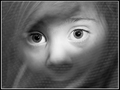
ETA: This shot
...was one of my faves and IMO one of the few where the eyes themselves told a little story about the subject. Pensive, humorous, mischevious...warm etc. One of the few in the Challenge to accomplished that.
Message edited by author 2008-02-14 19:26:58. |
|
|
|
02/14/2008 06:55:31 PM · #22 |
Originally posted by pawdrix:
ETA: This shot
...was one of my faves and IMO one of the few where the eyes themselves told a little story about the subject. Pensive, humorous, mischevious...warm etc. One of the few in the Challenge that accomplished that. |
I agree, and wouldn't have been a fraction as effective cropped to basically JUST the eyes. They're a part of the whole package, but THE important part.
As to the part of your comment I clipped;
I agree that we on DPC stress certain things too strongly, I just don't want them to be ignored altogether. We just need to find a better balance? Tricky thing, though. |
|
|
|
02/14/2008 07:08:21 PM · #23 |
Yikes! Thanks for bringing  Mario's shot to my attention. Mario's shot to my attention. |
|
|
|
02/14/2008 07:23:27 PM · #24 |
I find that if pick an image by myself it usually does poorly, however if I use the aid of my wife or children I usually fair a bit better. Sometimes the photographer is to close to an image and can't see the beauty in the others. Thats why there are photo editors. Photographers are not always the best ones to pick their own images.
As for your image I like the edit that you choose, however I find her eyes and expression emotionless, almost haunting. It does invoke emotion in me, but I don't see any in her. Just my thoughts.
Message edited by author 2008-02-15 06:17:01. |
|
|
|
02/15/2008 12:53:12 PM · #25 |
Originally posted by iamkmaniam:
I find that if pick an image by myself it usually does poorly, however if I use the aid of my wife or children I usually fair a bit better. |
That's funny. I have the exact opposite experience. Anytime I ask for selection advice or have been prompted to enter a certain image it undoubtedly tanks.
ETA:I then turn around...delegate full blame to the person who gave me the awful advice and bad mouth them in public...as God intended.
Message edited by author 2008-02-15 13:35:10. |
|


