| Author | Thread |
|
|
11/19/2007 12:00:54 AM · #1 |
| Post your outtakes from the Duotones III challenge here. |
|
|
|
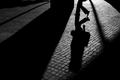
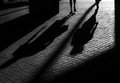
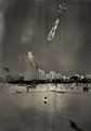
11/19/2007 12:23:19 AM · #2 |
Would any of these have done any better?
Original Entry @ 5.1013
Others 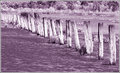 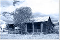 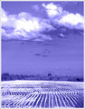 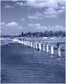 |
|
|
|
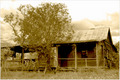
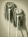
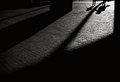
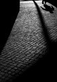
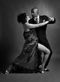
11/19/2007 12:48:54 AM · #3 |
My entry did very well, so I entered the right one, but for the sake of humor, here's the one I had earlier in the week:
|
|
|
|
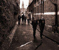
11/19/2007 12:53:43 AM · #4 |
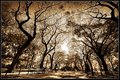
went a little nuts with the editing here, glad I stuck with the my Times Square shot... |
|
|
|
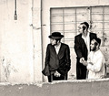
11/19/2007 01:02:47 AM · #5 |
Judging by the results I guess this pic would have done better (lots of portraits in this challenge)
[thumb]614745[/thumb]
Funny I really thought the picture I submitted had much more character
|
|
|
|
11/19/2007 01:06:25 AM · #6 |
Originally posted by Oded:
Judging by the results I guess this pic would have done better (lots of portraits in this challenge)
[thumb]614745[/thumb]
Funny I really thought the picture I submitted had much more character
|
I really like them both and I think they work well together as a pair. I do like your entry just bit better. |
|
|
|
11/19/2007 02:02:30 AM · #7 |
 my entry my entry
My out takes. All pretty similar really, just different subjects and slightly different comp. : )
   |
|
|
|
11/19/2007 02:06:01 AM · #8 |
but it was overlayed and i couldnt get it to look
good without. |
|
|
|
11/19/2007 02:22:49 AM · #9 |
I actually like the first one even more than my entry, I think it has a genuine retro look I was after, but i thought (probably correctly this time) that it would not do as well in the challenge...
I may post some color "outtakes" later...
Message edited by author 2007-11-19 02:25:28. |
|
|
|
11/19/2007 02:53:24 AM · #10 |


idk which i liked more |
|
|
|
11/19/2007 02:58:39 AM · #11 |
challenge entry:

color version: (i wish i could've entered this one)
 |
|
|
|
11/19/2007 04:31:36 AM · #12 |
I actually thin your last one would have done much better - even though I think it should have been cropped in the bottom. The blue tone is great I think... |
|
|
|
11/19/2007 04:36:30 AM · #13 |
|
|
|
11/19/2007 05:35:55 AM · #14 |
My original edit...
I was worried about the brightness of the sky and decided to do a quick burn on the sky (but I did it after I had colorized the b/w image). Oops!
My entry...

I agree with many of the comments about the strange tint of the sky in my final entry. I think I should have gone with my original edit. |
|
|
|
11/19/2007 07:29:57 AM · #15 |
Originally posted by briantammy:
challenge entry:
color version: (i wish i could've entered this one)
|
The Duo-Tones one is *much* more powerful!
|
|
|
|
11/19/2007 07:55:24 AM · #16 |
This one was so much fun......when I dumped it out of the camera, I saw the weird effect and I thought, "WTF??????".
[thumb]614808[/thumb]
Then after I thought about it, I realized that after shooting outside in 20º weather and then going into the warm church......it was condensation.
So this was my entry with "Temperature Compensation"......kicked the WB into the stratosphere for the blue effect.

|
|
|
|
11/19/2007 08:07:54 AM · #17 |
oops...nvm! :)
Message edited by author 2007-11-19 08:11:53. |
|
Home -
Challenges -
Community -
League -
Photos -
Cameras -
Lenses -
Learn -
Help -
Terms of Use -
Privacy -
Top ^
DPChallenge, and website content and design, Copyright © 2001-2026 Challenging Technologies, LLC.
All digital photo copyrights belong to the photographers and may not be used without permission.
Current Server Time: 04/29/2026 07:51:00 AM EDT.


