| Author | Thread |
|
|
11/05/2007 12:31:59 AM · #1 |
I entered this image into "the beginning of the end".
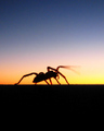
I know there is some awesome talent here, so I did not expect to win (or even come close), but I was disappointed at the totally mediocre performance this photo did, and only one comment. (I've learned now that a lack of comments is a sure sign of middle-of-the-roadness) I thought this photo was one of my best.
If you gave this a 5 or lower, I would sure appreciate knowing what kept this so low. Was it technical reasons, for instance, the motion blur on the leg? Thanks in advance.
-Steve |
|
|
|
11/05/2007 12:37:04 AM · #2 |
Fist off let me say its not a bad shot, but I gave this a five for the following reasons:
Technicals:
The sillhoutte of the spider is a bit blurry. That means problably that your shutter speed was not fast enough.
Compostion: Your subject is close to the center.
The noise takes away, its not very sharp. Other than that, the photo is alright. Nothing that would have called my attention when voting. Sorry.
Maybe if photo was in a horizontal frame which would have put the spider in a third.
That was my reasoning and only my 2 cents. If I had given it below a 5 I would have given a reason in the comments.
|
|
|
|
11/05/2007 12:38:17 AM · #3 |
well i gave you 6, i like the shot, it didnt make me say WOW! but i like it...i wonder if maybe entitling it "goodbye to another day" would have helped some people make the connection.
on a technical note, the bottom of the legs seem a bit OOF and the sky would have been helped by a bit of noise ninja or some such. Hope this helps.
J
|
|
|
|
11/05/2007 01:05:05 AM · #4 |
Thanks for the feedback.
I removed as much noise from the sky as I felt I could without damaging the main subject. I had thought the slight grain might show and obviously it did. I liked the way she appeared to be waving in this one.
I may go back and re-edit with one of my other images of this spider. Since I won't be restricted with basic editing rules, I can do a selection on the sky and get it really smooth.
An SLR would have probably done better on this as well. I think shots like this run into some of the limitations of my Canon S5. |
|
|
|
11/05/2007 01:07:47 AM · #5 |
About the noise in the sky, one thing that might help is if you select the blue channel and run something like Noise Ninja just on that channel. That should improve your sky quite a bit without affecting your subject.
That would be legal in advanced, but not in basic editing. |
|
|
|
11/05/2007 01:15:52 AM · #6 |
Originally posted by ursula:
About the noise in the sky, one thing that might help is if you select the blue channel and run something like Noise Ninja just on that channel. That should improve your sky quite a bit without affecting your subject.
That would be legal in advanced, but not in basic editing. |
Say what? I thought it was legal to do legal adjustments on channels? Certainly, in Neat Image I can set the parameters to remove noise only in specific color ranges, and i was sure THAT was legal...
People sharpen all the time on the luminance channel in cmyk, and then convert back to rgb, too. is THAT illegal in basic?
R.
|
|
|
|
11/05/2007 01:20:46 AM · #7 |
| Personally, I think it's the composition that holds this photo back, as well as it not being sharp of course. There's just not enough in the composition to hold my interest, and I'm not sure why the photo is in portrait mode. If there was something of interest in the top 2/3rds of the shot rather than just a gradient of sunset colours, this would make more sense. Otherwise, I would have gone for landscape and put the spider right on the left. Here, there is negative space to the left of the spider which feels superfluous. The composition here feels like it hasn't been thought through, other than a superficial rule of thirds for the horizon. |
|
|
|
11/05/2007 01:23:42 AM · #8 |
Originally posted by Bear_Music:
Originally posted by ursula:
About the noise in the sky, one thing that might help is if you select the blue channel and run something like Noise Ninja just on that channel. That should improve your sky quite a bit without affecting your subject.
That would be legal in advanced, but not in basic editing. |
Say what? I thought it was legal to do legal adjustments on channels? Certainly, in Neat Image I can set the parameters to remove noise only in specific color ranges, and i was sure THAT was legal...
People sharpen all the time on the luminance channel in cmyk, and then convert back to rgb, too. is THAT illegal in basic?
R. |
Selections are not legal in basic. And I was talking about selecting all the pixels of the blue channel, as in a mask. Shucks, I hope I'm wrong, 'cause I would love to be able to do this in basic.
I always thought that working on channels (like in curves for example) was OK in basic, but selecting all the pixels of a channel (as in going to the blue channel and option clicking it to select all the blue channel pixels) was not.
I guess the way I've always [roughly] sorted these out in my mind was, if it makes a squiggly line selection, then it's not legal in basic; if it doesn't make a squiggly line selection then it's OK. For the most part that is.
Message edited by author 2007-11-05 01:26:27. |
|
|
|
11/05/2007 02:38:14 AM · #9 |
If we are going to complain about mediocre scores just check mine out for the same challenge.

Scored the highest number of 1's, 2's and 3'd that I have ever received.
I didn't expect it to be a winning shot by any stretch of the imagination but it I'm shocked at how low it scored. Some great comments from people who took the shot as an entry for a competition with a topic of 'The beginning of the end', others were obviously offended by the image and didn't look at it in that light.
I even got a DNMC because I had the razor blade the wrong way - how sad is that.
I had expected this shot may finish in the very low 5's because of the type of shot it is, but to finish under 5 really did surprise me.
Things I learned from doing this shot, regardless of how badly it scored:
1. bounce light
2. vignette
3. fake blood (and it looked pretty real to - if you need the receipe PM me)
Message edited by author 2007-11-05 02:40:52. |
|
|
|
11/05/2007 02:51:55 AM · #10 |
Originally posted by ursula:
Originally posted by Bear_Music:
Originally posted by ursula:
About the noise in the sky, one thing that might help is if you select the blue channel and run something like Noise Ninja just on that channel. That should improve your sky quite a bit without affecting your subject.
That would be legal in advanced, but not in basic editing. |
Say what? I thought it was legal to do legal adjustments on channels? Certainly, in Neat Image I can set the parameters to remove noise only in specific color ranges, and i was sure THAT was legal...
People sharpen all the time on the luminance channel in cmyk, and then convert back to rgb, too. is THAT illegal in basic?
R. |
Selections are not legal in basic. And I was talking about selecting all the pixels of the blue channel, as in a mask. Shucks, I hope I'm wrong, 'cause I would love to be able to do this in basic.
I always thought that working on channels (like in curves for example) was OK in basic, but selecting all the pixels of a channel (as in going to the blue channel and option clicking it to select all the blue channel pixels) was not.
I guess the way I've always [roughly] sorted these out in my mind was, if it makes a squiggly line selection, then it's not legal in basic; if it doesn't make a squiggly line selection then it's OK. For the most part that is. |
You don't have to do that, though; you can just apply neat image or noise ninja to the blue channel globally. No selection is required, any more than you make a "selection" when you use hue/saturation in the blue channel...
R.
Message edited by author 2007-11-05 02:52:24.
|
|
|
|
11/05/2007 04:17:28 AM · #11 |
Originally posted by RamblinR:
If we are going to complain about mediocre scores just check mine out for the same challenge.
Scored the highest number of 1's, 2's and 3'd that I have ever received.
I didn't expect it to be a winning shot by any stretch of the imagination but it I'm shocked at how low it scored. Some great comments from people who took the shot as an entry for a competition with a topic of 'The beginning of the end', others were obviously offended by the image and didn't look at it in that light.
I even got a DNMC because I had the razor blade the wrong way - how sad is that.
I had expected this shot may finish in the very low 5's because of the type of shot it is, but to finish under 5 really did surprise me.
Things I learned from doing this shot, regardless of how badly it scored:
1. bounce light
2. vignette
3. fake blood (and it looked pretty real to - if you need the receipe PM me) |
Voters can be quite sensitive and don't want to be confronted with something so raw, so real. Roz's red ribbon photo is similar to yours in that she showed what is a controversal subject however she did it in a very PG sort of way. She didn't show the raw reality of being addicted to crack. Had she did her score would have plummeted. So if you want to improve your score with a setup shot like this make it prettier to look at.
Message edited by author 2007-11-05 04:20:26.
|
|
|
|
11/05/2007 05:20:11 AM · #12 |
Originally posted by yanko:
She didn't show the raw reality of being addicted to crack. |
You mean coke, you snort coke, you smoke crack...
ummm, or so I have heard.. |
|
|
|
11/05/2007 05:33:57 AM · #13 |
Originally posted by yanko:
She didn't show the raw reality of being addicted to crack. |
It seemed she showed the raw reality of getting married. :P
to be a little more productive, you could have done a lot with that 50 mm 1.8 you used. Things that would have helped this shot could have been a better lighting set up. It looks underexposed, using a large aperture(~f2) you could have played with DoF, and you would have been able to get more light in the shot. Putting the focus on the rings and put more storytelling into the photo and let the viewer fill in the details but still know of the impending doom/suicide. I think focus on the rings with an ambiguous title like "cheated" would have brought the score up. also a properly exposed image will always score better than an underexposed one, regardless of subject matter I find.
Message edited by author 2007-11-05 05:34:09. |
|
|
|
11/05/2007 05:58:02 AM · #14 |
Originally posted by jdannels:
[quote=yanko]
to be a little more productive, you could have done a lot with that 50 mm 1.8 you used. Things that would have helped this shot could have been a better lighting set up. It looks underexposed, using a large aperture(~f2) you could have played with DoF, and you would have been able to get more light in the shot. Putting the focus on the rings and put more storytelling into the photo and let the viewer fill in the details but still know of the impending doom/suicide. I think focus on the rings with an ambiguous title like "cheated" would have brought the score up. also a properly exposed image will always score better than an underexposed one, regardless of subject matter I find. |
Thanks for the tip - something more like this then?
[thumb]609156[/thumb] |
|
|
|
11/05/2007 06:14:29 AM · #15 |
Originally posted by RamblinR:
Originally posted by jdannels:
[quote=yanko]
to be a little more productive, you could have done a lot with that 50 mm 1.8 you used. Things that would have helped this shot could have been a better lighting set up. It looks underexposed, using a large aperture(~f2) you could have played with DoF, and you would have been able to get more light in the shot. Putting the focus on the rings and put more storytelling into the photo and let the viewer fill in the details but still know of the impending doom/suicide. I think focus on the rings with an ambiguous title like "cheated" would have brought the score up. also a properly exposed image will always score better than an underexposed one, regardless of subject matter I find. |
Thanks for the tip - something more like this then?
[thumb]609156[/thumb] |
exactly, and maybe lighten it more, I left you a comment :) |
|
|
|
11/05/2007 06:32:44 AM · #16 |
Originally posted by jdannels:
Originally posted by RamblinR:
Originally posted by jdannels:
[quote=yanko]
to be a little more productive, you could have done a lot with that 50 mm 1.8 you used. Things that would have helped this shot could have been a better lighting set up. It looks underexposed, using a large aperture(~f2) you could have played with DoF, and you would have been able to get more light in the shot. Putting the focus on the rings and put more storytelling into the photo and let the viewer fill in the details but still know of the impending doom/suicide. I think focus on the rings with an ambiguous title like "cheated" would have brought the score up. also a properly exposed image will always score better than an underexposed one, regardless of subject matter I find. |
Thanks for the tip - something more like this then?
[thumb]609156[/thumb] |
exactly, and maybe lighten it more, I left you a comment :) |
Thanks Joe - very very helpful. This tones the image down and it may have been received much better.
Actually, after having looked at this image so much (update button and all - wishing the score to go up) I think I would have changed the image to show the razor blade where the rings are and blood running from the top of the arm. To have blurred it like this would have been great and to keep the razor in focus to show what had taken place. Oh well, too late now. lol
Message edited by author 2007-11-05 06:40:34. |
|
|
|
11/05/2007 09:15:38 AM · #17 |
Originally posted by yospiff:
I removed as much noise from the sky as I felt I could without damaging the main subject. |
In advanced editng, you could have ran noise reduction on just the sky by putting the sky in its own layer and working on it their, then flatten when done. Or, like was already suggested, you could reduced noise on a specific color (or colors).
Noise wasn't what caught me eye as much as the blurred sillhouette. Maybe a smaller aperture would have brought more into focus. f/2.7 is much to large for this type of shot (unless the spider was moving quickly).
By the, this was a very unique capture!
Message edited by author 2007-11-05 09:26:04.
|
|
|
|
11/05/2007 10:02:37 AM · #18 |
Originally posted by AperturePriority:
Noise wasn't what caught me eye as much as the blurred sillhouette. Maybe a smaller aperture would have brought more into focus. f/2.7 is much to large for this type of shot (unless the spider was moving quickly). |
Thanks for all the feedback. I'm learning a lot from this. I can't go back and do this shot over, but I can play around with some of my other images from the same session and correct some of the post processing things.
I think this type of shot was really pushing my camera, but it's going to be some time before I can justify the purchase of an SLR, I only recently upgraded from a small P&S.
Message edited by author 2007-11-05 10:03:08. |
|
|
|
11/05/2007 10:24:59 AM · #19 |
Originally posted by yospiff:
I entered this image into "the beginning of the end".
I know there is some awesome talent here, so I did not expect to win (or even come close), but I was disappointed at the totally mediocre performance this photo did, and only one comment. (I've learned now that a lack of comments is a sure sign of middle-of-the-roadness) I thought this photo was one of my best.
If you gave this a 5 or lower, I would sure appreciate knowing what kept this so low. Was it technical reasons, for instance, the motion blur on the leg? Thanks in advance.
-Steve |
I gave it a "it's ok 5 vote". The composition was the first thing for me to want to move on. A landscape orientation instead of portrait would have been better IMO. The spider is a bit centered and I'd have like to seen much less black (say only a 1/3 of what's shown) at the bottom. Based on this quick impression I never even noticed the noise (didn't make it to the technical scrutiny stage). As for the motion in the legs, I thought that added to the image in a good way.
Regarding your camera; that's supposed to be a highly rated P&S isn't it? One consideration is to play more in aperture priority mode to control the DOF (someone in this thread mentioned it). I wouldn't give up in yet. :-)
|
|
|
|
11/05/2007 10:43:22 AM · #20 |
Originally posted by yospiff:
I think this type of shot was really pushing my camera, but it's going to be some time before I can justify the purchase of an SLR, I only recently upgraded from a small P&S. |
This type of shot should be within the capabilities of your P&S. What mode were you in when you shot that? - Macro mode would have allowed you to get closer to the spider and would have produced a sharper silhouette (but f/2.8 is too large, you'd need to use a smaller aperture for macro mode)
Generally in macro shooting (and this applies to dSLR as well) you need a small aperture (f/11 or smaller) to have a good chance of getting the focus right. The trouble with using f/2.8 in macro is that the in-focus band is about 1mm. |
|
|
|
11/05/2007 10:53:32 AM · #21 |
Posted a comment for you.
|
|
|
|
11/05/2007 11:39:23 AM · #22 |
| I may have had it in program mode. I had a monopod, but I might have done this handheld, as the monopod kept me from getting close enough. It was a very small spider! With a 1.4 second exposure time as it was, I don't know if I could have gone to a smaller aperature. I'll try it that way the next time I run across a similar situation. |
|
|
|
11/05/2007 12:02:36 PM · #23 |
| Don't blame it on your camera. it IS a difficult shot to pull off with any camera, not just yours. For this shot to work the focus has to be really crisp, and yet if you want to depict waving of one of the legs you need a longish exposure, plus it is a macro shot (very shallow DOF) - so a tripod is an absolute must. It could be improved somewhat in post-processing (composition, noise, etc.) but there was nothing that you could do about the focus, and that was the most important flaw, IMO. |
|
|
|
11/05/2007 12:38:17 PM · #24 |
Originally posted by glad2badad:
The spider is a bit centered and I'd have like to seen much less black (say only a 1/3 of what's shown) at the bottom. |
To further this, if you'd given it the Cowspace treatment, along with that great gradient sunset (or whatever that BG is), I bet you'd have seen top 20.
|
|
|
|
11/05/2007 03:22:24 PM · #25 |
Here's the same image with with neat Image in blue channel, cropped and skewed for a little more dynamic flow, and sharpened a little:
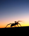
R.
|
|


