| Image |
Comment |
| 11/13/2009 01:15:30 PM |
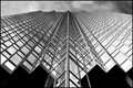
Pillar of Reflectionby jegerComment: Strong image! Great choice for the B&W! The black part at the bottom could be croped in my opinion. Nice shot. |
 Photographer found comment helpful. Photographer found comment helpful. |
| 11/13/2009 01:15:23 PM |
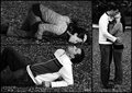
Let the Battle Beginby denboteComment: Classy shot! I'm not a fan of the border, maybe because of its black sides, i think the top and the bottom would be enough! The light is great! You did a nice job there! |
| Photographer found comment helpful. |
| 11/12/2009 11:34:00 PM |
Long Legged Flyby rozComment: What can i say? I always like green things, not to say that this is an amazing macro!
Adding to my favorites! |
| Photographer found comment helpful. |
| 10/26/2009 11:14:02 AM |
|
| Photographer found comment helpful. |
| 10/21/2009 12:32:04 AM |
Together at Lastby VitaminBComment: Awww! Great idea and choice for the B&W! The composition and the pp are really classy, so as the light. I hope you get a very good score! |
| Photographer found comment helpful. |
| 10/14/2009 03:16:40 PM |
haloby LelezComment: Lelez! Parabéns pelo seu novo PB!
BelÃssimo abstrato! |
| Photographer found comment helpful. |
| 10/06/2009 10:34:24 AM |
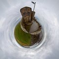
Lindisfarne Castle Planetby bobonacusComment: Woa! Really great shot! I don't have any idea how you did it, but i'm willing to learn! The "planet" is great. I wish the grass were more brighter and the green of it were more saturated.
Great planet! Cheers to the population of Lindisfarne. |
| Photographer found comment helpful. |
| 10/01/2009 11:01:07 PM |
The Pelicanby JedusiComment: Great image! The light is beautiful and the textures of the Pelican feathers are really pleasing someway. The image looks a little grainy at the background and bottom here on my monitor, but this is actually adding something to the shot in my opinion. Great choice for the B&W. You should use that kind of thing in a challenge, at least it would get an 8 to 10 from me. |
| Photographer found comment helpful. |
| 09/21/2009 12:25:21 AM |
|
| Photographer found comment helpful. |
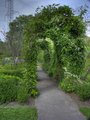
| 09/20/2009 11:09:29 PM |
HDR Archwayby binsurfComment: I like the top of this shot. The sky and the leaves are looking great there. I'm not a fan of the perspective though. The floor and this left part of the shot with this weak light and saturation are not helpin there. But the HDR theme looks just fine for me there. With more saturation, more bright and a different perspective this would be really nice for me. |
| Photographer found comment helpful. |
Home -
Challenges -
Community -
League -
Photos -
Cameras -
Lenses -
Learn -
Help -
Terms of Use -
Privacy -
Top ^
DPChallenge, and website content and design, Copyright © 2001-2025 Challenging Technologies, LLC.
All digital photo copyrights belong to the photographers and may not be used without permission.
Current Server Time: 08/21/2025 01:13:54 AM EDT.