| Image |
Comment |
| 01/02/2007 05:46:34 PM |
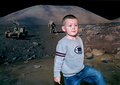
"Hey Schmitty, how about some O2 over here!"by NaldComment: Several things seem to be a little off in this one. The skin tones on the model are just a bit too redish/pinkish. (I hate skin tones myself...) The composition looks a litte awkward. The model isn't on a third line or centered but just a bit off from center. This may look more natural if he weren't looking out of the frame. I'm assuming that you placed him in this position to capture the moonbuggy in the shot. Turning him the other way may have helped...
TC |
 Photographer found comment helpful. Photographer found comment helpful. |
| 01/02/2007 05:43:37 PM |
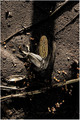
Famineby TranquilComment: I don't know why, but something just doesn't look right about this shot. I've come back 4 or 5 times to try and figure it out but can't. I THINK it's the harsh shadow going right up the center of the shot and enveloping the main subject.
TC |
| Photographer found comment helpful. |
| 01/02/2007 05:42:22 PM |
Fire and Iceby tooterComment: This looks like it is just a tad crooked. Could be the perspective though...
TC |
| Photographer found comment helpful. |
| 01/02/2007 05:41:21 PM |
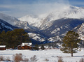
Winter Refugeby hahn23Comment: I would not call having to wake up and see a scene like this harsh, but can see how it can fit the challenge! :-P Nice entry.
TC |
| Photographer found comment helpful. |
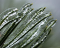
| 01/02/2007 05:40:26 PM |
freezing rainby ralphComment: Nice and simple! Nothing blown out which is always a good thing. Background could be a bit less blah in color but it is what it is.
TC |
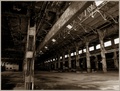
| 01/02/2007 05:39:23 PM |
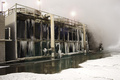
Burned out Train Engine Factoryby grainman9Comment: Like the lines in this. Definatly fits the challenge. Only thing I don't like and could be fixed easily I'm told (I never could figure it out...)j is the perspective. It's not fish eye off which would actually look good, it's annoying off. If you don't know what I mean, it's how the building looks like it's leaning in on itself...
TC |
| 01/02/2007 05:37:19 PM |
don't jumpby skewsmeComment: LOL... I didn't even see the cat till I came back to comment on the shot. This is not exactly a photogenic scene, but fits the challenge well and doesn't seem to be overly manipulated like some...
TC |
| Photographer found comment helpful. |
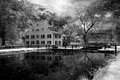
| 12/31/2006 09:57:29 PM |
gr_tavern_04-16-06_800-199k.jpgby LanceWComment: The tonality and detail work of this shot are incredible. It's simply laden with details that work together and do not look busy!
Kudos
TC |
| Photographer found comment helpful. |
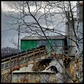
| 12/31/2006 08:53:33 PM |
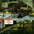
Engulfment Hazardby posthumousComment: This is very busy. It is good that you used a square crop for this otherwise within the constraints of allowable screen real estate you would have a mish mash of details. As it is it's just too busy. It confuses the eye. It doesn't know where it's supposed to end up.
TC |
| Photographer found comment helpful. |
| 12/31/2006 08:52:04 PM |
|
| Photographer found comment helpful. |
Home -
Challenges -
Community -
League -
Photos -
Cameras -
Lenses -
Learn -
Help -
Terms of Use -
Privacy -
Top ^
DPChallenge, and website content and design, Copyright © 2001-2025 Challenging Technologies, LLC.
All digital photo copyrights belong to the photographers and may not be used without permission.
Current Server Time: 08/23/2025 06:46:36 PM EDT.