| Image |
Comment |
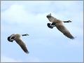
| 03/25/2004 07:09:10 PM |
Pacific Northwest Outdoorsby justineComment: The photo is amazing for composition, but too bright. I'd love to see darker blues in the sky and less light on the ducks. Great shot though! |
 Photographer found comment helpful. Photographer found comment helpful. |
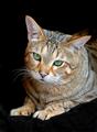
| 03/25/2004 07:08:37 PM |
Cat Fancyby SharonSComment: Tone down your flash a little with the flash exposure compensation. The eyes are beautiful and the composition is very nice too! The flash is way too bright though for the fur... too reflective. I have the same colored cat, i always have to tone down my flash for her. |
| Photographer found comment helpful. |
| 03/25/2004 07:07:31 PM |
Placesby claudiadfComment: The dark spot in the upper left corner is distracting, also the bridge or rail is not level. I love the colors though! |
| Photographer found comment helpful. |
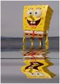
| 03/25/2004 07:06:35 PM |
Nickelodeonby cabaComment: The grey really takes away from the bright fun spongebob. I would have taken this on a brighter day or used a fake water pool at home with a blue backdrop. |
| Photographer found comment helpful. |
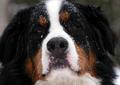
| 03/25/2004 07:05:41 PM |
Dog Worldby willtataComment: Cropped too tight. The snow is fun, but the grey day makes the photo a little dull for color, when the color would pop on a blue-sky day. I know you can't control that. But you could try a bit of color level adjustments in photoshop maybe. Cute dog. |
| Photographer found comment helpful. |
| 03/25/2004 07:02:28 PM |
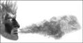
Smoke Magazine...by theodor38Comment: How much of this is photo vs how much is photoshop? I like the idea, but more for an art contest and photo contest. The tones are very nice. |
| 03/25/2004 07:01:40 PM |
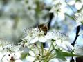
THE BUZZby channeledComment: Beautiful photo! The color and lighting are nice, a little bright... but fine. The motion of the bee is neat too. I love hte composition and DOF of the flowers. |
| 03/25/2004 07:00:39 PM |
|
| Photographer found comment helpful. |
| 03/25/2004 06:59:51 PM |
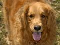
Dogsby rll07Comment: Very nice composition and clarity. The colors are nice too. I'd use photoshop on the dog's tongue a bit to remove the shadow and saliva bubbles. Other than that, the photo is great. 8 |
| 03/25/2004 06:58:34 PM |
|
Home -
Challenges -
Community -
League -
Photos -
Cameras -
Lenses -
Learn -
Help -
Terms of Use -
Privacy -
Top ^
DPChallenge, and website content and design, Copyright © 2001-2025 Challenging Technologies, LLC.
All digital photo copyrights belong to the photographers and may not be used without permission.
Current Server Time: 08/05/2025 09:56:02 AM EDT.