| Author | Thread |
|
|
04/03/2004 08:17:35 PM |
**Critique Club**
Hi Sally!
Positives:
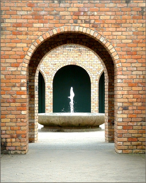
The crop is good and even and the archways in the background are aligned nicely. Nice textures, with the brick and stone walkways. Meets the challenge well.
Possible Improvements:
Lighting is a bot harsh, as folks mentioned below, the background area and fountain is a bit overexposed. Since you are using natural light, I would suggest either taking the photo earlier in the morning or later in the afternoon. You could also try using a neutral density filter or polarizer to help with this. Colors are also just a bit dull, which I think a polarizer might help correct.
Overall, this is interesting photo that with just a little correction on the exposure, would be a great photo.
Good luck in your future challenges.
Chris |
|
Comments Made During the Challenge  |
|
|
03/27/2004 05:10:38 PM |
|
Yup, Good cover for architecture magazines... 9 |
|
|
|
03/26/2004 03:22:28 PM |
|
Nice picture, shame it's a little overexposed. I'd have liked more contrast in PS. |
|
|
|
03/26/2004 12:03:37 PM |
|
Nice shot, and a good magazine cover, with a vertical format and space at the top that could carry type without spoiling the picture. |
|
|
|
03/25/2004 06:58:34 PM |
|
I think this would look nice with a diffuser filter or the fountain doing something a little nicer (if it changes sprout styles). I like the composition |
|
|
|
03/25/2004 03:26:03 PM |
|
good picture, but I feel the fountain isn't just right. |
|
|
|
03/24/2004 08:13:35 PM |
|
|
|
03/24/2004 04:28:05 PM |
|
|
|
03/23/2004 02:30:24 PM |
Great perspective and composition. I would definitely see this on a magazine. 8
Good luck... |
|
|
|
03/22/2004 05:29:36 PM |
|
A crop up to the bottom of the figures would not have taken anything away. |
|
|
|
03/22/2004 04:53:23 PM |
|
It could be an optical illusion, but the photo doesn't seen horizontal to me, nice composition |
|
|
|
03/22/2004 10:26:26 AM |
|
wonderful symmetric composition |
|
|
|
03/22/2004 07:13:55 AM |
|
very nice shot, great "bricky" colours, 8 |
|
Home -
Challenges -
Community -
League -
Photos -
Cameras -
Lenses -
Learn -
Help -
Terms of Use -
Privacy -
Top ^
DPChallenge, and website content and design, Copyright © 2001-2026 Challenging Technologies, LLC.
All digital photo copyrights belong to the photographers and may not be used without permission.
Current Server Time: 06/29/2026 09:35:42 PM EDT.