| Image |
Comment |
| 05/14/2004 05:17:51 PM |
|
 Photographer found comment helpful. Photographer found comment helpful. |
| 05/14/2004 04:33:47 PM |
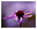
Purple centerby pitsamanComment: This really is a great shot. The colors are beautiful. What lens are you using, if you don't mind sharing? Also, what white balance setting do you have set for this photo? Again, if you don't mind sharing. |
| Photographer found comment helpful. |
| 05/12/2004 07:46:04 PM |
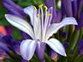
My first flower pictureby TrollManComment: For your first, you did an excellent job. I take pictures of flowers every day and rarely do I get something as nice as this. Your color and composition are beautiful. Your DOF is perfect and overall feel is very very nice. The only thing I'd change is the pink distraction to the left and show a tiny bit more of the main flower's stem. |
| Photographer found comment helpful. |
| 05/12/2004 07:44:13 PM |
Take Cover!by sjonniComment: This is an awesome photo! I love the expression, the raindrops, the idea, the composition, everything. Perfect 10. |
| 05/12/2004 07:39:35 PM |
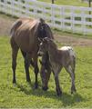
Mother's Loveby shkelly587Comment: Completely adorable. I would have adjusted the levels on the entire photo to darken it a bit though. |
| Photographer found comment helpful. |
| 05/12/2004 07:38:51 PM |
Behind the Green Fenceby ccaseyComment: Ridiculously cute!!!! I love the expression, colors, composition, focus and interest! Great shot. It'd be perfect if the fence were completely straight or both of the planks were 100% parallel. But that's not your doing. From a technical standpoint, it's a great shot! |
| 05/12/2004 07:37:28 PM |
Crookedby kosmikkreeperComment: Wow, a glass door to nowhere! I love it. The horizon line seems a tad off, and the lighting is a bit bright. The tones are beautiful (sepia) and the subject is fascinating. The composition is also very nice. |
| 05/12/2004 07:36:27 PM |
The Welderby sp00fComment: Didn't we get to see the photo in a forum recently? I like the concept and lighting. I think the bottom is a little distracting though. Perhaps you could try to darken it to take it out of focus or something so that our eyes aren't drawn to it (for future reference of course) :) |
| Photographer found comment helpful. |
| 05/12/2004 07:34:58 PM |
The New 20by vince31874Comment: The money is way too bright. The money borders (corners) aren't perfectly aligned. This throws the photo off a bit. The background is crisp, but the photo still lacks something, not sure what. It would be cool to see this with fun colored lighting or tons of old 20s lying around with the new one on top, off center or something. |
| 05/12/2004 12:59:32 AM |
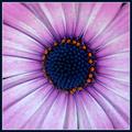
Rusty Barrelby HBunchComment: I like the colors and composition a lot. The flower is a tad bright though, as you stated. :) Nice job! |
| Photographer found comment helpful. |
Home -
Challenges -
Community -
League -
Photos -
Cameras -
Lenses -
Learn -
Help -
Terms of Use -
Privacy -
Top ^
DPChallenge, and website content and design, Copyright © 2001-2025 Challenging Technologies, LLC.
All digital photo copyrights belong to the photographers and may not be used without permission.
Current Server Time: 08/05/2025 03:30:17 PM EDT.