| Image |
Comment |
| 06/03/2004 11:48:09 AM |
Across the Generationsby HifiComment: I don't know for sure, but I would think the people holding the ball might be the players, and thus to me, I don't feel it represents the challenge. The photo is also very small, and hard to get a full feel for. The dark shadows are a little distracting, and perhaps you can try to lighten them up with a fill in flash. The crop is a little tight on the left too. The colors are nice. Good luck. |
 Photographer found comment helpful. Photographer found comment helpful. |
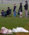
| 06/03/2004 11:46:12 AM |
View from the rough - The Ryder Cup 2004by kevrobertsonComment: Although I like the photo, the photo itself doesn't communicate team sports to me without the title. I think the title and the photo should go hand in hand, but not explain what we are supposed to think or feel. That's my opinion. Anyhow, the sky is nice, the blur sports make me think you got water on your lens though. The dark branch at the bottom is a little distracting, the composition is nice though. Good luck. |
| Photographer found comment helpful. |
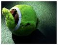
| 06/03/2004 11:43:09 AM |
The Basketballby agroikoiComment: Not the best background, and I wouldn't know that's a basketball without you titling the photo so, so I think that means the photo has no direct communication to the challenge subject (to me), although it meets the challenge based on the fact that you said it's a ball. Anyhow, what's that underneath the ball? It's blurry and hard to tell. It looks like feet of some sort. The lighting is dark. I would try to put the ball against a dark background and light the ball from different angles, keeping the crop the same if you want. Good Luck. |
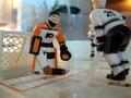
| 06/03/2004 11:41:00 AM |
Stanley Cup Playoffsby rogerspaulComment: Okay, I would say those three guys are PLAYERS in the sport. I won't DQ, but I think you might reconsider the instructions next time. Anyhow, for the photo: the background is distracting with the plant and the kitchen cabinets, the lighting is dark, but the colors are nice. The focus might be on the orange player, but it's hard to tell... it's not crystal clear. The crop is too tight on the top, right and bottom. To capture this scene better, go from higher above, move out a bit and try not to get your home in the background. Use more light sources to light up the scene but don't overexpose. Good luck |
| 06/03/2004 11:38:28 AM |
Rained Outby GalimagesComment: The colors are a bit washed out. On grey days like this, you might want to try for some more yellows and blues to help bring out some color. The lighting is way too bright on the ball and the stick doesn't seem in focus. The composition is nice though. |
| 06/03/2004 11:37:25 AM |
The Balancing Actby aerogurlComment: Beautiful! I like the colors, lighting, composition and overall feel. It'd be nice to see another few inches of the poll, but it's very nice nonetheless. Great job |
| Photographer found comment helpful. |
| 06/03/2004 11:36:26 AM |
Hard Day of Tennisby ccaseyComment: The colors are nice, the composition is tight on the left. I like the background but the dark corners kind of bother me. The brightness is a tiny bit high too. |
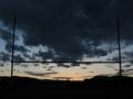
| 06/03/2004 11:35:39 AM |
Through the Uprightsby anatomComment: A tiny bit tilted and the mountain homes or buildings aren't truly silhouetted (either show them better or take them out with silhoutting completely is my thought. I like the sunset (or sunrise). |
| 06/03/2004 11:34:44 AM |
|
| Photographer found comment helpful. |
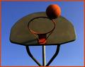
| 06/03/2004 11:33:58 AM |
Hoop it up!by jazzmanmgtComment: I think the crop is too tight on top and the ceiling is a little distracting. I think the colors are fine, but the lighting is off (particularly on the ball). The photo is also off on the horizon line. You can see the rectangle behind the ball is not straight across. I would change the angle you shot from to help strenghten this photo I think. |
| Photographer found comment helpful. |
Home -
Challenges -
Community -
League -
Photos -
Cameras -
Lenses -
Learn -
Help -
Terms of Use -
Privacy -
Top ^
DPChallenge, and website content and design, Copyright © 2001-2025 Challenging Technologies, LLC.
All digital photo copyrights belong to the photographers and may not be used without permission.
Current Server Time: 08/04/2025 07:21:34 PM EDT.