| Image |
Comment |
| 01/28/2009 08:55:02 PM |
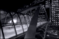
The Gatewayby GabrielComment: Trying to find the point of focus here. Not sure how this meets slence witht he traffic rushing by below. The processing does nothing for me, there is not enough contrast to really make an impact on me......... |
 Photographer found comment helpful. Photographer found comment helpful. |
| 01/28/2009 08:52:23 PM |
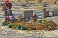
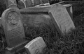
After The Partyby teacherphotoComment: Not the Title I would have put with this type of image, but I will ignore that
The background headstones create clutter. A shallower depth of field may have helped. A different angle shooting the photo also could have been good, therefore removing the need to crop through headstones int he background. Showing some sky, wither overcast or blue could have helped declutter the image. I feel the crop is also too close all around, and the colours could have been better processed to get a better statement |
| Photographer found comment helpful. |
| 01/28/2009 08:49:45 PM |
after the bell ringsby reezyComment: Nice effect and nice image. Tricky lighting situation to get right with the shadows and bright areas due to the light spacing. The PP is really good and suits the mood of the photo......Good Submission |
| 01/28/2009 08:47:21 PM |
Shhhhhhhhhhhhhhh!!!by rmezzoComment: A number of these photos in the challenge. The overexposure doesn't work for me. The black background menas the hair merges with in. |
| Photographer found comment helpful. |
| 01/28/2009 05:13:34 PM |
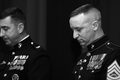
A Moment for the Fallenby toddheadComment: I Like the idea you have gone with for this photo. The mood is set, the black and white processing adds to the mood, the shallow depth of field works well.
However, the crop is distracting. I would have preferred that the background person does not have part of his face cropped off. I don't know why you have done this (unless that was all the capture you had). Also not sure about the crop at the bottom right corner. A little more space below and to the right, just for that the Rank is not crossed, and run the crop along the back of his shoulder. |
| Photographer found comment helpful. |
| 01/28/2009 01:32:36 AM |
Silenced By The Soundby HhughesComment: This image does not appeal to me at all. Apart from the shock factor you are tryng to acheive (which rarely does well here), the post processing does not appeal to me at all. The dark eye areas, the shadow under the chin, the hair loosing any detail in it......
I expect you to get plenty of comments though.......... |
| 01/28/2009 01:06:02 AM |
Silencedby LCDeHaanComment: I like the idea, meets the challenge really well. Black and white works here, but also would have been interesting in colour with the green grass and grey stones. The angle of the photo and the crop though are a little awkward. Having this angle with the close crop on the left stone makes it look like maybe the image is not straight (however it is). Also the cropping accross the other headstones across the back. With this angle, having a couple more stones in the row might have helped, and from slightly lower that the stones behind could have remained in the image........ |
| Photographer found comment helpful. |
| 01/28/2009 12:53:41 AM |
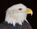
Strengthby GaiaComment: Nice, sharp, clear capture of an amazing bird. The black background makes it jump out really well and suits the photo.
However, I cannot see where this eagle, with a title of Strength, meets the Sinence challenge......... |
| 01/28/2009 12:50:39 AM |
Silence: ASLby ErikTurnerComment: The idea for this photo is really good, however the entire image is out of focus. I would have loved to see this, if possible, with the head sharp, and the hands slightly blurred showing movement. I feel that the shutter speed you used, based on the amount of motion blur from the hands, was too slow. Slight blur on the hands would have worked better, and things like the Teeshirt showing through the hands would then have been avoided, and a much better chance of getting the face sharp, and avoiding movement of the shoulders.
Also, the head is off centre. I don't think that works for this shot. Having the head centred and the crop off the shouolders the same of both sides would also have helped the image...... |
| Photographer found comment helpful. |
| 01/28/2009 12:39:59 AM |
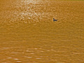
Peaceby jellybellyComment: Unfortunately, the colours in the water, being gold/brown, are unappealing to me. With them making up much of the shot, I feel they need to be more appealing to make the overall photo here. The bird is very small (too small for my liking) and I am not sure if it is in focus either. |
| Photographer found comment helpful. |
Home -
Challenges -
Community -
League -
Photos -
Cameras -
Lenses -
Learn -
Help -
Terms of Use -
Privacy -
Top ^
DPChallenge, and website content and design, Copyright © 2001-2025 Challenging Technologies, LLC.
All digital photo copyrights belong to the photographers and may not be used without permission.
Current Server Time: 08/10/2025 11:59:01 PM EDT.