| Image |
Comment |
| 05/27/2009 12:18:51 AM |
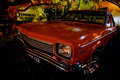
Classic, Not Plastic.by Kel73Comment: The lighting of the car is the biggest concern with this photo. Much of the car is too dark, and then there are bright highlights from surrounding lights reflecting off the paintwork. Also, the angle of the photo is awkward, as doesn't show off the best elements of the car. The background is interesting, but doesn't cover the whole back, as it runs out in the top right. More overall light was needed for this to more evenly light the car, and add more light to the overall image. |
 Photographer found comment helpful. Photographer found comment helpful. |
| 05/27/2009 12:16:16 AM |
Girls in Trucks (soft in all the right places, tough in all the right ways)by pixelpigComment: Very different to what I expected out of this challenge. The letters are a bit of a problem, I find myself trying to work out what the word says, especailly as a letter is cut off on the left. Apart from that, something different. Howeer, having the text on the image, as was allowed for this challenge, would have allowed the image to stand by itself, and help with the connection to the challenge |
| Photographer found comment helpful. |
| 05/27/2009 12:14:10 AM |
Time For An Upgrade?by GeneralEComment: An interesting concept, a different image. There have been a couple fo these where people have gone the different direction, and a number have worked. I feel the crop on this just doesn't work, I feel seeing more of the car would have helped, or at a different angle. The striahgt on angle doesn't povide a lot of interest for this image. The text though is good and draws attention. |
| Photographer found comment helpful. |
| 05/27/2009 12:11:53 AM |
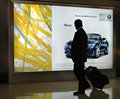
Musingby LevTComment: I read the challenge as creating an Auto ad, or something that could be used for the purpose of an auto ad, and not to take a photo of an auto ad. This overall picture has little appeal, the man is too dark, the surroundings are as well, and he is standing in front of the car, which obscures it, when it is meant to be the main subject. |
| Photographer found comment helpful. |
| 05/27/2009 12:09:21 AM |
|
| Photographer found comment helpful. |
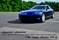
| 05/26/2009 10:52:27 PM |
Mazda RX-8. It Moves You.by arron_christensenComment: I like the overall composition of this image. The front of the car is a little dark though, however the use of panning and the crop you have applied is very good. The text used is spot on and well placed for an Ad. I like the sub reflection off the front wheel flare as well,, i think it adds to the image. |
| Photographer found comment helpful. |
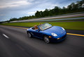
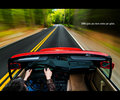
| 05/26/2009 10:50:28 PM |
Porsche.....Every Ride Is An Adventureby senor_kasperComment: A really good panning shot. This type of shot is perfect for the car here. I like the angle you have this at, as I feel that adds to the overall effect. Well composed and well executed.
Maybe the title could have been in text along the bottom of the photo so that the end product could then stand alone as an Ad........just a suggestion for these challenges. |
| Photographer found comment helpful. |
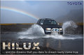
| 05/26/2009 10:48:17 PM |
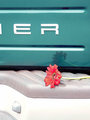
At the end of the the rainbowby GlanniComment: A great image, that captures the essance of how you are tryiong to sell the car. The Photo fits in really well with the overall theme you chose. Having the rainbow there is also very good, and adds to the image. The image is sharp, well executed and very well composed.
The Hilux writing though is a bit annoying for me. Having the car in it just grabs more attention I feel than it should. That text in a well chosen colour would have been better. |
| Photographer found comment helpful. |
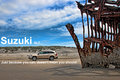
| 05/26/2009 10:45:26 PM |
Suzuki XL7by aliquiComment: I like the composition of this image. Even though the wreak is so much bigger, the car is still the subject, just by the placement of the elements. Like a few other photos, maybe a different car colour would have been better to avoid it blending in (yes, borrow a Red One......) but that is not something easily done.
Would have preferred the bottom line of text to be closer to the bottom of the ad. I think the top line is really well positioned, but the other line could have gone along the very bottom almost, and been a better placement.
A great submission for the challenge |
| Photographer found comment helpful. |
| 05/26/2009 10:42:24 PM |
The Ultimate Driving Machine by bassboneComment: A couple of people tried this, but you pulled it off by far the best. A really well executed image of movement, and one that fits the challenge exceptionally well. Something I could easily see on a billboard. |
| Photographer found comment helpful. |
Home -
Challenges -
Community -
League -
Photos -
Cameras -
Lenses -
Learn -
Help -
Terms of Use -
Privacy -
Top ^
DPChallenge, and website content and design, Copyright © 2001-2025 Challenging Technologies, LLC.
All digital photo copyrights belong to the photographers and may not be used without permission.
Current Server Time: 08/10/2025 11:58:53 PM EDT.