| Image |
Comment |
| 06/01/2009 12:23:18 AM |
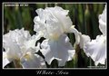
White Irisby grummanComment: I like the image, but a shame because you will get DQ'd as under standard Advanced Editing rules, you are not allowed to add text to the photos (Auto Ad etc had special rules).
Great Depth of field control and presentation with the borders. |
 Photographer found comment helpful. Photographer found comment helpful. |
| 05/31/2009 11:31:00 PM |
Ford Taurusby XMountaineerComment: The ront of the car really needed some additional dispersed light as it is too dark and the details can't be seen. Great composition though of the overall image. |
| Photographer found comment helpful. |
| 05/31/2009 11:29:54 PM |
|
| Photographer found comment helpful. |
| 05/31/2009 11:29:05 PM |
BOLD MOVESby SEGComment: Great overall compostion and a really professional looking submission here. Only one small distraction/improvement. Cloneing out (probably legal under these rules) or a slight position change to remove the structure behind the car on the right would have added to the clean image look. |
| Photographer found comment helpful. |
| 05/31/2009 11:27:13 PM |
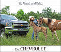
Go ahead. Relax. by LydiaComment: I like the overall composition Idea, however the crop on the car just seems a little awkward to me. Keeping a little more of the car in the shot may have helped. |
| Photographer found comment helpful. |
| 05/31/2009 11:25:36 PM |
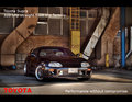
Toyota Supraby rob_smithComment: Nice capture and nice composition for this, which matches well the theme you chose. Great presentation here and use of the text to make a professional looking Ad. |
| Photographer found comment helpful. |
| 05/31/2009 11:24:39 PM |
Cruising the Roadby BarbBComment: Great colours in this image, maybe a little over the top but I think that works int eh advertising world. All of the lines though seem to lead me away from the car. and towards the road sign. A close crop to make the car bigger and making it the main subject would have helped. |
| Photographer found comment helpful. |
| 05/31/2009 11:23:12 PM |
Lexus Manby snafflesComment: Nice composition, but the colours seem a little washed out. Some extra vibrance and contrast through PP would have helped this a lot. |
| Photographer found comment helpful. |
| 05/31/2009 11:22:21 PM |
FORDby justineComment: Not really sure about the text fonts etc used here. A nice image, but the angle/colours and composition of the image don't help it stand out fromt eh crowd |
| Photographer found comment helpful. |
| 05/31/2009 11:20:09 PM |
My Baby - Infiniti G35xSby MisterMarcusComment: Don't know what has happened in the bottom right corner. presenting the reflection as the top part of the photo is a different and effective choice, but the other processing artifacts in the image, especially also in the top half are a big distraction from the overall effect |
| Photographer found comment helpful. |
Home -
Challenges -
Community -
League -
Photos -
Cameras -
Lenses -
Learn -
Help -
Terms of Use -
Privacy -
Top ^
DPChallenge, and website content and design, Copyright © 2001-2025 Challenging Technologies, LLC.
All digital photo copyrights belong to the photographers and may not be used without permission.
Current Server Time: 08/07/2025 02:46:48 AM EDT.