| Image |
Comment |
| 10/22/2008 10:50:11 PM |
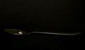
Luxury Toysby MotekComment: Brilliant colours in this capture. The ioverexposed areas from the direct sunlight are not a problem for me in this shot. Well exposed. Great Capture. |
 Photographer found comment helpful. Photographer found comment helpful. |
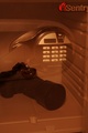
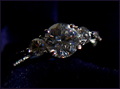
| 10/22/2008 09:55:26 PM |
All the wealth I needby Travman1925Comment: Very cleaverly done, however the resulting colours are unappealing. The overlap of part of the safe that hides the Canon label distracts. I also would have cropped out the makers logo complete4ly, rather than having it partly cropped |
| 10/22/2008 09:52:49 PM |
|
| Photographer found comment helpful. |
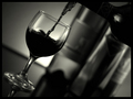
| 10/22/2008 09:49:48 PM |
la ricchezzaby yankoComment: I like the angle this was taken on. I think it works really well, however I feel that the glass should have been in focus, while still keeping a really shallow depth of field that has the background bottles very soft. |
| Photographer found comment helpful. |
| 10/22/2008 09:46:26 PM |
|
| 10/22/2008 09:44:29 PM |
Indulgenceby JulietNNComment: The overall composition of the photo does not appeal to me. I struggle to find where I should focus attention. Tehnoverblown parts of the white material os distracting, while the flat light on the face doesn't work for me. |
| Photographer found comment helpful. |
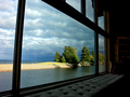
| 10/22/2008 09:42:18 PM |
Beach Houseby JuliBocComment: Nice idea nad nice view. However, a closer zoom of the building could have been a little better (but then you would loose the framing) The eyes are drawn to the trees and building, but they are too small to really see any detail. |
| Photographer found comment helpful. |
| 10/22/2008 09:40:39 PM |
Iceby jpochardComment: I think the lighting could have been better for this photo. The photo also does not appear sharp. For these simple photos to work, they need to be very sharp, and the lighting needs to make it stand out |
| Photographer found comment helpful. |
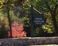
| 10/22/2008 08:22:51 PM |
Members Onlyby csalingComment: I guess this is an exlusive club. The photo looks a little soft and the upject is relatively uninspiring |
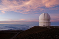
| 10/22/2008 08:20:24 PM |
Dome With A Viewby CraigDComment: This is a great photo, however I am unsure of why a Telescope really fits the c hallenge....
Ignoring that though
The colour through the sky is great. The foreground/hills though are too dark for my liking. The Dome looks good, but slightly lighter would not have hurt. Shame about the Steel tower in front of the Dome. |
| Photographer found comment helpful. |
Home -
Challenges -
Community -
League -
Photos -
Cameras -
Lenses -
Learn -
Help -
Terms of Use -
Privacy -
Top ^
DPChallenge, and website content and design, Copyright © 2001-2025 Challenging Technologies, LLC.
All digital photo copyrights belong to the photographers and may not be used without permission.
Current Server Time: 08/05/2025 11:32:43 PM EDT.