| Image |
Comment |
| 07/12/2008 03:44:50 PM |
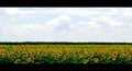
Sun followerby c3realComment: I really like this shot. It has a very professional, iconic, cinematic quality, obviously emphasized by the border treatment. I could easily see some green (or maybe not) energy company using it in a marketing campaign. |
 Photographer found comment helpful. Photographer found comment helpful. |
| 07/12/2008 03:24:27 PM |
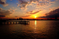
The end of dayby facesastheycomeComment: Absolutely gorgeous sunset and clouds. However there is too much water on the bottom of the frame for my taste. Did you consider any alternate crops? Perhaps putting the pier on the lower horizontal 1/3rd line? It might help put the focus on the details in the city/sky rather than the dark uninteresting water. |
| Photographer found comment helpful. |
| 07/12/2008 03:05:29 PM |
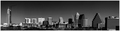
Austin urban landscape by s2hphotographyComment: Nice panorama I just have two thoughts. First, it seems the horizon is slightly tilted to the right, or am I crazy? Also I dislike the square building on the far right being right on the edge of the frame, especially with the black box that sits right in the corner. |
| 07/12/2008 02:51:10 PM |
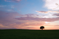
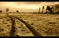
where the wind comes sweepingby kraeComment: I liked the photo, but thought it would have been better with a different crop. Perhaps 3:1 with the horizon on the bottom third line. As it stands I find there to be too much grass and too much of the uninteresting blue upper sky. I would try to put the focus on the middle third of the photo with the gorgeous red sky/clouds and a thinner slice of the horizon. The exaggerated length of the 3:1 crop might also fit with your title better. As it stands, I don't really get sweeping wind from the image. |
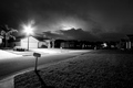
| 07/11/2008 07:44:24 PM |
Suburban Summerby jimmyn4Comment: I really like the shot, though I have a hard time articulating why exactly. The ominous sky and singly illuminated house, with the rest of the street bathed in darkness. It makes me think of a somewhat bleak modern counterpoint to something out of Bill Ownen's Suburbia series (//www.billowens.com). It would be better without the light from what I assume is another lamp post down the street.. but not much you could do about it under basic rules I guess. |
| Photographer found comment helpful. |
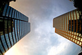
| 07/11/2008 07:21:55 PM |
In each others eyes by tjmuellerComment: This is a terrific composition and a shot I think a lot of people never would have noticed. The choice of time of day adds the detail of lights both in the building and it's reflection. Much different than if taken earlier when the windows would be perfect mirrors. What really gets me is how each building seems to have an glow in the opposing buildings color. Fantastic.
However as much as I liked it I didn't vote it as high as I would otherwise since I don't really see it as a landscape. |
| Photographer found comment helpful. |
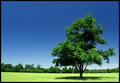
| 07/11/2008 05:57:24 PM |
Noon. Clear. Hot.by FromacComment: Great title and shot. Something about the cloudless sky combined with the "island" of shadow around the tree... it feels like it would be a welcome respite from the heat. |
| Photographer found comment helpful. |
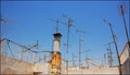
| 07/11/2008 05:48:32 PM |
Crowdedby IraklisComment: I really liked the subject matter and the unique take on the urban landscape but didn't care for the shot itself. Did you consider any alternate crops or angles? I think I get what you were going for, but with it titled "croweded" there is just too much negative space from the sky in my opinion. Perhaps a tighter, maybe square crop of just the right side of the image might archive the claustrophobic effect better? |
| Photographer found comment helpful. |
| 07/11/2008 05:30:28 PM |
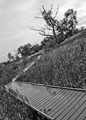
Walk on the Wild Sideby everclear25Comment: I really like the composition of this shot. An alternative title could have been "nonsyncope nonvertigo". This deceptively simple S curve photo with it's combination of tilted orientation and the angular receding walkway almost makes me dizzy. I also like how as my eye follows the pathway it doesn't just end but becomes increasingly obscured by the vegetation until it disappears. |
| Photographer found comment helpful. |
| 07/11/2008 04:30:46 PM |
P A T Hby bnileshComment: I'm not a fan of borders in general but this is one of the rare shots I've seen were I think it works. Even so I think I would have preferred it in solid black (without the white lines). |
| Photographer found comment helpful. |
Home -
Challenges -
Community -
League -
Photos -
Cameras -
Lenses -
Learn -
Help -
Terms of Use -
Privacy -
Top ^
DPChallenge, and website content and design, Copyright © 2001-2026 Challenging Technologies, LLC.
All digital photo copyrights belong to the photographers and may not be used without permission.
Current Server Time: 06/27/2026 07:18:54 AM EDT.