| Image |
Comment |
| 12/05/2003 07:20:20 PM |
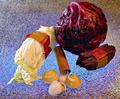
Aromaticby amsmythComment: Greatings from the Critique Club
Definitely met the challenge. A very nice image.
I would have tried to use a less damaged clove of garlic. That detracts abit and it's just a tad grainy, a little soft reflected light may help that.
I like the textures all around but there are a couple of hot spots on the top of the bulb.
The cinammon is very nice, but one or the other I think. You have a lot of nice detail showing in the garlic and table already I don't think an additional element is helping here.
Good angle and composition.
Really a very good effort.
I hope this helps.
JC |
| 12/05/2003 12:26:32 PM |
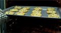
Freshly Bakedby amcraigComment: Greetings from the Critique Club
and welcome to the site.
This is a good first effort for a challenge. It definitely fit the criteria of the challenge.
A number of comments have already pointed out some the weaknesses.
The crop and angle are the two major points I see.
If you could bring the level of view up, to focus more on the cookies and the top part of the oven I think it will help. A little light on the interior of the oven would accent it. I could see using a smaller baking sheet with fewer cookies so you would have more space around your central theme.
I do think that the oven mitt is fine, it creates a sense of movement, your pulling the fresh cookies out of the oven. I might find a more neutral one though.
I hope this helps.
JC |
 Photographer found comment helpful. Photographer found comment helpful. |
| 12/04/2003 11:43:39 PM |
|
| 12/04/2003 11:39:29 PM |
Maneki Neko Bankby HavokComment: Nice black and white. I just purchased one of these for my mothers holiday present for her cash register. I like the composition alot. The use of mininmal light also works well, I think. 9 |
| Photographer found comment helpful. |
| 12/04/2003 11:37:20 PM |
|
| Photographer found comment helpful. |
| 12/04/2003 11:36:08 PM |
|
| Photographer found comment helpful. |
| 12/04/2003 10:50:09 AM |
Body for saleby kinksComment: Stunning image. Love the light. I wish her hair was not on her back, pulled to the sides would have presented a cleaner image I think. 8 |
| Photographer found comment helpful. |
| 12/04/2003 10:49:07 AM |
Can't Buy My Loveby SamaraComment: This is a really good idea. I wish the background was just a little richer and the stones more defined. 8 |
| Photographer found comment helpful. |
| 12/03/2003 01:23:02 PM |
can´t believeby claudiadfComment: Greetings from the critique club
I think this is a good concept.
A number of the things I see to comment on have been covered in the during the challenge comments.
Blur, shadows, fingers, all don't quite work.
I do like the composition in the frame.
Possible shooting from a greater distance to allow for more light fill below the eyes and better focus then cropping would have made for a better image.
Diffused fill flash or other diffused light from below to smooth out the shadows.
Of course you could go the other way entirely and strictly limit the light to create sharper shadows which could be interesting.
I can see there is a lot of good detail there.
I hope this helps.
JC |
| Photographer found comment helpful. |
| 12/03/2003 12:02:17 AM |
Fragranced by sahkoComment: Congratulations! Well deserved, I knew this would win. |
| Photographer found comment helpful. |
Home -
Challenges -
Community -
League -
Photos -
Cameras -
Lenses -
Learn -
Help -
Terms of Use -
Privacy -
Top ^
DPChallenge, and website content and design, Copyright © 2001-2025 Challenging Technologies, LLC.
All digital photo copyrights belong to the photographers and may not be used without permission.
Current Server Time: 09/02/2025 02:55:33 AM EDT.