| Image |
Comment |
| 12/17/2003 02:07:50 PM |
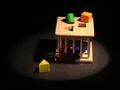
A child's Shape Sorting Cubeby JasonComment: Greetings from the critique club
Good use of selective lighting on this shot.
I find the focus just a little off.
As far as the challenge, there is not one central focal shape.
My eye first travels to the top right where there are many shapes, rather than to the single one at the bottom.
Colour and detail are good. Maybe just a bit over exposed on the top elements.
JC |
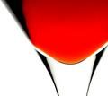
| 12/17/2003 02:03:00 PM |
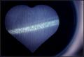
Shot through the Heartby heidaComment: Greetings from the critique club
Hello! suprise to get your image.
I see you've been practicing with the flashlight.
This is a fine image.
The central shape is strong and I like the line of light through the heart.
The detail of the bubbles is very good.
I'm trying to decide if the rings on the right are a distraction or not.
Your correct that this needed more than the heart as far as composition.
I love the fact that it is dark and with a limited colour pallete.
To me an excellent image. I suspect it did not place higher in the challenge because it was dark. (but we've discussed that before)
Very good work.
JC
|
 Photographer found comment helpful. Photographer found comment helpful. |
| 12/17/2003 12:52:28 PM |
Antheriumby nsoroma79Comment: Greetings from the critique club
I think this shot could have benefited from more DOF and a little better lighting.
It's just a tad washed out.
With the composition you chose, the stamen (?) [green long bit] should have been in focus as it is one of the main elements in the shot.
Actually I think the entire shot should have had sharper focus to really work.
A valiant effort.
Of course, just my opinion.
JC |
| 12/17/2003 12:49:21 PM |
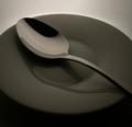
Spoon by e301Comment: Greetings from the Critique Club
Crikey! How to comment.
This was one of my 10 votes during the challenge. So needless to say I love it.
The tones, shadows and textures are perfect in my estimation.
Highlighting the top edge of the plate was a stroke of genius. That little extra bit of definition really pulled the shot off. Without it I think too much fade would have lessened the definition and drama.
A wonderful shot.
Congratulations.
JC
|
| Photographer found comment helpful. |
| 12/13/2003 11:04:42 AM |
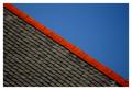
roof lineby deceptiveComment: Very good. I like the idea. One thing, because the roof is a much stronger element than the blue sky, I may have had less of it in the shot. I realize that would keep you from having the perfect angle with the red edge. But it might make for a stronger image. 9 |
| Photographer found comment helpful. |
| 12/13/2003 11:03:01 AM |
|
| 12/13/2003 11:01:19 AM |
|
| Photographer found comment helpful. |
| 12/13/2003 11:00:41 AM |
Spoonby e301Comment: very nice, I love the shadows esp. 10 |
| Photographer found comment helpful. |
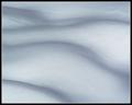
| 12/13/2003 11:00:17 AM |
Evening Snowby dsidwellComment: An excellent capture of a very difficult subject. Extremely well done. 10 |
| Photographer found comment helpful. |
| 12/13/2003 10:59:30 AM |
Cheers!by MichaelsComment: Fantastic. I esp. like the way the left edge blurs off. If the entire shot had been hard focus it would have been great. But with that addition, whether planned or not, I feel it elevates to art. bravo. 10 |
| Photographer found comment helpful. |
Home -
Challenges -
Community -
League -
Photos -
Cameras -
Lenses -
Learn -
Help -
Terms of Use -
Privacy -
Top ^
DPChallenge, and website content and design, Copyright © 2001-2025 Challenging Technologies, LLC.
All digital photo copyrights belong to the photographers and may not be used without permission.
Current Server Time: 09/02/2025 07:12:13 AM EDT.