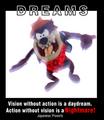
Dreamsby
wwjdwithcaComment: Greetings from the Critique club
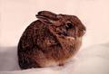
Ok, this is difficult to critique, There are two elements so I'll first comment on the image.
I'm afraid the image is not very good. After reading your description I can see what you were trying to do, I think. Giving the impression of movement to an object is difficult at best.
I'm assuming the brightness was an attempt to give it a dream like state. Possibly if you had done just that and not also tried to add movement it would have worked better.
It's better to not try and have multiple effects. There are some brighter than other areas spots, esp. on the face, that shouldn't be there.
Also using a stuffed animal rarely gets high marks. I also don't see how this one relates to the proverb.
RE: the text. There is too much of it for one thing. The Dreams is well done. Reversing the colours of the outline is a good technique.
The font at the bottom should be lighter. It's overpowering at this point. While it appears to be a similar family the fact that it is heavy causes it to appear to contrast. Japanese Proverb should be much smaller. And the proverb itself should probably be in quotes.
of course this is just my opinion.
JC