| Image |
Comment |
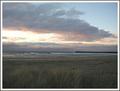
| 11/10/2003 10:03:39 PM |
Sacred Shoresby Silent SisterComment: While I like this photo very much I find it is a little drab in color and the sky appears to have a lot of noise (might just be the screen I am looking at though). The sky is nice but would have preferred the beach and grass to be a little brighter. All in all a good shot though. |
 Photographer found comment helpful. Photographer found comment helpful. |
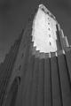
| 11/10/2003 10:01:54 PM |
Hallgrimskirkjaby heidarthorComment: While you have fulfilled the challenge very well and I do like this photo I think it may have worked better in color. However, either way it does not seem to quite clear. I like the angle though and the building. |
| Photographer found comment helpful. |
| 11/10/2003 08:08:31 PM |
In My Little Townby TerryGeeComment: While I really like this photo a lot it seems like you used lights to brighten it up a little and they were placed in the wrong position. I don't like the harsh shadows and it makes the side of the building being lit seem washed out. I actually think this would have been an excellent photo taken in daylight. |
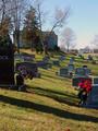
| 11/10/2003 08:04:49 PM |
sacred groundby wkmenComment: While I think you fulfilled the challenge there does not seem to be a point of focus in your picture. Maybe a different angle or zooming in on one section might have looked better. |
| Photographer found comment helpful. |
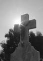
| 11/10/2003 08:03:02 PM |
Cemeteryby StevePaxComment: That sun shining on the tombstone does nothing for it. The picture looks really blurry with little definition. |
| Photographer found comment helpful. |
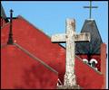
| 11/10/2003 08:02:02 PM |
Red and Crossesby ColeyComment: While this was a good idea and I love things with red in them, this picture was not clear at all. IMHO I would have preferred that the crosses were really sharp. The sky also loooks very noisy. |
| Photographer found comment helpful. |
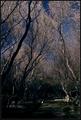
| 11/10/2003 08:00:44 PM |
Sacred Groundsby heidaComment: My focus in this photo totally goes to the trees. I can barely make out what is at the bottom of the photo. A different exposure was needed. |
| Photographer found comment helpful. |
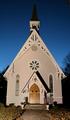
| 11/10/2003 07:59:22 PM |
Positive Space by jjbeguinComment: While I like your angle of view I would have liked to have seen a little more of the rest of the building. I know that this might have been impossible and I know this might look better bigger but that is my opinion. |
| Photographer found comment helpful. |
| 11/10/2003 07:58:07 PM |
College's Porcelain Godby brianlhComment: Love this idea but what I don't care for is the top portion of the photo. It is too blank and doesn't add much to the photo being as how white it already is in parts. IMHO. |
| Photographer found comment helpful. |
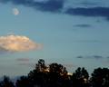
| 11/10/2003 07:56:53 PM |
Mother Moon, Father Sunby shareinncComment: While I like your idea very much this shot seems to be very pixelated in the sky and not much definition in the bottom part of the pic. I would have liked this shot much better had it been clearer. |
Home -
Challenges -
Community -
League -
Photos -
Cameras -
Lenses -
Learn -
Help -
Terms of Use -
Privacy -
Top ^
DPChallenge, and website content and design, Copyright © 2001-2025 Challenging Technologies, LLC.
All digital photo copyrights belong to the photographers and may not be used without permission.
Current Server Time: 08/05/2025 01:52:48 AM EDT.