| Author | Thread |
|
|
11/20/2003 11:41:23 PM |
Greetings from the Critique Club!
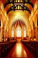
This quaint church is a great subject for a photograph. The colors are great and the fallen leaves are a nice touch. You already realize the spotlight is too harsh. I personally like the face-on view; better lighting and some sharpening would help give it some depth. The formal symmetric composition matches the subject well, although it needs a bit of space on the sides and even more on the top.
Do keep making photos of this photogenic church in various lighting conditions and seasons. You may be surprised how different it can look. |
|
 Photographer found comment helpful. Photographer found comment helpful. |
|
|
11/17/2003 07:36:34 AM |
For those of you that commented about the lights- there was a spotlight lighting the church. It was off to the left(obviously). Yes it was too harsh, but I couldn't do anything about it. I adjusted the curves and levels, and even changed the white and neutrals selectively, but I guess it wasn't enough.
Next time there is a challenge I don't like, I will sit it out. :) |
|
Comments Made During the Challenge  |
|
|
11/16/2003 11:06:27 PM |
|
What a nice little church! I love the simplicity of it on a whole. The lighting is very dramatic, the shadows are really well defined. It's a bit to bright on the right, almost blown out a bit and the crop seems just off a tad to me, maybe a little tighter on the bottom? A 6 |
|
|
|
11/16/2003 09:49:44 PM |
This looks like a very nice, cute little church house! How did you light this up? Car headlights? The colors seem to be very dull and uneven making me think that the lighting is inadequate... If you could reshoot this during the day I would love to see it!
TC |
|
|
|
11/13/2003 12:45:05 AM |
|
Very tight crop, and harsh lightinghere. But I love the symmetry and the formal point of view. The light church works well with the soft blue background. |
|
|
|
11/12/2003 03:32:41 PM |
|
This light seems really bad for the subject - lots of hard, harsh and unpleasant shadows - almost as if you'd used car headlights or a spot light. Some other time of day would have helped, but it would still be a very straight on composition of a church |
|
|
|
11/11/2003 01:01:09 PM |
|
You used a polarizer huh? The sky is a very deep blue, especially at the top there, or maybe it was taken at dusk with the sun going down in the background. In a way the lighting does seems a little off. The top is too dark in comparision to the church, and the left side looks brighter than the right side. Going from the glare on the door I guess you used a flash on this photo. Personally I would have liked to see the whole steeple with the cross at the top still visible. Otherwise a quaint old little church. |
|
|
|
11/10/2003 10:07:22 PM |
|
charming church. I'm afraid the glare of the light is just too bright. I do like the deep blue sky. |
|
|
|
11/10/2003 09:33:25 PM |
|
This is the most adorable little church! It looks kind of pink though, which seems odd. I think that I would have preferred to see this shot at an angle to give it more dimension. The way it is shot straight on, it looks "flat". The blue in the sky is quite lovely |
|
|
|
11/10/2003 09:17:43 PM |
|
Great Color in this picture. Very nice. |
|
|
|
11/10/2003 08:08:31 PM |
|
While I really like this photo a lot it seems like you used lights to brighten it up a little and they were placed in the wrong position. I don't like the harsh shadows and it makes the side of the building being lit seem washed out. I actually think this would have been an excellent photo taken in daylight. |
|
|
|
11/10/2003 06:02:17 PM |
|
|
|
11/10/2003 12:21:55 PM |
|
Some serious compression issues in the sky or something, but the subject is well lit and I like the color of the sky. |
|
Home -
Challenges -
Community -
League -
Photos -
Cameras -
Lenses -
Learn -
Help -
Terms of Use -
Privacy -
Top ^
DPChallenge, and website content and design, Copyright © 2001-2026 Challenging Technologies, LLC.
All digital photo copyrights belong to the photographers and may not be used without permission.
Current Server Time: 06/29/2026 02:36:11 AM EDT.