|
|
| Image |
Comment |
| 11/28/2010 11:41:36 AM | Just another day at the office by Yo_SpiffComment: I don't want this to come out the wrong way... I've not entered a challenge in a long time, but this seems to be one of the reasons why... Although the image is amazing, it is a great copy and a great edit. I don't think that the editing preserved the "image integrity." In fact the editing to me added an element that was not in the photo to begin with. I mean if anyone can look at the original and say 'I see fire in it', or looked at the post image and say, 'I see smoke in it', I will withdraw this post and apologize most profusely. Had this been advanced editing I wouldn't have as much problem (although still some). To me the editing didn't just change the color of the smoke, it changed it into fire which was not there originally. As I look at the comments the vast majority talk about either the editing or the post-processing of the image. But fantastic image outcome.
I did create a thread on the challenge outcome forum for this discussion, so don't reply here. Message edited by author 2010-11-28 12:49:58. |  Photographer found comment helpful. Photographer found comment helpful. |
| 05/02/2007 09:11:25 AM | Through the Blazeby ZoomdakComment: Wow, this is a great shot.... I like it better than your ribbon winner... You should print, frame and give to the firestation. Just an amazing shot. | | Photographer found comment helpful. |
| 01/27/2006 08:31:34 PM | |
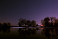
| 12/20/2005 02:13:04 AM | Absolute Stillby SkipComment: Wow, this is a truly amazing photograph. It has such a masterpiece painting feel to it. The colors, composition, reflections, and the starlights in the sky just all work together to make a photo that begs to be blown up to poster size and mounted in a really nice frame ona wall someplace. Honestly, if this doesn't ribbon, there is something wrong with this site. Thanks for taking a picture that is truly inspiring. | | Photographer found comment helpful. |
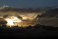
| 10/16/2005 11:35:57 AM | My Mountainsby AarthekComment: Greetings from the Critique Club
Let me first of all echo the comment about the fabulous sky. The clouds and the sunset are just fabulous. Now with such a fabulous sky, why did your photo only score a 5.1872.
Let me try to point out a few things that give me a lower impression on this photo.
First: Sky. Now wait a minute, you just said the sky was fabulous. Let me amend that and say, most of the sky is fabulous. That clear section of blue sky at the top is so strong, that it detracts from those fabulous clouds and lighting. I would definitely crop that blue strip out from the top. This would remove that distraction and also reenforce the drama of the clouds and sun.
Second: Sky. Wait, that was first one. Many people say that they do not look at the title of the photo, but in truth we all let the title effect us. Your title of "My Mountains" is sort of deceptive, as when I am looking at the photo, I do not see much of the mountains. Now some of this is the size of the photo, some that the mountains are so dark and some because the clouds extend down into the mountains and is hard to see what is cloud and what is mountains. Instead of the mountains, my eyes are looking at the sky.
This also goes towards the challenge theme itself. This does not show much in the way of a distinctive that would enable us to say, yes, that is exactly what I think of when I think of Orem, Utah, or some other location. Instead it almost seems to be a generic (although pretty and dramatic) sunset/rise picture.
Possible solution: Tighter crop, cropping out the parts that are not important to the photo. This would be the top and some of the bottom to almost give it a panoramic feel. This would also put us closer to the mountains and enable us to see them just a little bit better. It would also get rid of the empty blue sky at the top and some of the empty black space at the bottom.
If you have any questions or comments about this critique, feel free to pm me. | | Photographer found comment helpful. |
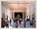
| 09/27/2005 04:48:59 PM | Welcome to 3-D Gallery !by richabhatiaComment: Greetings from the Critique Club
As I've spent a little while looking at this photo, I am left with a sense of wondering. I am really wondering what it is that I am looking at, and why are all of these tourists looking at it as well. There are aspects of the photo that I want to look at, to see more detail of. It almost seems like you were trying to get so much into the photo, that all of the interesting things become so small as to be insignificant.
This photo has the feel of a touristy snapshot. It seems as if you just happened to take a picture and decided to put it in the challenge. The question comes, how does this picture tie into Perspective. The challenge was to use perspective to create a dramatic effect. This means getting in close, using a different angle, something in the way that you took the photo that creates interest in it.
I could easily see an interesting photo in this place if you could get closer to the Buddha at the end of the hall, get down low and photograph him from a different angle, maybe including one of the tourists in the photo (one and only one).
Simplification should be a key for you. There is too much going on here in the photo for me to see what it is that you are trying to get me to see.
Ask yourself in this photo, what is it that I am taking a picture of? Is this the best perspective (angle/composition) to focus on it? Are there distractions in the photo that detract from my subject? If you can answer all of those questions, you will see your score jump up.
In conclusion, I'm looking at your title, and I think through that you are trying to get us to look at the tourists in the hall as being the real gallery. Unfortunately, this is not that clear in the photo itself, rather only in the title.
If you have any questions or comments about this critique, feel free to PM me. |
| 09/27/2005 04:22:15 PM | Tunnel Funby rwouthuisComment: Greetings from the Critique Club
What a gorgeous photo of this young man. The colors and textures of the tunnel really give him a sense of distance and perspective. The straight black and white lines mixed together with the spiral of the supporting wire produce good interest and lead in to the photo. His arms being held the way the are also produce lines to lead the eye in to the boy.
The square crop works great for this photo, giving it good balance. I would like to see one try with him at a 45 degree angle with his hands reaching toward the top left and bottom right corners (this may not be an improvement, rather just an idea for a different look).
The only suggestions I have for this are those that have already been said.
1. Reflection off the floor. This could easily be fixed by having him stand on a black cloth of some kind. This would give him more of a fade into the background look of where he is standing. It would also remove the distraction of the bright reflection taking attention away from him.
2. Contrast in the stripes. This probably cannot be fixed with levels and curves without effecting the boy's exposure (which I think is right on). Rather, this will take some judicious use of the burn and dodge. Burn the black, dodge the white. Time consuming, but to make the stripes have more even lighting would be much better.
3. Wrinkles in tunnel. This suggestion may not be able to be fixed, but I do find distracting the very strong wringkles in the cloth toward the top of the photo. Interestingly, the bottom doesn't show those same wrinkles. Maybe some cloning out of some of the more stark wrinkles would help.
Overall Impression: I do feel that your score is a little lower than it should be. This may be as a result of the picture being a 'cute kid' type of picture. This is unfortunate. I do believe that without the reflection on the floor, this would have certainly been another 6 picture.
(By the way, I really love your Black Eyed Abstract photo, I scored it a 10 when I voted it, and just now added it as a favorite)
Anyway, if you have any questions or comments about this critique, feel free to PM me. | | Photographer found comment helpful. |
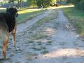
| 09/27/2005 03:41:28 PM | The biggest dogs in town...by basia03Comment: Greetings from the Critique Club
Perspectives really help to accentuate the size difference between the two dogs. I keep finding myself going back and forth between them wondering how on earth is that little dog so little in comparison to the big one. The difference is amazing, and is the good start for a photo.
However, it seems as if this is a 'snapshot' type of photo, or one that you took that just seemed to fit the challenge. There doesn't seem to have really been any forethought to the photo. This is probably the biggest reason for the lower score.
Let me offer just a couple of suggestions that may help the photo:
1. Composition - What an awesome opportunity to put these two dogs closer together to give them more interaction. I don't know if you can control these two dogs or not, but I think a fantastic shot would be the little one sitting there, looking up at the big one with that same look on his face. As it is in this photo, the big dog on the left needs to be more into the photo. Try to frame the shot so that the dogs are much closer together. Maybe use a higher angle to focus solely on the two dogs (see suggestion #2).
2. Simplicity - If you notice, those photos that do well on DPChallenge are really ones that are simple. They remove anything from the photo that might be a distraction or doesn't really add anything to the photo. Notice that it is not just detract from, but the elements in the photo need to add something to it. Here, we have several items that serve as detractions to the main idea of the interaction between the two dogs. Things like: the woman and the other dogs in the background, the tractor/truck, the sign sticking up over the dog's head, and even the bright sunshine (the trees and shrubs can be added as well, since the brightness of the sunlight on them draws the eyes to them). Removing those elements will make the people focus in on what you want them to pay attention to, and that is the two dogs.
3. Lighting - Use of a (stepped down) fill flash in this case would help to even out the lighting on the dogs and bring a little more contrast to them.
Overall Impression: The potential is there in this photo. The interaction between the two amazingly different sized dogs (especially the look on the smaller ones face) is amazing. It begs to be photographed. Good eye in seeing that. A little more time in setting up the shot and paying attention to the background will help move the picture up from the mid 4's up to a solid 6.
Feel free to PM me if you have any questions concerning this critique. | | Photographer found comment helpful. |
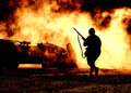
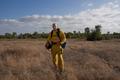
| 09/24/2005 04:19:04 AM | Fire Markby BryantComment: Just wanted to reply here to your reply so that you can have it for perpetuity...
Your response:
>Thank you for your critique but I can't say I agree with everything
>you have said.. If you’re right about your cropping job then one of
>the best portrait photographers in the world isn't any good.. I took
>this idea from Annie Leibovitz. Yes I missed the fact that my helper
>dropped the reflector and I had lost the fill light. But with the
>subject in the center of the frame it gives him the most power. I was
If you would really spend a lot of time examining Annie Leibovitz' photographs (good site with several examples: //www.temple.edu/photo/photographers/leibovitz/photos.html, you would actually see very FEW of them having a centered composition and those that do have it, have it that way for a reason (symmetry in the photo, dominance of the subject). Good one for you to examine would be number 10 of the surfer. Notice how he is centered, there is landscape behind him, but yet he is dominant in the photo, and the other elements do not detract from him. BTW, I think my favorite of hers is her photo of Whoopi Goldberg in the bathtub filled with milk.
Center framing is powerful only when the subject is strong enough to hold that dominant position. Unfortunately in your photograph, the subject is NOT dominant, rather he is in a secondary role to the landscape which is overpowering him. This is doubly true not only to the size he is in relation to the landscape, but also to his darkness in comparison to the landscape.
>in a rush for getting this in by the deadline but after reflection I
>see a few things I would have done differently like balance the
>horizon line in balance with his waist. Also bring my model even more
>into the frame it would have enforced his presence..
This is the probably the biggest thing that would have helped your 'color portrait' is to focus in on the individual. I didn't mention the leveling of the horizon, since it is a minor thing that can easily be fixed in post-processing with a slight rotational adjustment, and the other problems seemed much greater.
>Again thank you for your critique but I find most people how suggest >setting fire to a field to get a wow effect they are not looking at >the full image..
If you think I meant for you to start a fire in the field simply to give your photo the wow factor, then you are mistaken. However, had you happened upon a field that a farmer was burning, or some other fire that would be the wow factor that would tie your subject (the firefighter) to the background (the fire). There is a connection. In this photo, there is no connection between the subject (firefighter) and the background (landscape).
Last thing I would suggest for you would be to check people's comments as helpful. This is the polite way to say, "I have read your comment, I see what you mean." It seems like you are really only checking the comments of those you agree with. But to only say 19 out of 63 comments you have received are helpful is pushing it. Especially when you have multiple people telling you the same thing.
Have a nice day.Message edited by author 2005-09-24 04:22:06. |
| 09/22/2005 04:40:17 AM | Fire Markby BryantComment: Greetings from the Critique Club
We have here what could turn into two separate photos. The firefighter and the landscape. I do think you got the exposure right for the landscape.
However, this was a challenge for a Color Portrait, and the focus needs to be on the person, with portraits specifically focusing in on the face and eyes. This may be the primary reason that your photo scored low, in that we cannot even see this man's eyes, rather they appear just as black shadowed spaces.
Just a couple of suggestions that might help the photo:
1. Move closer/Crop. I understand your wanting to get the full outfit/person into your photo. However, what has happened here is that you have allowed the landscape/sky to become dominant in the photo. This means that you need to move in and allow the man to become the dominant part of the photo. A crop like this would help:

This crop also helps to move him off the 'dead' center and to the right third to place him in a more dynamic position.
2. Lighting/exposure: As I said, your camera exposed great for the landscape, but unfortunately, the firefighter is not exposed well at all, he is dark and in shadows. If you notice, the light is coming from the back right, which makes him totally in shadows. the light would be better if it was 45 degrees to your back right instead so that he would have some light shining on his front side. You used a reflector, but the reflector didn't have enough strength to overcome the bright sky/landscape, so he still remains dark. A fill flash would help in this situation to shine more light on him.
Overall conclusion: I have to agree with the voters on this picture, I would have scored it either a 3 or a 4. If the crop came in on him, would immediately jump to a 5, proper lighting and exposure would be a 6. Add a fire to the background, and the 'wow' factor would jump it up to a winner :-)
If you have any questions about this critique, feel free to PM me. |
Home -
Challenges -
Community -
League -
Photos -
Cameras -
Lenses -
Learn -
Help -
Terms of Use -
Privacy -
Top ^
DPChallenge, and website content and design, Copyright © 2001-2026 Challenging Technologies, LLC.
All digital photo copyrights belong to the photographers and may not be used without permission.
Current Server Time: 06/27/2026 11:38:15 AM EDT.
|