| Image |
Comment |
| 02/29/2008 11:01:59 AM |
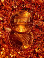
copper on copper... my two cents worthby OldCoyoteComment: The colors are fabulous and the values in them are really nice. This is one of my favorites i just think it looks alittle too staged, maybe a few more pennies leading out of the frame would put this at a ten for me (intead of a 9.9999999) but who knows i could be wrong. |
 Photographer found comment helpful. Photographer found comment helpful. |
| 02/28/2008 12:02:40 PM |
|
| Photographer found comment helpful. |
| 02/28/2008 09:57:24 AM |
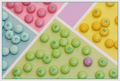
- Spring -by LydiaComment: I love this photograph it is very original and the most creative i have seen so far. You did a really good job at creating a pattern with all the m&ms and matching the colors behind them perfectly. It could be a little sharper but personally i like it this way because it goes with the soft colors. |
| Photographer found comment helpful. |
| 02/28/2008 09:37:42 AM |
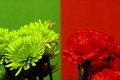
Couldn't Decideby cyanComment: The picture on the left isn't as strong to me. I think you would have been better off only submiting the picture on the right. The left image looks unnatural and doesnt really look as good because the greens are so different, the one on the right has better compostion and is more focused. |
| Photographer found comment helpful. |
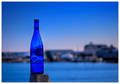
| 02/28/2008 09:28:03 AM |
Harbor Blueby Bear_MusicComment: Lovely color in the sky and water (even if its edited) the distortion you got out of the glass adds interest and puts more emphasis on the bottle. Could be a little sharper though. |
| Photographer found comment helpful. |
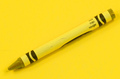
| 02/28/2008 09:25:27 AM |
Redby ralphComment: I really like the simlpicity and contrast between yellow and black that you used and the placement of the crayon is very nice. |
| 02/27/2008 11:58:25 AM |
|
| 02/27/2008 10:37:35 AM |
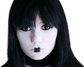
81,192,39 by jessy_pesceComment: Beautiful, vibrant colors. I love the values and the rough texture of your subject. He gets a little blurry but that is to be expected wih how close you were. Really nice shot. |
| Photographer found comment helpful. |
| 02/27/2008 10:33:55 AM |
So Blueby dmul91Comment: Your subject is boring, you may have been going for abstraction but it doesnt work for me. There is too much negative space and not enough contrast between colors. Maybe a more interesting shape or some kind of line, pattern, or 3D object would have made this work better. |
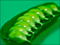
| 02/27/2008 10:31:18 AM |
Peas in the Podby HeiSchComment: Love love love the bright vibrant color, not enough pictures are as vibrant. The detail it sharp where it needs to be and you have suceeded in creating movement with the repeation of the pattern of the circle. |
| Photographer found comment helpful. |
Home -
Challenges -
Community -
League -
Photos -
Cameras -
Lenses -
Learn -
Help -
Terms of Use -
Privacy -
Top ^
DPChallenge, and website content and design, Copyright © 2001-2025 Challenging Technologies, LLC.
All digital photo copyrights belong to the photographers and may not be used without permission.
Current Server Time: 08/18/2025 03:03:32 PM EDT.