| Image |
Comment |
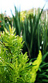
| 03/03/2008 10:26:20 AM |
Skinny Leavesby GeneralEComment: I think too much of your photo is blurry, the color and natural light is beautifulbut because the majority of your photo is blurred i find it very distracting. |
 Photographer found comment helpful. Photographer found comment helpful. |
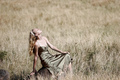
| 03/03/2008 10:24:43 AM |
Field of Dreamsby anthonyczajaComment: i love how every color found in the grass is somewhere on the girl either in the hair, skin, dress, or headband. the composition is nice and the detail is beautiful. Nice editorial pic. |
| Photographer found comment helpful. |
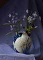
| 03/03/2008 10:21:52 AM |
Blue Huesby zifengwComment: This looks a little unprofessional i really didnt want to know it was a sheet and the lighting is a little weak. Maybe if it was cropped without the bottom corner of the table showing the wrinkles in the sheets wouldnt bother me as much. |
| Photographer found comment helpful. |
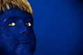
| 03/03/2008 10:17:32 AM |
BLUE!!!by Dirt_DiverComment: I like the contrast of the yellow hair and the complemtary green eyes. The texture you were able to incorporate into the skin adds alot to your photograph as well. |
| Photographer found comment helpful. |
| 02/29/2008 12:10:11 PM |
Prideby molinski4611Comment: This seems soft and fuzzy and just a touch blurry, but since its a cute animal in people clothes i think that adds to it. The background looks like a sheet, i dont know if thats what you were going for but i find it distracting. But the compostion and values in your photo are really nice and it brings the score back up. Great subject! |
| 02/29/2008 12:07:43 PM |
Blue Birdby Jacques123Comment: The border is very distracting but i love that vibrant electric blue! The lighting is beautiful and i really love how close together the shades of blue are also. |
| 02/29/2008 12:04:01 PM |
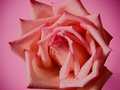
Pretty On Pinkby ZeppKashComment: I like hoe the colors fade out and darken, as if the raindrops didn't bring my attention enough this change in color creates movement that puts more emphasis on the flower and draws my eye inward. Great use of negative space. |
| Photographer found comment helpful. |
| 02/29/2008 12:02:20 PM |
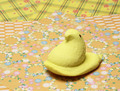
Peep on Origamiby beckettbootsComment: I like the placement of the peep and how all the focus and emphasis was on it. But i dont like how the like color in the placemats was on the mat that was the furthest away. the colors and patterns on the mats with the peep are dull and weak, it really brings the whole picture down. The different patterns( as bad as they are) do create nice diagonal lines that lead my eye back down to the peep. Great phot, bad choice of color and pattern. |
| Photographer found comment helpful. |
| 02/29/2008 11:59:21 AM |
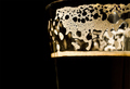
Thank Goodness For Guinnessby astonjay32Comment: This is very sharp and well done. I like the small line of the cup on the edge of the glass that seperates the two dark colors, that really makes the picture for me as well as the contrasting light bubbles to your overall dark picture. Well done! |
| Photographer found comment helpful. |
| 02/29/2008 11:57:46 AM |
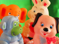
Lets have a party !by atvidComment: This is way to random and doesn't really have two or more things with one complementary color up next to eachother. It is also too blurry, backing up and just cropping it down would have been a good idea. I do like how you didnt have alot of negative space and the lighting is good, not flat at all. |
Home -
Challenges -
Community -
League -
Photos -
Cameras -
Lenses -
Learn -
Help -
Terms of Use -
Privacy -
Top ^
DPChallenge, and website content and design, Copyright © 2001-2025 Challenging Technologies, LLC.
All digital photo copyrights belong to the photographers and may not be used without permission.
Current Server Time: 08/18/2025 05:07:56 PM EDT.