| Author | Thread |
Comments Made During the Challenge  |
|
|
03/03/2008 11:50:00 AM |
|
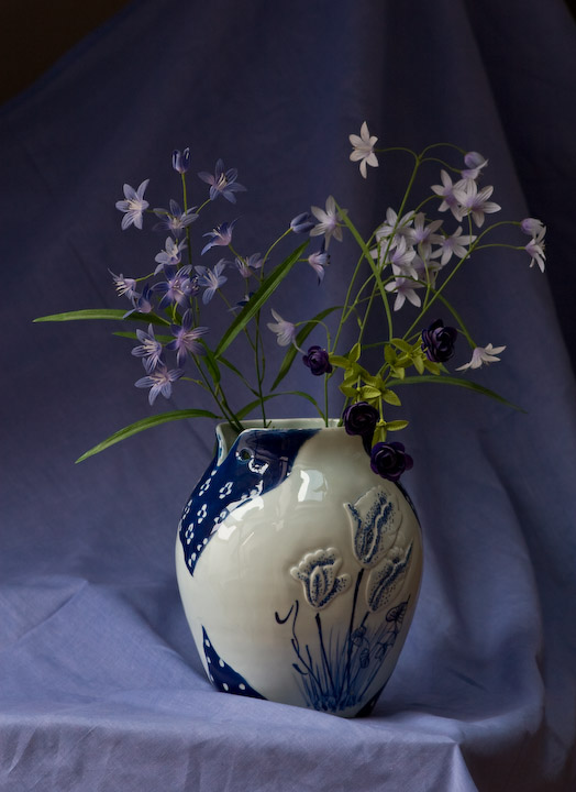
I think a tighter crop might have helped this one pop a little more. |
|
 Photographer found comment helpful. Photographer found comment helpful. |
|
|
03/03/2008 10:21:52 AM |
|
This looks a little unprofessional i really didnt want to know it was a sheet and the lighting is a little weak. Maybe if it was cropped without the bottom corner of the table showing the wrinkles in the sheets wouldnt bother me as much. |
|
| Photographer found comment helpful. |
|
|
03/01/2008 12:20:48 PM |
|
| Photographer found comment helpful. |
|
|
03/01/2008 03:10:01 AM |
|
I think a little more brightness and a bit more contrast would really make this pop. |
|
| Photographer found comment helpful. |
|
|
02/29/2008 02:51:19 PM |
|
Nicely done. The wrinkles are a bit distracting, though. |
|
| Photographer found comment helpful. |
|
|
02/28/2008 03:04:48 PM |
|
I would recommend you iron the cloth if you're using it as background. Try cropping the vase out, the flowers and the stems look beautiful against the darker purple. 7 |
|
| Photographer found comment helpful. |
|
|
02/28/2008 09:55:19 AM |
|
This is a nice shot and there is really nothing wrong with it, but it is lacking creativity. Something could help it such as a different subject or perspective. |
|
| Photographer found comment helpful. |
|
|
02/27/2008 10:04:28 PM |
|
I wish the flowers were a bit lighter...I love the color. |
|
| Photographer found comment helpful. |
|
|
02/27/2008 06:41:18 PM |
|
I love the feel of the flowers, lighting and the colors, but I have a few distractions which are the wrinkles in the sheet and the corner of the table. I would also have liked to see a different colored vase. This may sound like an awful lot of nit-picking, but I would hope that you may reshoot it as it could be an outstanding shot. |
|
| Photographer found comment helpful. |
|
|
02/27/2008 09:22:20 AM |
|
I would like more light on the flowers themselves if the drape below is to be so well lit. |
|
| Photographer found comment helpful. |
|
|
02/27/2008 09:09:47 AM |
|
In my opinion I'd have focused more on the flowers and cropped some of the vase off |
|
| Photographer found comment helpful. |
|
|
02/27/2008 08:54:45 AM |
|
Home -
Challenges -
Community -
League -
Photos -
Cameras -
Lenses -
Learn -
Help -
Terms of Use -
Privacy -
Top ^
DPChallenge, and website content and design, Copyright © 2001-2026 Challenging Technologies, LLC.
All digital photo copyrights belong to the photographers and may not be used without permission.
Current Server Time: 06/30/2026 10:08:11 PM EDT.