| Image |
Comment |
| 11/06/2003 10:14:05 PM |
|
 Photographer found comment helpful. Photographer found comment helpful. |
| 11/06/2003 02:57:11 PM |
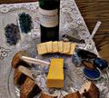
Apples with flowerby willemComment: well....a darker draping material, better draped at the bottom would have provided better contrast for this but the vase and flowers are just too overpowering and I had to scoll all the way down to see the maint title subject.....the background might have also been a different color as it blends a bit too much with the vase....now if you lost from the apples on down by cropping, this would be a much better, minimalist still life even without the aforementioned suggested background change. |
| Photographer found comment helpful. |
| 11/06/2003 02:52:31 PM |
I swear, he didn't move!by SoulHunter74Comment: the corner in this is way too blown out....which interests me as the lighting on the moorse or dear or what ever the stuff animal is very good. |
| Photographer found comment helpful. |
| 11/06/2003 02:51:29 PM |
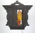
Doorway To No Whereby RoosterComment: like the main subject very much, nice lighting and detail....Iike the idea of the colors of the leaves in the doorway to break up the white BG but do not feel that they might have been the best item to have used. the long stem at the bottom from the one leaf is very distracting and feel it should have been cut prior to taking the shot. May be more leaves would have helpe, maybe less? him it just does't seem to jell. |
| Photographer found comment helpful. |
| 11/06/2003 02:47:43 PM |
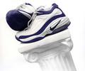
Nikeby ArnayComment: the frame in this is too filled for my tastes....the composition would have been improved with more above the subjects....the lighting and shot are very good otherwise. |
| Photographer found comment helpful. |
| 11/06/2003 02:46:13 PM |
Studyby RegoComment: the glare of the light in this sort of does it in....shooting of from above would have lessened the glare and also given some better or different shadows to help this out....also the framing of the image at the bottom is too tight. |
| Photographer found comment helpful. |
| 11/06/2003 02:43:18 PM |
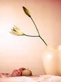
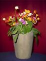
Many Colorsby FullyFocusedComment: The colors are nice as is this lighting....the vastness of the vase, however, overwhelms the flowers and the entire image....something smaller and would have been better, perhaps, although its color is fine. |
| 11/06/2003 02:41:27 PM |
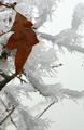
Changing Seasonsby rll07Comment: This is very interetesting and I almost really like it....I think that if you had angled more to the right of the leaf and got more of the ice ladened branches in the shot below the leaf the compostion might have been improved. I can see where this might not have been possible but could the leaf have been turned to help? Very much like the textures in this. |
| 11/06/2003 02:37:12 PM |
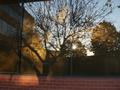
shadows & reflectionsby johnny_justjohnnyComment: Ahh....i know the problems of this shot all too well: where do I meter to get the best overall brightness with out blowout and if there will enough of it be in focus....it's really tough to do....Very much like how the tree shadow almost blends into the reflected trees, but the reflected trees are too out of focus and the overall image does not quite work....really needed to use a tripod....nice attempt at the challenge this image affords. |
| Photographer found comment helpful. |
| 11/06/2003 02:32:41 PM |
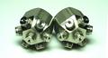
Two still nozzlesby jimsappComment: overkill....one of them in a better composition might have been better....these are too centered. |
Home -
Challenges -
Community -
League -
Photos -
Cameras -
Lenses -
Learn -
Help -
Terms of Use -
Privacy -
Top ^
DPChallenge, and website content and design, Copyright © 2001-2025 Challenging Technologies, LLC.
All digital photo copyrights belong to the photographers and may not be used without permission.
Current Server Time: 08/07/2025 02:47:00 AM EDT.