| Image |
Comment |
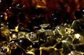
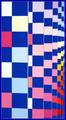
| 05/08/2004 09:20:49 PM |
Composition 1by elsapoComment: Charming...like the colors....wish the lower area of the amber orange was not so dark, but the abstractness of the gold shapes at the bottom make up for that a bit. Very nice...now idea what it is so it makes for a great abstract. |
 Photographer found comment helpful. Photographer found comment helpful. |
| 05/08/2004 09:18:58 PM |
JMZ Linesby the-O-sterComment: The lines are good! I grave some saturation or conversion to BW in this....the composition is static in this straight horizontal presentation.....You might have gone with a smaller portion of the image, closing in on a section where there is a diagonal like the two rivited plates and shot around them....it would have been more abstract and perhaps better comp wise. Nice focus, the exposure needs a little work or help post. |
| Photographer found comment helpful. |
| 05/08/2004 09:15:27 PM |
untitled (crop only)by superdave_909Comment: Wow! Wow was my reaction to the title. 'Untitled' would have been just fine. Putting editing information in the title is not a good idea....describe the final image...my forays into titling are not the best....but 'Blue Swirl' comes to mind....since it is apparent that it is blue, perhaps just 'Swirl'.
Well maybe something more than a crop would have been in order.
This is a summation of a critque....I would love to sit and critique every image in a challenge....I cannot. However: In the abstract form lines should be discernible but the subject should not. If you feel the only way you can make the subject indiscernible is to use camera blur, than you might need to get another subject and shoot it without blurring. This image as is might have been better presented with a lesser crop and a vertical orientation. The shooting idea might have done OK if the lines of the swirl were more pronounced and the object on the left were more in focus. As you description does not state what you shot or how you shot it I have very little to work with.
Hope that helps a little. Sorry if you were offended by the inital comment. RoB Message edited by author 2004-05-10 09:43:17. |
| Photographer found comment helpful. |
| 05/08/2004 09:14:20 PM |
Conceptionby lwkimagesComment: very nice composition and great DOF. appears a bit blown out but I think you were going for that and it is not overly blown out. Nice! |
| Photographer found comment helpful. |
| 05/08/2004 09:12:37 PM |
A Flash in the Panby rudacbComment: I'm not normall a fan of the frames but in this, the fram e is more abstract than the main image....I might have gone with a tighter shot on the front vessels on an angle to improve the composition and had less of the background....though I like the color of the BG.....and maybe less of the large light in the middle. |
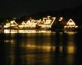
| 05/08/2004 09:09:07 PM |
Come to the light...by jmleliiComment: ahhh...a little boat house row....hmmm...abstract wise I whould have foucuse more on the lights in the Schuylkil and left the houses out....but I love boat house row especially at night and especially at Dad Vail Regatta time of the year. THat said the epxosure appears a bit long for either to have been real effective....but I appreciate the effort a lot! |
| 05/08/2004 09:06:26 PM |
|
| Photographer found comment helpful. |
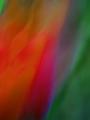
| 05/08/2004 09:06:14 PM |
Separate Realityby flip89Comment: Very cool...like the wild color of purple running throughout. great reflections and lines....nicely done |
| Photographer found comment helpful. |
| 05/08/2004 09:02:00 AM |
Global Warmingby ArtifactsComment: !!!!!!!!!!!!!!!!!!!!!!!!!!!!!!!!!!!!!!!!!!!!!!!!!WOW!!!!!!!!!!!!!!!!!!!!!!!!!!!!!!!!!!!!Like this very much...super....just the right amount of everything, lines, compostion, excellent exposure, colors, sky (okay I would like the blue a bit richer but I can't have everything).....ribbon color? My preference so far is blue! 10. Excellent! |
| Photographer found comment helpful. |
| 05/08/2004 08:58:35 AM |
Colorful Perspectiveby tyt2000Comment: the frame and its color was perhaps not well thought out...black would have done much better and no frame even more so. I like the colors and the abstractness to the far right very much. The large amount of pink varigations, too many pastel like in shade, do nothing for me. |
| Photographer found comment helpful. |
Home -
Challenges -
Community -
League -
Photos -
Cameras -
Lenses -
Learn -
Help -
Terms of Use -
Privacy -
Top ^
DPChallenge, and website content and design, Copyright © 2001-2025 Challenging Technologies, LLC.
All digital photo copyrights belong to the photographers and may not be used without permission.
Current Server Time: 08/14/2025 05:51:35 PM EDT.