| Image |
Comment |
| 07/24/2005 09:18:26 AM |
Are you looking at me?by barbaraanneComment: Great angle and detail and I like the nice tight crop and the downward view. The white about the ear borders on being blown out at the right, but that does not trouble me much. There is a bit of a gray something right about the ear on left that is distracting. The color is close enough to that of the animal that I'm not sure it is part of it or not...guess it is the tail. Great shot, like it very much. |
 Photographer found comment helpful. Photographer found comment helpful. |
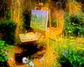
| 07/23/2005 04:46:59 PM |
Garden Paletteby banmornComment: NP. The site is Digital Photo Contest. Let me try to remember the process and I'll get back to you on it. I just never save these as PSD files as I should so I have to depend on my waning memory. Message edited by author 2005-07-23 17:04:24. |
| 07/23/2005 12:56:50 PM |
|
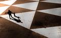
| 07/23/2005 12:55:25 PM |
F A T H E R & S O Nby librodoComment: Originally posted by saintaugust:
i love this. faving it. |
Me, too. Great design composition and shadows. |
| Photographer found comment helpful. |
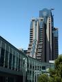
| 07/22/2005 01:05:39 AM |
IMG_1118mariott-metreonW.jpgby sfaliceComment: This is very nicely framed in the lower left by the trees which do not seem intrusive at all in the image. There is a nice flow to the angle you chose and I agree very much about the fine composition. If the Marriot is the far building, it has some great possibilites due to its rather eclectic design. I certainly could see one not liking it depending on how a sore a thumb it might be against the rest of its environs. But it is a fascinating building to me. Glad you shot it despite your opinion of it. Like the colors of this series very much. Message edited by author 2005-07-22 01:06:42. |
| Photographer found comment helpful. |
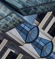
| 07/22/2005 01:00:48 AM |
IMG_1124mariott-detail2W.jpgby sfaliceComment: Originally posted by dragonlady:
Now, this is making me dizzy! |
Have to agree. The original orientation would look much better, I think. Really like the design color contrasts of this and the angle. Really is a very good abstract. Not sure how to improve this other than a 90 degree rotation left. I like the shapes and colors of the blue/beige bulding enough that I do not mind them seeming to over power the other building. You might want to think about bringing out the reflections in the building on the upper left which I am fairly certain you could do by selecting that area and boosting the levels/curves and and contrasts a bit. Nice work. |
| Photographer found comment helpful. |
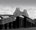
| 07/19/2005 01:06:27 AM |
jb.jpgby dragonladyComment: Marion you did a great job in post on this as the work you did on the sky gives the image a bit a drama that really adds to it. The billowy clouds you shopped in really make a nice layer upper level to the image and are a great contrast to the choppy river. The bridge image itself is very finely shot and I like the contrasts and use of BW very much. Is this a new bridge and old bridge together, one goes one way the other the other way? I really the contrasts of the newer bridge to the old and was wondering if you could find another angle to bring that out a bit. There is plenty of the old bridge in this (great detail on that, BTW) and if you shot left a bit you might get more of the newer bridge in the image for a better contrast of the two. Neat stuff! |
| Photographer found comment helpful. |
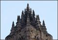
| 07/19/2005 12:56:44 AM |
William Wallace Monumentby riotComment: I think I might agree about increasing the contrast a bit. This is a great bit of stunning architecture and anything that you can do in shooting or post to bring out this wonderful detail should be done. I'm not sure that the centering in this works in a horziontal/landscape orientation and that it might be better in portrait/vertical. Well perhaps not. But the level is off a bit and it is not true center. Not sure if you want to fix that or not or reshoot. I assume that you used a tripod as your specs indicate the lense was closed down a bit to f/ 11 and you used a 0.8 sec. shutter speed. Guess you were quite a distance from this. I have no idea where you might get to shoot this at a better angle. I would like to see the detail more pronounced and more of the lower portion of the building which seems interesting as well. I do like the symmetry in this and the fact that you did not blow out the sky. Great architecture and I hope we see some more from you and Scotland. Thx! Message edited by author 2005-07-19 00:57:42. |
| Photographer found comment helpful. |
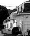
| 07/19/2005 12:14:31 AM |
mill-houses.jpgby dragonladyComment: I am usually in the same camp with singe about the wires. But I grew up in a small town like this and they are just unavoidable...I tried shooting the family church there and you just cannot get around them. They somewhat work for me in this because of the angle you chose. I would like to see them repeated down the street but some of them get lost in the far dark background. Maybe some PS dodging or brigtening of that area would bring them out more, rather than less, because they are there and it helps to make the shot. Note further that I regularly remove window air conditioners from images that I have done, but again, their repitition down the street also adds to the flavor of this image for me. Great stuff....ah home....better call Mom tomorrow and say hi! |
| Photographer found comment helpful. |
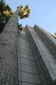
| 07/19/2005 12:05:06 AM |
arch1.jpgby briphotoComment: Like the angle as it really shows some fine perspective and nice lighting at the top. I don't think any perspective adjustment would make this better. It's an almost FLWright in the way the architecture almost blends in to the natural environment. Might be an idea for another assignment....hmmmm. |
Home -
Challenges -
Community -
League -
Photos -
Cameras -
Lenses -
Learn -
Help -
Terms of Use -
Privacy -
Top ^
DPChallenge, and website content and design, Copyright © 2001-2025 Challenging Technologies, LLC.
All digital photo copyrights belong to the photographers and may not be used without permission.
Current Server Time: 08/17/2025 03:40:39 AM EDT.