| Image |
Comment |
| 04/29/2002 02:15:00 PM |
|
| 04/29/2002 02:13:00 PM |
|
| 04/30/2002 11:43:00 AM |
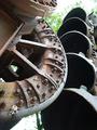
Dredge it upby yyyapComment: I have to admit I don't know what this is...but the shapes are well-thought out, I think. |
| 04/29/2002 11:51:00 AM |
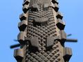
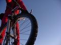
Getting Tyredby ManicComment: Oh, it's a bike. Nice graphic look. Seems to be ever so slightly tilted to the left? |
| 04/29/2002 02:12:00 PM |
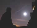
Untitledby itsaghostcarComment: the black isn't quite black...adjusting the levels in a Photoshop-like program might have helped. The composition is nice, but the two yellow lights are distracting. Couldn't you have asked your neighbor to turn off their lights for a second while you took a picture? ;-) |
| 04/30/2002 07:21:00 AM |
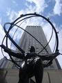
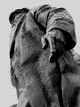
The Oppressor?by mykolearyComment: Nice texture. Good use of black and white. Nice framing. Technically, I wonder if the levels should be adjusted because I don't see any true 'white' highlights, but that might have made the sky white too. The greyness might actually work though, it makes it look more 'oppressive'. |
 Photographer found comment helpful. Photographer found comment helpful. |
| 04/30/2002 11:46:00 AM |
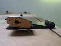
No:130by VodkamanComment: I do like it, though I didn't think I did in thumbnail. Good depth of field. The color is very subtle and softens it up a bit, but I think in black and white it would have been too harsh, as it's not a very warm-fuzzy subject. Well done. |
| 04/29/2002 11:18:00 AM |
...and Justice for Allby DigiteyesComment: I think this might have been stronger framed vertically...the silhouette of the plane is richly symbolic, and the flag is lit rather nicely, but there just seems to be too much blue on the right. Must have been difficult to catch that at the right moment though. |
| 04/29/2002 08:25:00 AM |
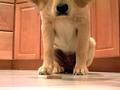
Budby MaYzComment: I would have liked to see from the perspective of a little closer to the dog and a little more 'up', perhaps framed vertically. I think it's too bad you can't see his eyes, eager to eat that bone. Right now, the focal point is on a place where you really don't want it (I hope)... |
| 05/01/2002 08:54:00 AM |
Don't run over me!by jonrComment: Quite nice. I like the off-set framing and the red jumpsuit. Though it appears that the rider isn't actually riding, since his feet aren't on the pedals, the fact that you left out the bottom of the wheel makes it seem as though the wheel could be off the ground. Well done. |
Home -
Challenges -
Community -
League -
Photos -
Cameras -
Lenses -
Learn -
Help -
Terms of Use -
Privacy -
Top ^
DPChallenge, and website content and design, Copyright © 2001-2025 Challenging Technologies, LLC.
All digital photo copyrights belong to the photographers and may not be used without permission.
Current Server Time: 08/25/2025 02:45:34 PM EDT.