| Image |
Comment |
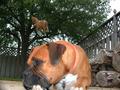
| 04/30/2002 10:20:00 AM |
From the groundup horse they make dog food.by David EyComment: It's hard to tell if that horse is hanging from the tree or where it's coming from...am I correct if I think it's a small ornament hanging over the dog's head to make him look like he's dreaming of dog food? I can see a faint white line. If I'm not totally missing something (and if I am, I apologize), I think this would have been a lot better with a less busy, lighter colored background. |
 Photographer found comment helpful. Photographer found comment helpful. |
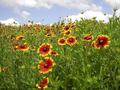
| 04/29/2002 08:14:00 AM |
Texas Indian Blanketsby marcelleComment: Odd texture. Is it artifacting? I like how the flowers extend all the way out into the background. It's too bad that the sky wasn't a deeper blue, I think it might have been a better contrast to the red and yellow flowers. If your camera supports it, a polarizer might have helped. |
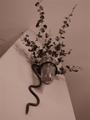
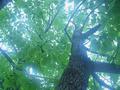
| 04/29/2002 04:29:00 PM |
Overviewby ciscocaliComment: Might be a little flat. The focus seems like it should be more on the leaves at the top. I like the composition though, but I'm not convined that sepia was the best choice, I'd like to see it in color |
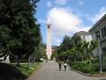
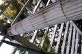
| 04/29/2002 08:32:00 AM |
Sather Towerby bobgaitherComment: Doesn't feel very close to the ground? Also, might have emphasized the tower more to be closer and to frame vertically. |
| 05/01/2002 08:45:00 AM |
Fractals Entering Cartesian Spaceby ReignComment: Took me a minute to realize that this picture is turned sideways than how most would normally orient it. Nice use of lines. I think you might want to see how it looks in black and white...just because there isn't much color and taking out that hint of green might put the emphasis more on the lines. |
| 04/29/2002 11:50:00 AM |
|
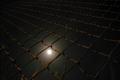
| 04/30/2002 11:41:00 AM |
Powerby paully2k1Comment: I like the composition. Glad you didn't try to match the power lines to the edge of the frame. The fact that it was done at nighttime really sets it apart from other telephone pole photos and makes it a bit less busy. I think I'd like to see it in black and white though. The odd greenish cast at the bottom and the browner elements on top detract a bit. |
| 04/29/2002 09:43:00 AM |
|
| 04/29/2002 04:27:00 PM |
Freedomby sonicblisComment: great shot, I wish it were just a little less overexposed |
| 05/01/2002 08:47:00 AM |
up or downby heritconComment: Power line is distracting. I think a more dynamic angle would improve this witty photo. |
Home -
Challenges -
Community -
League -
Photos -
Cameras -
Lenses -
Learn -
Help -
Terms of Use -
Privacy -
Top ^
DPChallenge, and website content and design, Copyright © 2001-2025 Challenging Technologies, LLC.
All digital photo copyrights belong to the photographers and may not be used without permission.
Current Server Time: 08/25/2025 02:48:47 PM EDT.