|
|
| Image |
Comment |
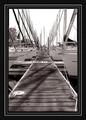
| 08/11/2004 02:28:41 AM | Xtreme Docking!by parrotheadComment: I'm a fan of big borders, and get PO'd when people complain about a simple thick black border, but this is even too much for me. It draws attention away from the photo ( which is VERY strong). This photo is fantastic, but would've been GREAT if you had just gone for the inner part of the border (black/skinny white/black). |  Photographer found comment helpful. Photographer found comment helpful. |
| 08/04/2004 03:48:07 AM | ouch! sharp!by animes2kComment: The reworked version does it much more justice, and I would love to see the series if you make one!
Lee |
| 08/04/2004 01:51:02 AM | Glassesby Hye5Comment: hmm, that's interesting. it's almost like i've already taken this photograph before, or at least one remarkably like it.
lee Message edited by author 2004-08-04 01:51:39. | | Photographer found comment helpful. |
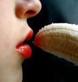
| 08/03/2004 04:08:26 PM | Yummmmmmmmmmmby NeuferlandComment: Deannda,
This is a wonderful composition, and a brilliant idea, you definetly deserve the score you got! However, with just a few finishing details, this could have broken the seven barrier and grabbed you a ribbon!
As this was an 'advanced' editing challenge, it would have been nice to see the background a true flat black, a little burning would have darkened up that right-hand corner which is slightly distracting.
What type of lighting did you use? The banana seems to be covered in a fair amount of shadow. A good idea would've been to shoot this outside, as natural light would've given evenly distributed light across the entire photo, allowing us a fuller view of the banana.
One technique that might've looked cool on this photo is selective desaturation. If you had desaturated the face, it would have left only the lips and banana in color, which really would've given it a 'WOWZERS' (which it already has, but even more so). Also along these lines, it might've been nice to get rid of the red in the banana, which you probably could've done by using the sponge desaturation tool on the red channel.
Those are my comments! Don't think I have all negative, cause I think this is a wonderful image, and am glad too see you placed so well with it. Funnily enough, I took a picture very similar to this one for the freedom 2 challenge:

Good luck, and keep up the good work!
Lee Message edited by author 2004-08-03 16:09:47. | | Photographer found comment helpful. |
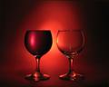
| 08/02/2004 02:58:07 AM | full / emptyby redmoonComment: I was just wondering how you lit this, you did a wonderful job of it!
Would you mind sending me a PM when you read this?
Thanks!
Lee |
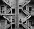
| 08/02/2004 02:45:35 AM | Exposed Staircaseby d14Comment: I like this image alot!
I think one thing that could have helped it alot is upping the contrast, it seems a little washed out, and a high contrast in the this image would be a very cool effect.
Secondly, this photo BEGS for a border. I would suggest just a plain black one. It just amplifies the effect that your demonstrating here, and is nice for the viewer to have a clear edge around the photo.
Good work, awesome composition!
Lee | | Photographer found comment helpful. |
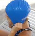
| 08/02/2004 01:03:33 AM | Blue Speedoby DiamondPeteComment: This photo would've been a great condidate for selective desaturation, especially since it's 'advanced' editing. If you had desaturated everything but the cap, it would've been fantastic! A great angle, you might've even gone from a little more downwards. Also, it would have been better if you had got the entire cap in the picture. |
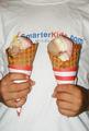
| 08/01/2004 05:05:30 AM | Now THAT's What I Call a Balanced Diet!by GeneralEComment: Greetings from the Critque Club!
This seems to be another case where marks were taken due to the fact the image appears to be more of a snapshot then purposefully composed photograph. The image lacks that something special that a viewer looks for.
The t-shirt background is one major cause of this problem. The logo on the t-shirt draws attention away from the subject of the picture - the ice cream cones. If you were determined to use a t-shirt background perhaps a flat color would have worked better, as it would provide a uncluttered background where the ice cream cones would have jumped out, providing clear subject-matter.
The lighting used in the photo is quite harsh, and does not light the ice cream cones in a pleasing way. You mention that you used flash to lighten the picture. Flash is a tricky tool to use, especially when lighting an image from directly in front. It gives them a very flat look, and can cast bad shadows directly behind the subject, distracting the viewer. I would have recommended shooting this outside using natural light. Or indoors with some good 3-point lighting. This would have ensured a good, solid form of lighting that gives an interesting 3 dimensional view of the cones.
Personally, I would have done the photo against a black background, with 3 point lighting set up to illuminate the cones and the hands, and nothing else. I would have also liked to see the cones closer together and a much closer crop. This may have given the photo that little thing that makes it special, and please the viewer.
Overall, I think your idea had merit. It was a bit of stretch to fit the challenge, but it did so in a humorous way. Knowing your work GeneralE, it seems like you were a bit rushed putting this together and couldn't put everything into it.
Good Luck!
Lee | | Photographer found comment helpful. |
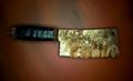
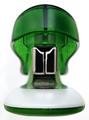
| 07/31/2004 04:10:06 AM | Mushroom Stapleby bruskiComment: This looks just like the head and shoulders of a transformer, or if it were in b&w it could be Darth Vader! This too me is what abstract photography is all about! It's about taking a mundane 'everyday object' and taking a picture of it at a certain angle, light or whatever so it appears to be something else. Well done! 8 | | Photographer found comment helpful. |
| 07/27/2004 10:23:27 PM | - Miracle! -by ImagineerComment: Greetings from the Critique Club!
This is a masterful use of painting with light, and would like to commend you on truly fulfilling your goal! You certainly produced an image that truly capsulates everything you hoped for, so congratulations!
I think the major reason your score wasn't higher here was because this image comes off as a graphic instead of photo. Not that I'm saying it was heavily post-processed or anything of the sort, I simply think this type of photo doesn't fall in with most forms of photography.
Personally, I think the effect you created here is magnificent and shows an incredible control of light (a significant achievement considering photography is all about light). You managed to take a simple idea, and make is spectacular through your use of light.
Compositionally, I think the way you organized the words seems a little unnatural to me. I like the fact that you placed the word 'star' dead center in the image, it really gives focus to the image. My eyes do however somewhat 'revolt' when it comes to the other words. The second word is very hard to make out, and the word 'dust' is unproportional to the other two words above 'star', which instantly draws my eye towards it. I think also, if you had cropped a little more off the left side, it be more eye friendly.
Overall, this is a very good image, unfortunatly I don't believe it will ever be received well in the photography world, because it is something that graphic artists and the such produce all the time! Your lighting skills are remarkable, and you set out to produce something particular and you did just that.
Good Luck!
Lee
| | Photographer found comment helpful. |
Home -
Challenges -
Community -
League -
Photos -
Cameras -
Lenses -
Learn -
Help -
Terms of Use -
Privacy -
Top ^
DPChallenge, and website content and design, Copyright © 2001-2025 Challenging Technologies, LLC.
All digital photo copyrights belong to the photographers and may not be used without permission.
Current Server Time: 08/23/2025 08:05:01 PM EDT.
|