| Author | Thread |
|
|
08/01/2004 10:23:06 PM |
Originally posted by Spanish_Grease:
Overall, I think your idea had merit. It was a bit of stretch to fit the challenge, but it did so in a humorous way. Knowing your work GeneralE, it seems like you were a bit rushed putting this together and couldn't put everything into it.
Lee |
I think you summed it up nicely! |
|
|
|
08/01/2004 05:05:30 AM |
Greetings from the Critque Club!
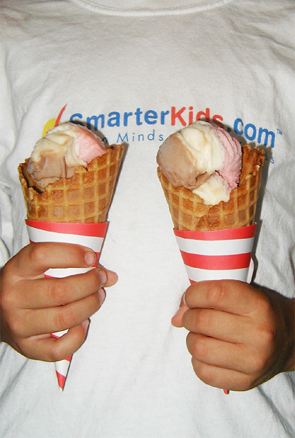
This seems to be another case where marks were taken due to the fact the image appears to be more of a snapshot then purposefully composed photograph. The image lacks that something special that a viewer looks for.
The t-shirt background is one major cause of this problem. The logo on the t-shirt draws attention away from the subject of the picture - the ice cream cones. If you were determined to use a t-shirt background perhaps a flat color would have worked better, as it would provide a uncluttered background where the ice cream cones would have jumped out, providing clear subject-matter.
The lighting used in the photo is quite harsh, and does not light the ice cream cones in a pleasing way. You mention that you used flash to lighten the picture. Flash is a tricky tool to use, especially when lighting an image from directly in front. It gives them a very flat look, and can cast bad shadows directly behind the subject, distracting the viewer. I would have recommended shooting this outside using natural light. Or indoors with some good 3-point lighting. This would have ensured a good, solid form of lighting that gives an interesting 3 dimensional view of the cones.
Personally, I would have done the photo against a black background, with 3 point lighting set up to illuminate the cones and the hands, and nothing else. I would have also liked to see the cones closer together and a much closer crop. This may have given the photo that little thing that makes it special, and please the viewer.
Overall, I think your idea had merit. It was a bit of stretch to fit the challenge, but it did so in a humorous way. Knowing your work GeneralE, it seems like you were a bit rushed putting this together and couldn't put everything into it.
Good Luck!
Lee |
|
 Photographer found comment helpful. Photographer found comment helpful. |
Comments Made During the Challenge  |
|
|
07/24/2004 03:08:32 PM |
|
Very harsh lighting, creating ugly shadows. if flash has been used it would improve it by using bounce or reflected light. |
|
| Photographer found comment helpful. |
|
|
07/22/2004 07:12:42 AM |
|
Good idea but the shirt distracts a little maybe if it was darker or didn't have text would have been better. |
|
| Photographer found comment helpful. |
|
|
07/21/2004 11:48:16 AM |
|
A cute idea. Exposure is right on - hard to do with a white t-shirt. The text on the shirt doesn't add anything for me. |
|
| Photographer found comment helpful. |
|
|
07/21/2004 07:48:18 AM |
|
The lighting is done well and the image is really crisp. I feel that perhaps more could have been done with the composition to make the image a liitle more interesting. The writing on the T-shirt distracts my attention from the ice-creams. |
|
| Photographer found comment helpful. |
|
|
07/21/2004 02:37:36 AM |
|
Haha, great composition and balance in both subject and framing. I also like the slogan on the kid's T-shirt for the whimsical quality it adds. The only element I found distracting is the lighting. The use of flash really makes for a harsh look and washes out the colors, as well as created unwanted shadows. |
|
| Photographer found comment helpful. |
|
|
07/20/2004 08:06:49 PM |
|
very yummy looking and a good idea. the slogan on the t-shirt is a bit distracting and natural lighting may have worked better. |
|
| Photographer found comment helpful. |
Home -
Challenges -
Community -
League -
Photos -
Cameras -
Lenses -
Learn -
Help -
Terms of Use -
Privacy -
Top ^
DPChallenge, and website content and design, Copyright © 2001-2026 Challenging Technologies, LLC.
All digital photo copyrights belong to the photographers and may not be used without permission.
Current Server Time: 06/28/2026 07:48:24 PM EDT.