| Image |
Comment |
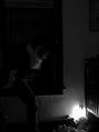
| 10/06/2003 02:41:07 PM |
A Mother's Worst Nightmareby ShannonComment: very scary thought! well composed, but a bit dark. I like the lighting, but I think the kidnapper could have been a bit better defined. |
 Photographer found comment helpful. Photographer found comment helpful. |
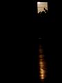
| 10/06/2003 02:39:27 PM |
Panicby JenHallComment: hard to tell what is going on in this shot - I assume someone is banging on the door to get out of the dark room, but the idea is not expressed very clearly. |
| Photographer found comment helpful. |
| 10/06/2003 02:38:39 PM |
Dreams of Freedomby paganiniComment: I think your idea would have been expressed better if we were able to see the bear's caged environment. |
| 10/06/2003 02:36:38 PM |
|
| Photographer found comment helpful. |
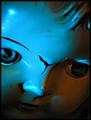
| 10/06/2003 02:31:47 PM |
When The Dolls Awake...by fleenkComment: one of my biggest creepy nightmares! I like the lighting and tight crop here. The crack in the doll's face adds to the scary mood. well done. |
| Photographer found comment helpful. |
| 10/06/2003 02:29:30 PM |
The Shadowby thelselComment: nicely composed shot. I like the catchlight in the boy's eye and his open mouth look of fear. I think a grainy effect could have worked well here but the way you implemented it is too harsh. subtler grain tones would have been better. |
| Photographer found comment helpful. |
| 10/06/2003 02:25:12 PM |
|
| Photographer found comment helpful. |
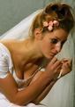
| 10/06/2003 02:19:22 PM |
He never came!by kiwinessComment: clever idea. nicely photographed, but the bride doesn't look sad enough in her expression. It looks as if you just wanted us to see the smeared mascara rather than the unhappiness she is experiencing. |
| Photographer found comment helpful. |
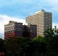
| 10/02/2003 01:21:20 PM |
progressby tomzinhoComment: nice enough architecture shot, but the building looks aslant. perhaps you need to rotate the frame somewaht or correct barrel distortion. |
| Photographer found comment helpful. |
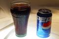
| 10/02/2003 01:19:58 PM |
It's The Real Joyby Ram21Comment: I like your idea here a lot but not the presentation. I think the lighting from underneath can be effective, but here it's just making the overall light levels very uneven. The fabric at the top of the frame and the top of the can and glass are very dark - especially on the glass where it is important to read the Coke logo to get the joke. I think you could have had the objects arranged better too, placing them so that they interact more rather than just standing beside one another. |
| Photographer found comment helpful. |
Home -
Challenges -
Community -
League -
Photos -
Cameras -
Lenses -
Learn -
Help -
Terms of Use -
Privacy -
Top ^
DPChallenge, and website content and design, Copyright © 2001-2025 Challenging Technologies, LLC.
All digital photo copyrights belong to the photographers and may not be used without permission.
Current Server Time: 08/04/2025 03:46:48 PM EDT.