| Image |
Comment |
| 11/04/2007 04:58:52 AM |
Far, Far Awayby scalvertComment: My God that place looks hideous, is it Disneyland? Sky feels too artifical, looks like colours are as a result of PS. Shame there are no clouds, composition feels like it needs something extra in it to add some interest. Shot is too blurry. |
 Photographer found comment helpful. Photographer found comment helpful. |
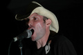
| 11/04/2007 04:57:14 AM |
American Speedway, American Dreamby AJSullivanComment: Lots of unused negative space on the right of the shot. Photos like these really need to have the subject looking INTO the frame, composition doesn't feel at all thought out. Bad skin tone, needs colour balancing caused by the flash catching all the surface blood just under the skin. Eyes don't have a really great expression that makes good gig photos come alive. Why is this photo so small? |
| Photographer found comment helpful. |
| 11/04/2007 04:54:26 AM |
Justification of a Higher Educationby RodertComment: Haha, not because you love learning, or want to make the world a better place, or want to reach your potential. Just a flash car. Man, I hate materialism. Anyway, your model needs more light... offboard carefully bounced flash is badly needed here. You don't have great reflections on the car, this needed more thought. Were you trying to light your model with the lights from another car? This hasn't worked, as the light isn't high enough. The sky is very poor, and really makes the shoot look amateur. You needed a little more dof so the background skyline would be in focus. It doesn't look good here. Or far more blurred. The model's clothes don't work well for this concept, not classy or thought out at all. Not a compelling expression either. He almost has a tower growing from his head... I don't feel that you were aware of the composition of how his head blends with the background. A far more inventive shot may have been to bring a very high stepladder so you could get the same shot with the same background but looking down on him. |
| Photographer found comment helpful. |
| 11/04/2007 04:47:53 AM |
|
| 11/04/2007 04:47:08 AM |
Barcelona Nightsby FellSevenLeavesComment: Needs more colour balancing... I'm not sure the white balance was good here. Lots of empty negative space to the left, not a very convincing composition. Why form a chord with the left hand if the right hand is posing for the camera? A bit of a mixed message there. Nice model, you've not flattered her ankle and you should generally aim not to see the bottom of the feet in a portrait. Have you come across rule of thirds? That will help you. Nice shallow dof, good bokeh. |
| Photographer found comment helpful. |
| 11/04/2007 04:43:40 AM |
Shades of Autumnby MAKComment: Don't like the colour balancing... he looks quite ill. I'd have used Photoshop to fix the lazy eye. |
| Photographer found comment helpful. |
| 11/02/2007 06:34:33 AM |
Miloby TacTZillaComment: Oh that's gorgeous, one of the best photos I've seen in ages! Almost painterly, and very humourous in a good way. Lots of love in this shot. Great textures, good post processing. Tough exposure, handled well. Superb composition. Thanks for brightening my day, in fact I'll keep this favourited so I can look at it when I want a lift! |
| Photographer found comment helpful. |
| 11/02/2007 06:31:00 AM |
|
| 11/02/2007 06:30:09 AM |
|
| Photographer found comment helpful. |
| 11/02/2007 06:29:10 AM |
Reflections of Fallby dtremainComment: Sky doesn't look good, everything is way oversharpened. Desperately needs colour balancing. Composition is not at all compelling. Nothing interesting in this shot to look at. |
Home -
Challenges -
Community -
League -
Photos -
Cameras -
Lenses -
Learn -
Help -
Terms of Use -
Privacy -
Top ^
DPChallenge, and website content and design, Copyright © 2001-2025 Challenging Technologies, LLC.
All digital photo copyrights belong to the photographers and may not be used without permission.
Current Server Time: 06/19/2025 08:56:02 AM EDT.