|
|
| Image |
Comment |
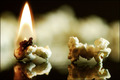
| 11/20/2007 11:00:31 AM | Burnt Popcorn Sucksby nicoledeeComment: You are a victim of the Critique Club.
Yeah, I agree burnt popcorn is never a good thing.
Pros
- I really like the reflections on the table, I think that was a good idea to add those to your shot. They really help to add interest.
- The DOF choice is great, with that popcorn in the background it helps this picture feel more 3d rather than a flat image.
Cons
- I think the composition here is the thing that bothers me the most. I really don't like to see so much symmetry. For me if I can split a picture in half and the two halves make pictures all on their own it probably could have been done better. I think taking this shot on an angle, rather than having the two kernels side by side would have helped this. Or even just having the kernel on fire be the lone subject, the second kernel isn't necessarily helping the shot.
- As I mentioned above I really like the reflections here, but the crop cuts out some of it. Taking this shot from a wider angle would have let us see the reflections fully, whereas here it looks like you weren't paying attention and part of it just got cut out, especially on the not on fire one. I agree with one of the other comments that was made that the reflection of the fire could have been interesting.
- I also think that the second kernel looks a little out of focus, as somebody else mentioned. Looking closely I don't think it is, I think it is the popcorn in the background that is giving that illusion. I'm not sure how to fix that, other than just taking that kernel out of the picture.
This is a great idea and I think you captured the topic well, try some of these ideas and see if you like any of your shots better, I hope this has been helpful. |  Photographer found comment helpful. Photographer found comment helpful. |
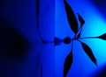
| 11/20/2007 10:48:03 AM | black plant shadowby vkotisComment: You are a victim of the Critique Club.
I think you have already received some great feedback on ways to improve this shot, btw people like it when you mark their comments as helpful, assuming they were helpful. I will try to add a few things that haven't been mentioned yet.
Pros
- I like what you are trying to do here with the blue light, I think it is a nice affect that you are trying to achieve.
- Somebody mentioned that they didn't like what seemed to be lens vignetting, I don't think it is vignetting at all, it seems to me that it is just the shape made by the way the light is set up. If you don't know what vignetting is, that is where the corners are darker, kind of like a spotlight is shining on the middle of the picture, so the edges look a little darker. In m opinion that actually helps with this shot, but it doesn't appear to be vignetting, but rather the light setup like I said before.
Cons
- As was mentioned in one of the other comments usually splitting your picture right down the middle visually isn't a good idea. Think rule of thirds here. Try to split your frame up into thirds and place things along those lines rather than the middle. If you wanted to emphasize the shadow more you would move the line formed by the wall and floor to the right, if you wanted to emphasize the plant more you would move the line to the left. This gives a little added interest to the shot, the same thing applies to horizons don't put them in the middle. Also your subject in general should never be centered in the picture unless you are filling the frame with it. Again, this is a guideline in photography, so it can be broken effectively, but usually it just looks wrong.
- I personally don't like the shadow on the floor, it is distracting to me. The focus of the shadow is on the wall, but my eyes keep going to that spot on the floor. From the top looking down this shadow would be really hard to eliminate, you would have to have another light to get rid out that spot on the floor, but since the challenge was a single light source this is really an option, see my next point as a way to possibly fix this.
- I had to stare at this shot for quite some time to figure out exactly what I was looking at. Your description finally helped me to orient it correctly, I thought you just didn't rotate your image at first. When people are voting on your image, they don't see that description, so I think that hurt you in the voting. I would have tried to take this shot facing the wall instead of the floor. Taking it from an angle would have shown the shadow just great, and for my point above it would have helped with the distracting shadow on the floor. The shadow would still be there, but from that angle it would be a continuous shadow and it would have looked better, IMO. Try taking this from different points of view and see if you like any of them better.
- Like others mentioned it seems there is some "noise" (some graininess in the pixels) here. Now that we can see your settings, with an ISO of 100 that isn't your problem. With a higher ISO you start to introduce noise to your shot. I also see that your shutter speed was a 1. Was this 1 second? Did you shoot this on a tripod? I think the "noise" is coming from movement during that 1 second the shutter was open. If your shutter speed is that low, you can't hand hold it and get a good shot.
This is a great idea, I think if you look at my suggestions and the suggestions from your other comments you could really turn this into a great shot. Keep shooting, and improving. |
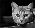
| 11/20/2007 10:07:50 AM | Sneak Attackby jeroweComment: You are a victim of the Critique Club. Again!
Your Confident shot was my first critique as a member of the club and now I've got you again. I must not have got it right the first time.
Pros
- I love that you chose to do this as a B&W conversion. It really adds to the emotion of the picture. It seems to be a good conversion too, it isn't too flat from what I can see.
- The composition is another strong point with this shot. The kitty isn't centered in the frame, the line coming from the arm of the chair (is that a chair?), this is just a well framed picture.
- Again, as I mentioned in your confident shot I am glad to see some catch lights here. Especially in animals they can really look dead without them, but I'm sure you don't need to be taught about catch lights.
Cons
- I would have listed the DOF as a pro, but I was having a hard time finding things wrong with the picture. I really like the DOF except for the left, the kitty's right, side of the face. I just wish the entire face was in focus, although I really like that the rest is out of focus. Maybe changing to a 3.5 would be enough to get just that last little bit in focus. Again this is just nit picky so I can give you something to work on.
- Some of the shadows are a little distracting to me. The shadow in the kitty's left eye is a little bit, but mostly the shadow from the chin is the one that draws my attention. With your setup, I'm not sure how you can get rid of this one, if the soft boxes are above that kitty then they will produce that shadow, so the other option is getting the kitty further away from the arm of the chair, but then I think it would hurt the composition more than it would help with the shadows, so I don't have any good suggestions on this one.
Sorry, I really struggled to find things for you to work on in this shot, I think it is a nicely done shot. Hopefully I will get to critique some more of your shots as I learn from them as well. | | Photographer found comment helpful. |
| 11/16/2007 06:13:26 PM | The Devil's Garden (1920)by posthumousComment: You are a victim of the Critique Club.
I'm not familiar with this movie, and from your description it looks like you're not either. I have a feeling that is why it didn't do as well, if people don't know the movie then they don't really know how good of a scene your shot is.
Pros
- I really like the composition here. You did a good job of not chopping your legs off in weirds places from your crop. Cropping on joints is usually a bad idea, so your mid leg crop is perfect. I also like how your hunched over back leading up to your head leads us right to the woman.
- I really like the tone that your conversion sets up. I agree with your comments that the green tint to the b&w really gives that old movie scary scene feel.
Cons
- I really wish there was more definition in the shot. I can't make out your face at all, it almost looks like your hat is just floating in the air. Also the woman looks a little weird with her other hand missing, maybe this is on purpose. I read from your comments that you cloned it out because it was holding her wrist, why was it holding her wrist? Try taking this so her other hand is somewhere else and we can see it in the picture. I'm not sure how you would get around having detail in your face, the first thing that comes to mind is to get rid of the hat, but I think the hat is a nice element to the shot.
- That darker plant, and its shadow in the lower left is somewhat distracting, my eyes move to that spot almost every time I look at this shot. I keep trying to figure out what it is. Try a different angle, or just tear it out, if it isn't too hard, so it isn't in the shot at all.
Overall I think this is a nice shot, and I think it scored worse than it would have mostly because people probably don't know anything about the movie. | | Photographer found comment helpful. |
| 11/14/2007 06:02:25 PM | WINDby acoppolaComment: You are a victim of the Critique Club.
Wow, that is a lot of 5s. Sometimes when your picture is in that range people don't really look at your shot long enough to give it a chance.
Pros
- I really like the sky in this shot. I'm glad on your rule of thirds you chose to show more of the sky rather than more of the water. I really like how the clouds keep following that pattern all the way into the horizon. It is nice to have an interesting sky when you are out shooting.
- Partially mentioned above, I think you have some good compositional points here. You used the rule of thirds well. I'm really glad that you left room for the sailboat to move through the picture. Too many times I see shots where the action is right on the edge and there is nowhere for the subject to go. Nice positioning here.
- Especially since your title is 'Wind', I'm glad to see some action here. There are some waves hitting the boat, and the sail is definitely full of wind. Good job in catching some action here, rather than just a shot of a boat in the water.
Cons
- Before I even read through the comments, my first thought was the sail is cutoff. After reading the comments it looks like a lot of your viewers thought that hurt your shot as well. Try two things here, either make the shot tighter, as was suggested in other comments, so we see a little more of the people on the boat, or take a wider shot. Cutting out the sail isn't bad, it just looks like it was an accident here, if the sail was cut off more, or the whole thing could be seen I think you would have seen some of those 5s move up to 6s, or better.
- I don't know if you even have any control of this, but it looks like there is another bank in the back of your shot. At first I thought those were some weird looking waves, but as I studied this shot it looks more like buildings. Those are pretty distracting. It is possible that the tighter shot might also make it more obvious that those are buildings. Or try a more shallow DOF so they aren't as distracting. Like I said, I don't know if this is something you can even have control over, but try both of those options and see if it helps.
This shot has a lot of potential, just look at some of these things when you go out next time. I hope this has been helpful. | | Photographer found comment helpful. |
| 11/14/2007 02:03:10 PM | -Confident-by jeroweComment: You are a victim of the Critique Club.
Nicely done on this shot, its too bad you couldn't have received some more 6s or 7s instead of those 3s and 4s, it definitely is a well done portrait.
Pros
- You did a nice job of getting the catch light in her eyes. This is probably an obvious concept to most people here, but without them the subject really does feel dead, so that is one of the first things I look for when looking at a portrait.
- Unlike a couple of the comments already posted, I think you actually did a great job of getting her eyes in focus. I especially like the DOF here, where here hair and sweater are losing focus. I think you actually did an excellent job of keeping her face sharp with that 2.8 f-stop.
- I really like the nice simple background in this shot. It always helps in portraits to not have too much, if anything, going on in the background. The color is a nice choice and it doesn't distract me from the portrait itself.
Cons
- I kind of agree with a comment that was already posted that says she seems a little unsure. I think part of this is because of the angle of the shot. Usually when you look down on the subject it makes them less important (I don't know if that is the best word choice). This can be effective, take for instance a shot of a child, it makes them seem more vulnerable, the feeling that they need someone to look up to, someone to help them. It seems like this shot is pretty close to straight on, possibly shot down a little bit, but her eyes seem to be looking up, that is what gives me the feeling of looking down on her, or the unsure type feel. Try to get her eyes looking at you, or even down, maybe even try shooting up at her just a bit and see if that maybe gives us more of a confident feeling.
- I actually like the blue eyes, but I am listing it as a con because given the advanced editing guidelines, I think you could have made them a little deeper, so they stand out a bit more. This also would have helped with the feeling of confidence.
- The hair that is flipped behind her head on the left is a little distracting to me. I had to look at it for a bit to make sure it wasn't just disappearing. I think this is because it is in the dark part of this photo, on a quick glance, because of the lack of light, her hair almost looks like it just disappears to me. Try to either have some of her hair fall to her back, rather than flip around, or change the lighting a bit to make it obvious the hair isn't just gone.
Overall I think you did an excellent job with this portrait. Hopefully some of my comments will make your future shots even better. | | Photographer found comment helpful. |
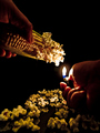
| 11/09/2007 01:10:21 PM | I Spy...Popcornby Janae_CooperComment: This is a very unique idea, nice thought for the challenge. On my monitor the colors look a little dull, this could definitely use some help from a levels adjustment. Try to work on the colors to bring it more to life. I spy...a key. | | Photographer found comment helpful. |
| 11/09/2007 01:03:24 PM | |
| 11/09/2007 01:02:52 PM | Popping Cornby olimpiadaComment: This is along the lines of my first thoughts when I saw the challenge. I have just been waiting to see something like it. Nicely done. | | Photographer found comment helpful. |
| 11/09/2007 01:02:07 PM | Getting Ready To Pop Openby RosacalacaComment: What was your iso on this shot? It looks like there is a lot of noise. This is a stretch to meet the challenge, there are so many good, unique, interesting ideas so far, and this looks like it took no effort. | | Photographer found comment helpful. |
Home -
Challenges -
Community -
League -
Photos -
Cameras -
Lenses -
Learn -
Help -
Terms of Use -
Privacy -
Top ^
DPChallenge, and website content and design, Copyright © 2001-2026 Challenging Technologies, LLC.
All digital photo copyrights belong to the photographers and may not be used without permission.
Current Server Time: 06/27/2026 08:17:25 AM EDT.
|