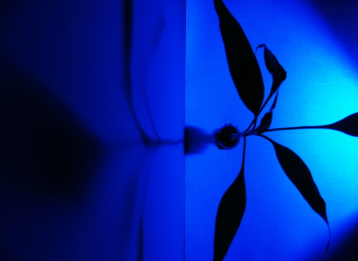
bamboo plant and shadow of plant on wall from flourescent blacklight lamp. photo taken downward.
raised both input and output levels of tone curve.
some red taken out.
Statistics
Place: 162 out of 199 Avg (all users): 4.6683 Avg (commenters): 4.0000 Avg (participants): 4.5472 Avg (non-participants): 4.7114 Views since voting: 975 Views during voting: 261 Votes: 202 Comments: 5 Favorites: 0
I think you have already received some great feedback on ways to improve this shot, btw people like it when you mark their comments as helpful, assuming they were helpful. I will try to add a few things that haven't been mentioned yet.
Pros
- I like what you are trying to do here with the blue light, I think it is a nice affect that you are trying to achieve.
- Somebody mentioned that they didn't like what seemed to be lens vignetting, I don't think it is vignetting at all, it seems to me that it is just the shape made by the way the light is set up. If you don't know what vignetting is, that is where the corners are darker, kind of like a spotlight is shining on the middle of the picture, so the edges look a little darker. In m opinion that actually helps with this shot, but it doesn't appear to be vignetting, but rather the light setup like I said before.
Cons
- As was mentioned in one of the other comments usually splitting your picture right down the middle visually isn't a good idea. Think rule of thirds here. Try to split your frame up into thirds and place things along those lines rather than the middle. If you wanted to emphasize the shadow more you would move the line formed by the wall and floor to the right, if you wanted to emphasize the plant more you would move the line to the left. This gives a little added interest to the shot, the same thing applies to horizons don't put them in the middle. Also your subject in general should never be centered in the picture unless you are filling the frame with it. Again, this is a guideline in photography, so it can be broken effectively, but usually it just looks wrong.
- I personally don't like the shadow on the floor, it is distracting to me. The focus of the shadow is on the wall, but my eyes keep going to that spot on the floor. From the top looking down this shadow would be really hard to eliminate, you would have to have another light to get rid out that spot on the floor, but since the challenge was a single light source this is really an option, see my next point as a way to possibly fix this.
- I had to stare at this shot for quite some time to figure out exactly what I was looking at. Your description finally helped me to orient it correctly, I thought you just didn't rotate your image at first. When people are voting on your image, they don't see that description, so I think that hurt you in the voting. I would have tried to take this shot facing the wall instead of the floor. Taking it from an angle would have shown the shadow just great, and for my point above it would have helped with the distracting shadow on the floor. The shadow would still be there, but from that angle it would be a continuous shadow and it would have looked better, IMO. Try taking this from different points of view and see if you like any of them better.
- Like others mentioned it seems there is some "noise" (some graininess in the pixels) here. Now that we can see your settings, with an ISO of 100 that isn't your problem. With a higher ISO you start to introduce noise to your shot. I also see that your shutter speed was a 1. Was this 1 second? Did you shoot this on a tripod? I think the "noise" is coming from movement during that 1 second the shutter was open. If your shutter speed is that low, you can't hand hold it and get a good shot.
This is a great idea, I think if you look at my suggestions and the suggestions from your other comments you could really turn this into a great shot. Keep shooting, and improving.
I love the color in this shot, but then blue IS my favorite color. I am voting this image a 5. Here is what you could have done differently to have scored higher with me: 1) Make it the full 640 pixels on at least one side. Saves the voter from craning his/her neck to look it over. 2) It's a bit noisy around the light. Did you use Neat Image? They have a demo version that's free and works wonders for DPC entries. You also might have gotten better results by diffusing the light a bit. 3) The "cut corners are a bit distracting. Looks like vignetting to me. If you can't get rid of it with your lens, try shooting from further back and then cropping it out.
Very striking, a bit noisy though. Having the split running vertically down across the centre of the image is not ideal, either 1/3 left or right would have been better and conformed to the standard composition guidelines