|
|
| Image |
Comment |
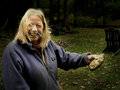
| 11/24/2005 04:22:43 PM | The Potatoby funnylooksComment: I used a draganizer action on PS, among other things, but basically I've been trying to see how people get the thing to work.... it also adds grunge, but I went really light on that. (-: |
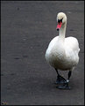
| 11/20/2005 04:16:41 PM | swan5.jpgby kevrobertsonComment: I like the way this swan seems to be strolling through the city. Very nonchalant. At first I was thinking, 'now these are very grey colours for such a beautiful bird', but for this particular photo, I like it. The tag on the ankle is kinda like a style statement. |  Photographer found comment helpful. Photographer found comment helpful. |
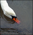
| 11/20/2005 04:12:28 PM | swan3.jpgby kevrobertsonComment: I like the composition of this one. I think the colour of the swan is great, especially the beak, even through the water.
One thing I find odd about both photos is the black line around the swan (were you selecting it in some way?)
In this picture I also noticed that the rock in front is a bit blurred.... have you tried cropping it without the rock? It might give it a different feel, but could be really cool too. (-:
Great job! | | Photographer found comment helpful. |
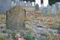
| 11/18/2005 04:51:05 PM | Sarah Badgerby 77LTDComment: Hello from the critique club!
Firstly, congrats on your highest score! I really like the idea of the image, it fits the challenge well, and I can see why this particular stone would have caught your eye.
One thing to keep in mind, the size/file limit is 640 pixels and 150kb, usually it's a good idea to keep as close to this line as possible, as the smaller the image/filesize the more detail is lost.
One of the most interesting parts of this image is the detail on the stone, and here it's a bit faded out. A couple of suggestions for ways to fix that: adjust the levels/histogram, play with contrast and highlights/shadow. This would also give it a sharper look, though I'd also suggest applying a very light 'unsharp mask' to the photo, just the clean the edges a bit.
I think that increasing the saturation would make this image 'pop' a bit more, and would also suggest considering adding a bit of warmth to the image (while the graves and frost are very cold, this particular stone has a warm glow about it; it's part of what makes it so nice.)
You did an excellent job with composition and depth of field. One thing I noticed is that in the background, there are a couple of large overblown white graves, they're distracting. It seems like the lighting wasn't quite right for the shot. (Perhaps a different time of day?) In advanced editing you could consider either cloning them out, or individually selcting them and changing the tone to something more like the rest of the blue stones.
Once again, congrats on the image, I look foreward to seeing more of your work.
--Mariana (funnylooks)
Feel free to PM me with questions/comments.
|
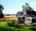
| 11/18/2005 04:04:00 PM | Days Gone Byby esdarbyComment: Hello from the Critique Club!
The first thing that struck me about this image is the beautiful colours of the house and the field behind. I love the saturation.
It fits the challenge very well (to me), and as I said, I enjoy the colours; though it might also make a striking black and white, this way it has an individual character.
I think that the sky is a bit overbright, it steals away some of the focus that could otherwise be on the house.
The focus/sharpness is really good, though I did notice that along the bars of the window, the lines look a bit choppy. Perhaps by using a larger aperature, for more depth, this could be avoided.
For composition, again, the sky is stealing focus away from the theme of your image. The top centimeter or so is only sky, and does not need to be included in the image... I'd suggest cropping off a bit of the top, and then maybe fiddling with cropping on the bottom and sides, to put better focus on the house.
Two other little things I noticed are:
- the right side of the house is dark and empty, which distracts me from the busy dissaray beautifully portrayed in the left.
- along with the right side of the house, there are four dark areas, all along the side -- the grass bunch, the shadow in the grass, and the tree... While they aren't all really distractions, I find that they do not add to the photo as a whole. (Which is why I suggested playing with the cropping along the sides and bottom as well.)
Congrats on the score, and good luck in all future challenges!
--Mariana (funnylooks)
Feel free to PM me with any questions/comments. | | Photographer found comment helpful. |
| 11/17/2005 03:42:26 PM | Dead End of the Netherlandsby Goldwing_edComment: Greetings from the Critique Club!
Firstly, as an entry to 'dead end', I like the overall greyness of the image. This is a bleak image pointing off to nowhere through the North Sea. One thing I would note is that the title just says it is a dead end; to me, the image had more impact on finding out that it is actually the northernmost part of the Netherlands.
The composition is good.
I seem to find that my eyes wander over the photograph, as though searching for something to follow or land on. Even minimalist and surreal photos tend to have a followable flow/line, or points of interest.
At first I was going to say that maybe you could play with the shadows and highlights a bit, and bring more depth to the image. It would be the 'stereotypical' thing to do to add more interest to the photo overall.
However, being honest, I don't think that this image has those components that make an eye catching photo really pop out, and creating a really flat, stark and empty image puts it into a different category of interest. Unfortunately, it is not a category that seems to appeal to a large audience, and dpc is based on popular vote.
-- Mariana (funnylooks)
Feel free to PM me for questions/comments on the critique. (-:
|
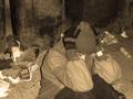
| 11/16/2005 04:12:09 PM | Waiting for dinnerby GiorgioComment: I remember thinking about this one during the challenge. It's a great emotive shot, and I personally like the fact that she's 'shutting us out', to me, the situation is one of aloneness and hardship. One thing that somewhat put me off is that since the title of the challenge is 'garbage' and the main focus of the image is a homeless person, it could be interpreted as a statement about the 'waste/garbage of society'... though I don't think (I hope and your title indicates) that was the intent. Nevertheless, the implication bothered me.
On a photographic note, I do think the lighting was a bit intense, as the shadow right behind her is the only really stark/black part of the image. | | Photographer found comment helpful. |
| 11/16/2005 01:19:38 AM | | | Photographer found comment helpful. |
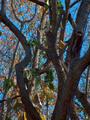
| 11/16/2005 01:06:10 AM | Hideing from the Enemyby amanComment: I really like the framing and concept of this image, though I find that it's really greyed out and flat. To me, it would be much more interesting with more 'depth'. | | Photographer found comment helpful. |
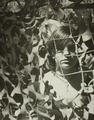
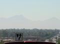
| 11/16/2005 01:03:38 AM | The Hidden Hillsby CamManComment: This image is a great concept, I like the creativity in not choosing the typical 'camoflauge' items. However I think that the image would greatly improve if the sign and the ?dashboard top? were not in it; they are much clearer than anything else in the image and it's distracting. |
Home -
Challenges -
Community -
League -
Photos -
Cameras -
Lenses -
Learn -
Help -
Terms of Use -
Privacy -
Top ^
DPChallenge, and website content and design, Copyright © 2001-2025 Challenging Technologies, LLC.
All digital photo copyrights belong to the photographers and may not be used without permission.
Current Server Time: 08/23/2025 10:52:20 PM EDT.
|